CSS Lists Tutorial: list-style-type, list-style-position & Custom Markers (2026-27 Guide)
Today we are discuss topic CSS Lists. Every bulleted or numbered list on the web starts from the humble
<ul> or <ol> tag, but by default browsers apply plain round bullets or simple numerals that rarely match a site's design. CSS gives you complete control over how list markers look -their shape, their position, whether they're an image or even a fully custom ::marker style, and how list items are laid out (vertical, horizontal, or grid-based navigation). In this complete guide you will master list-style-type, list-style-position, list-style-image, the list-style shorthand, the modern ::marker pseudo-element, removing bullets for navigation menus, building horizontal nav lists, and CSS counters. Includes live code panels, an interactive list-style playground, comparison tables, common mistakes, a quiz, and FAQ -everything you need to write professional, accessible CSS list styling. This tutorial or document breaks down the process step by step, using simple language and real-world examples to help you master the skill.
📋 Table of Contents
- What Are CSS Lists?
- list-style-type
- list-style-position
- list-style-image
- The list-style Shorthand
- Removing Bullets & Indentation
- Styling Markers with ::marker
- Horizontal Lists & Navigation Menus
- Nested Lists
- CSS Counters for Custom Numbering
- List Properties – Reference Table
- Best Practices
- Common Mistakes to Avoid
- Live Code Example
- Try It Yourself – Interactive Editor
- 🎨 Interactive List-Style Playground
- Practice Quiz
- Frequently Asked Questions (FAQ)
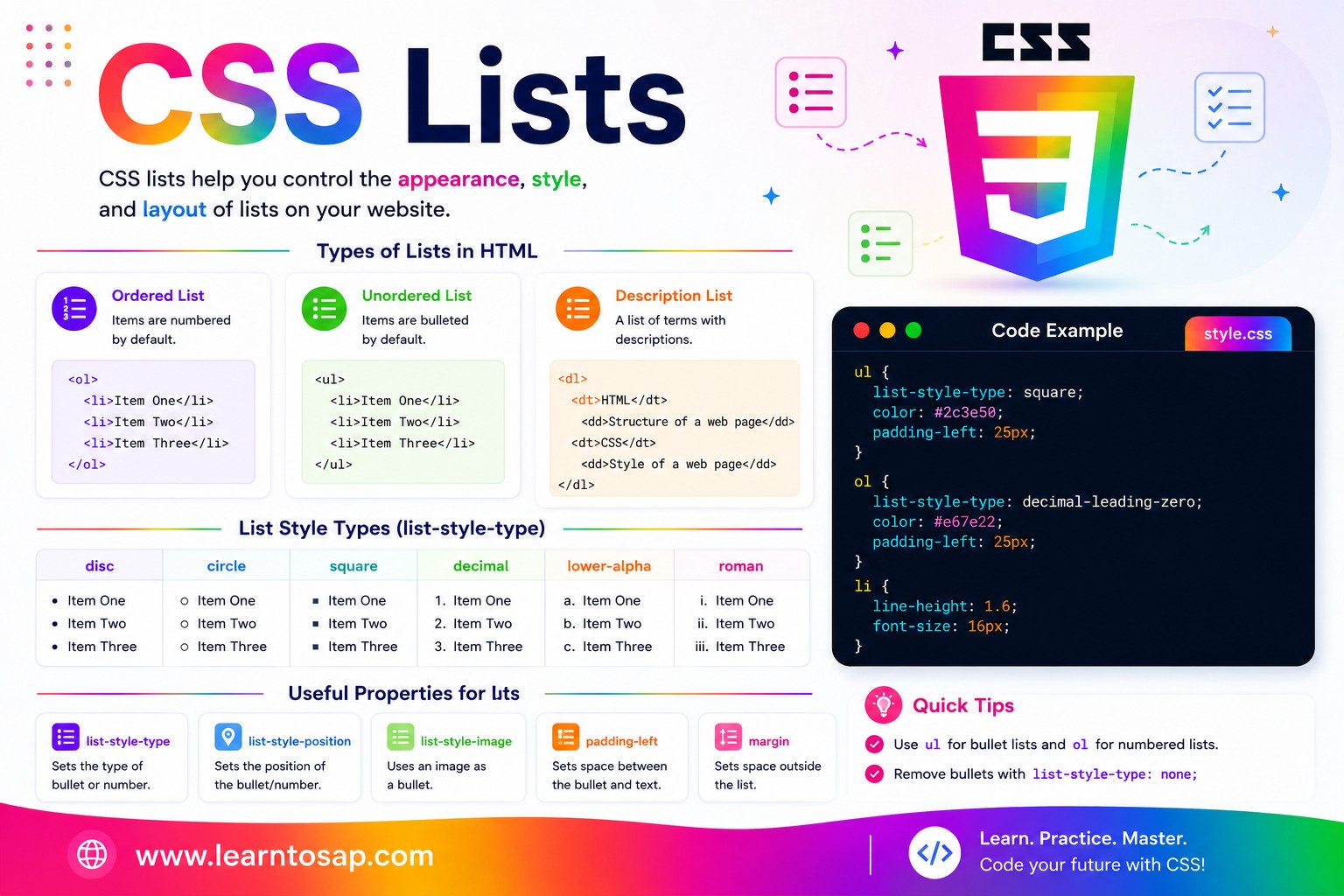
✅ What Are CSS Lists?
A CSS list refers to styling applied to HTML's two native list elements: <ul> (unordered list, normally bulleted) and <ol> (ordered list, normally numbered), each containing one or more <li> (list item) children. Without any CSS, browsers apply default markers -round bullets for <ul> and sequential numbers for <ol> -plus a left indent. CSS lets you fully override the marker style, its position, its image, and even the entire layout direction of the list.
<!-- Unordered list -->
<ul>
  <li>HTML</li>
  <li>CSS</li>
  <li>JavaScript</li>
</ul>

<!-- Ordered list -->
<ol>
  <li>Plan the layout</li>
  <li>Write the HTML</li>
  <li>Style with CSS</li>
</ol><ul> or <ol>, because lists are the most semantically correct way to group related items.
✅ list-style-type
list-style-type sets the marker shown before each list item. Unordered lists typically use shape-based markers, while ordered lists use numbering systems:
/* Unordered list markers */
ul.disc   { list-style-type: disc;   }  /* ● default */
ul.circle { list-style-type: circle; }  /* ○ hollow circle */
ul.square { list-style-type: square; }  /* ■ filled square */
ul.none   { list-style-type: none;   }  /* no marker */

/* Ordered list markers */
ol.decimal     { list-style-type: decimal;     }  /* 1. 2. 3. */
ol.lower-roman { list-style-type: lower-roman;  }  /* i. ii. iii. */
ol.upper-roman { list-style-type: upper-roman;  }  /* I. II. III. */
ol.lower-alpha { list-style-type: lower-alpha;  }  /* a. b. c. */
ol.upper-alpha { list-style-type: upper-alpha; } /* A. B. C. */.circle { list-style-type: circle; }
.square { list-style-type: square; }
.roman { list-style-type: upper-roman; }
- Disc
- Item two
- Circle
- Item two
- Square
- Item two
- Roman
- Item two
disc · circle · square · decimal · decimal-leading-zero · lower-roman · upper-roman · lower-alpha · upper-alpha · lower-greek · none
✅ list-style-position
list-style-position controls whether the marker sits outside the content box (the default) or inside it. This becomes visible the moment a list item's text wraps onto a second line.
list-style-position: outside; /* default */
}
.pos-inside {
list-style-position: inside;
}
outside (default):
- This is a long list item that wraps to a second line
inside:
- This is a long list item that wraps to a second line
outside, the wrapped second line aligns with the FIRST line's text (not the marker). With inside, the marker behaves like the first inline word, so the wrapped line aligns with the marker's left edge instead -a subtle but noticeable difference in multi-line list items.
✅ list-style-image
list-style-image replaces the default bullet with a small custom image:
ul.custom-icon {
  list-style-image: url('checkmark.png');
}

/* Modern alternative with more control: */
ul.custom-icon-modern {
  list-style: none;
  padding-left: 0;
}
ul.custom-icon-modern li {
  padding-left: 28px;
  background: url('checkmark.png') no-repeat left center;
  background-size: 18px 18px;
}list-style: none plus a background-image or an inline SVG via ::before -gives far more precise, consistent control.
✅ The list-style Shorthand
The list-style shorthand combines list-style-type, list-style-position, and list-style-image into a single declaration, in any order:
ul {
list-style: square inside;
}
/* Equivalent to writing: */
ul {
list-style-type: square;
list-style-position: inside;
}
- First item
- Second item
- Third item
✅ Removing Bullets & Indentation
The most common real-world use of CSS lists is removing the default bullet and indentation -the first step in turning a semantic list into a navigation bar, card grid, or custom layout.
list-style: none;
margin: 0;
padding: 0;
}
Before (default browser styling):
- Item one
- Item two
After (list-style: none; margin: 0; padding: 0;):
- Item one
- Item two
list-style: none AND margin: 0; padding: 0; together. Removing only the marker leaves the browser's default indentation in place, which is a very common partial-fix mistake.
✅ Styling Markers with ::marker
The modern ::marker pseudo-element lets you style the bullet or number itself -independently from the list item's text -without removing it and rebuilding it manually.
color: #0EA5E9;
font-weight: 700;
font-size: 1.2em;
}
/* Even custom text content */
.checklist li::marker {
content: "✅ ";
}
- ● Bold, colored marker via ::marker
- ● Marker color is independent of text
- ✅ Custom marker content
- ✅ Great for checklists
::marker is supported in all modern browsers (Chrome 86+, Firefox 68+, Safari 11.1+). Only a limited set of properties apply inside it: color, font-*, content, white-space, and a few text-related properties -not full box-model properties like padding or width.
✅ Horizontal Lists & Navigation Menus
Almost every horizontal navigation bar on the web is a <ul> with bullets removed and its items laid out in a row using display: flex or inline-block.
list-style: none;
margin: 0;
padding: 0;
display: flex;
gap: 6px;
}
nav a {
display: block;
padding: 8px 14px;
border-radius: 6px;
}
<ul>/<li> instead of plain <a> tags side-by-side is the more semantically correct approach -screen readers announce "list of 4 items" and let keyboard/assistive-tech users navigate the group more easily, which directly benefits both accessibility and SEO.
✅ Nested Lists
Lists can be nested inside one another -a common pattern for multi-level navigation menus, table-of-contents widgets, and outlines. Each nested level gets its own list-style-type automatically in many browsers, but it's best to set it explicitly:
ul ul { list-style-type: circle; }
ul ul ul { list-style-type: square; }
- Frontend
- HTML
- CSS
- Box Model
- Flexbox
✅ CSS Counters for Custom Numbering
For full control over numbering style -beyond what list-style-type offers -CSS counters let you generate fully custom numbering, including multi-level "1.1, 1.2, 2.1" style outlines.
list-style: none;
counter-reset: step;
}
ol.custom-counter li {
counter-increment: step;
}
ol.custom-counter li::before {
content: "Step " counter(step) ": ";
font-weight: 700;
color: #0EA5E9;
}
- Step 1: Plan your layout
- Step 2: Write the HTML
- Step 3: Style with CSS
✅ List Properties – Reference Table
| Property | Common Values | What It Controls |
|---|---|---|
list-style-type | disc · circle · square · decimal · upper-roman · none | The marker shape or numbering system |
list-style-position | outside (default) · inside | Marker placement relative to the content box |
list-style-image | url('icon.png') · none | Replaces the marker with a custom image |
list-style | square inside · none | Shorthand for type, position, and image |
::marker | color · font-size · content | Styles the marker itself, independent of item text |
counter-reset / counter-increment | counter-reset: step; | Creates fully custom numbering systems |
✅ Best Practices
✔️ 1) Always Reset Both Marker AND Spacing Together
When removing bullets for a nav menu, set list-style: none; margin: 0; padding: 0; together -not just one of them.
✔️ 2) Keep Using Semantic List Markup for Navigation
Even when a list is visually styled to look nothing like a "list" (a horizontal nav bar, a card grid), keep it as a real <ul>/<li> structure for accessibility and SEO benefits.
✔️ 3) Use ::marker Instead of Removing and Rebuilding Markers
Before reaching for list-style: none plus a manual ::before bullet, check whether ::marker alone (for simple color/size changes) solves the need with less code.
✔️ 4) Prefer Flexbox/Grid Over Floats for Horizontal Lists
Modern horizontal nav lists should use display: flex with gap, not the older float-based techniques, for simpler and more reliable spacing and wrapping.
✔️ 5) Use list-style-position: inside Carefully
It changes text alignment on wrapped lines -test it specifically with realistic, longer list item text before shipping, not just short single-line items.
list-style: none with an inline SVG inserted via ::before -this gives pixel-perfect control over icon size, color (via currentColor), and spacing that list-style-image simply cannot match.
✅ Common Mistakes to Avoid
Setting only
list-style: none; without also resetting margin and padding leaves an unexplained empty gap on the left -a very common partial-fix bug.
Building a nav bar from stacked
<div> or <a> tags instead of a real list loses the built-in accessibility benefits -screen readers can no longer announce the group size or structure.
list-style-image offers no control over size or vertical alignment, leading to inconsistent results across browsers. Use list-style: none with a sized background-image on the li instead.
li::marker { padding-left: 10px; } has no effect -only a small set of text-related properties (color, font, content) are valid inside ::marker.
A custom counter that never gets
counter-reset on its parent container can produce unexpected numbering, especially when multiple separate lists share the same counter name on one page.
✅ Complete Live Example
A real-world pricing-feature checklist combining several list techniques together:
list-style: none;
margin: 0;
padding: 0;
}
.feature-list li {
padding-left: 26px;
position: relative;
margin-bottom: 8px;
}
.feature-list li::before {
content: "✓";
position: absolute;
left: 0;
color: #2e7d32;
font-weight: 700;
}
- ✓Unlimited projects
- ✓Priority support
- ✓Custom integrations
✅ Try It Yourself – Interactive Editor
Edit the HTML and CSS below to experiment with list styling. Try changing marker types, building a horizontal nav, or removing bullets entirely. The preview updates automatically.
✅ 🎨 Interactive List-Style Playground
Pick a list type, marker style, position, and color to instantly preview how your list will look. Copy the generated CSS with one click.
- First list item
- Second list item
- Third list item
✅ Practice – Yes / No Quiz
1. Does list-style-type: none; automatically also remove the list's default left indentation?
2. With list-style-position: outside (the default), does a wrapped second line of text align with the marker?
3. Can the ::marker pseudo-element change the color of a list bullet independently from the item's text color?
4. Is it acceptable to use box-model properties like padding inside a ::marker rule?
5. Is using a semantic <ul>/<li> structure for a navigation menu better for accessibility than plain stacked <a> tags?
✅ Frequently Asked Questions (FAQ)
list-style-type sets the marker shown before each list item -values include disc, circle, square, none for unordered lists, and decimal, lower-roman, upper-roman, lower-alpha, upper-alpha for ordered lists. Setting it to none removes the bullet or number entirely.list-style: none; on the ul or ol element to remove the bullet or number marker. You typically also set margin: 0; and padding: 0; on the same element to remove the browser's default indentation, which is the standard first step when turning a list into a navigation menu.outside (the default) places the marker to the left of the content box, outside its width, so wrapped text on a second line aligns with the first line's text, not the marker. inside places the marker inside the content box as if it were the first inline element, causing wrapped lines to align with the marker's left edge instead.::marker pseudo-element: li::marker { color: #0EA5E9; font-weight: bold; }. This lets you change the marker's color, font-size, or font-weight independently of the list item's text content, without needing to remove the marker and recreate it manually.display: inline-block or display: inline on each li, or apply display: flex to the parent ul/ol so all list items sit in a row. Flexbox is the modern preferred approach because it also makes spacing, alignment, and wrapping behavior easy to control with gap and justify-content.list-style-image: url('icon.png'); on the ul or ol. However, most modern developers prefer setting list-style: none and then adding a background-image or an inline SVG/icon directly on the li via ::before, since list-style-image offers very limited control over the bullet's size and position.