HTML <img> Tag Explained with Examples | Complete Guide to Adding Images in HTML
By Pramod Behera · Updated: September 14, 2026 · 24 min read
- HTML Images Tag
- Why Images Matter in Web Design and SEO
- HTML Images (img tag) Syntax
- HTML img Tag Attributes at a Glance
- Image from Local Folder
- Image from the Internet
- Common Image Example – HTML Logo Image
- Width and Height: Define the Size of the Image
- Image Maps Examples
- Understanding Image Map Shapes and Coordinates
- Background Images (CSS) Examples
- Repeat Horizontally
- Repeat Vertically
- No Repeat
- Repeat Both (Default)
- Example of Picture Element
- img Tag vs CSS Background Image: Which to Use
- Image File Formats Compared
- Lazy Loading Images
- Responsive Images With srcset and sizes
- Common Mistakes to Avoid
- Best Practices for HTML Images
- Try It Yourself – Live Code Preview
- Practice Exercises
- Frequently Asked Questions
Complete HTML Image Tag Tutorial | Syntax, Attributes & Examples HTML Images Tag -
-HTML (HyperText Markup Language) is the standard language used to create web pages. HTML, Images are a key part of modern web design They help communicate ideas visually, make websites more attractive, and improve user engagement.In this tutorial, will explain in detailes standard HTML images, image maps, background images using CSS, and the
<picture> element for responsive images — five distinct techniques that together cover almost every situation you'll run into when placing images on a real web page. Each one solves a slightly different problem: the plain <img> tag for straightforward content images, image maps for clickable regions inside a single picture, CSS background images for purely decorative visuals, and the <picture> element for serving different image files depending on screen size. Knowing which tool fits which situation is just as important as knowing the syntax of each one, so this guide walks through both together.
Why Images Matter in Web Design and SEO
Text alone can explain almost anything given enough words, but images communicate certain things, scale, style, mood, spatial relationships, in a fraction of a second that paragraphs simply cannot match. That's part of why visually rich pages consistently keep visitors around longer and convert better than text-only equivalents, whether that's a product photo helping a shopper decide to buy, a diagram clarifying a technical concept, or a hero image setting the tone for an entire brand.
Images also carry real weight for search engines, not just human visitors. Search engines run dedicated image search indexes, and a properly described image, correct file name, meaningful alt text, reasonable file size, can bring in traffic on its own, entirely separate from your page's regular text-based ranking. On the flip side, large unoptimized images are one of the most common causes of slow page load times, which search engines increasingly factor into ranking as part of overall page experience. Getting the HTML image basics right, covered throughout this guide, is therefore not just a visual-design concern but a genuine SEO and performance concern too.
🔗 1. HTML Images ( tag) Syntax:-
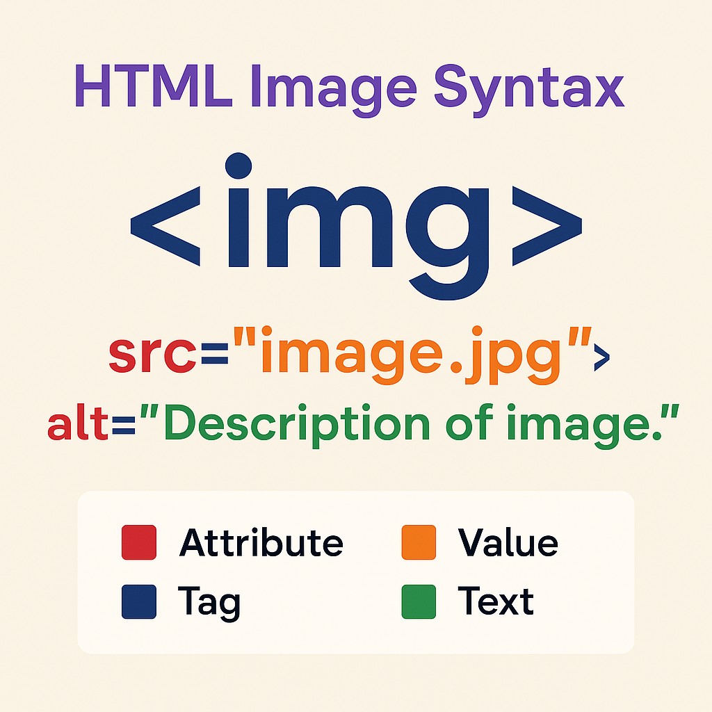
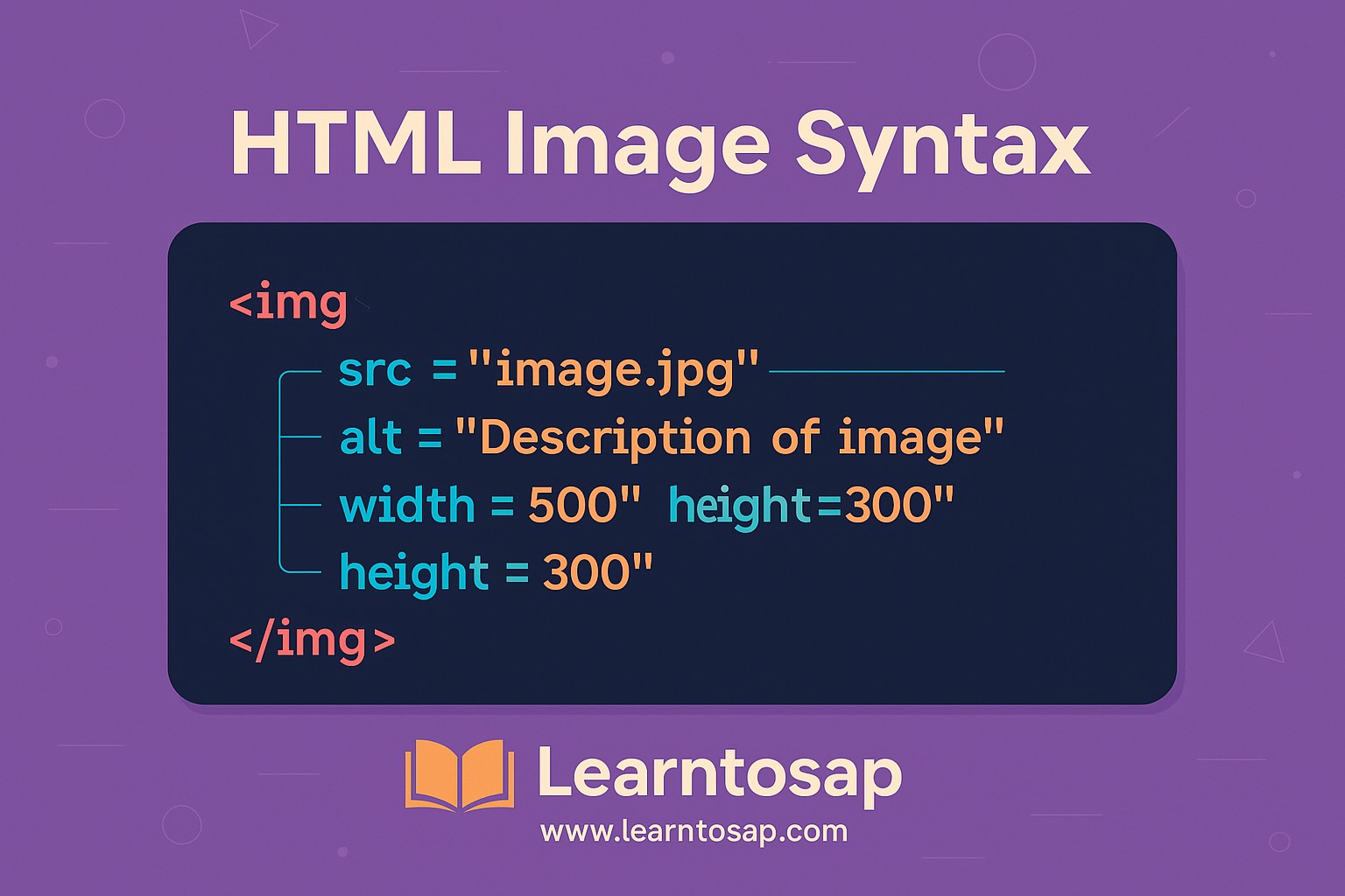
✅ The most basic and common way to display an image in HTML is by using the <img>tag. It is an empty tag (self-closing) and requires the src and alt attributes...
✅ src (source): This attribute specifies the path to the image file. It can be a relative path (like images/photo.jpg) or an absolute URL (like https://learntosap.com/image.jpg)...
✅ alt (alternative text): This attribute provides descriptive text for the image. It is displayed if the image fails to load and helps screen readers describe the image for visually impaired users...
<img src="image.jpg" alt="Description of image">Notice that the <img> tag never has a matching closing tag like </img> — it's what's called a "void" or "self-closing" element, since an image has no inner content to wrap around; the entire tag is just its own opening tag with attributes. This is the same category of tag as <br> and <hr>, and beginners coming from XML-style languages sometimes expect a closing tag that HTML simply doesn't use here.
HTML img Tag Attributes at a Glance
Beyond the two required attributes, src and alt, several other attributes commonly appear on real-world image tags and are worth knowing before you need to look each one up individually.
| Attribute | Purpose |
|---|---|
| src | Required. The path or URL to the image file. |
| alt | Required for accessibility and SEO. Describes the image in words. |
| width / height | Sets the displayed dimensions in pixels; also reserves layout space before the image loads. |
| loading | Set to lazy to defer offscreen images until needed, improving initial load speed. |
| srcset / sizes | Offers multiple image resolutions so the browser can pick the most appropriate one for the device. |
| usemap | Links the image to a client-side image map for clickable regions. |
| title | Optional tooltip text shown on hover; not a substitute for alt text. |
✅ 🌐 Image from Local Foldere-👇
<img src="image/pic1.jpg" alt="My Picture">A relative path like image/pic1.jpg tells the browser to look for a folder named image sitting next to the current HTML file, and load pic1.jpg from inside it. This is the most common way images are referenced on real sites, since it keeps the link working correctly across development, staging, and production environments without ever hardcoding a domain name.
✅ 🌍 Image from the Internet-👇
<img src="https://www.learntosap.com/html/image.jpg" alt="website image">An absolute URL like this one pulls the image directly from wherever it's hosted, which could be your own domain or a completely different one, such as a CDN or image-hosting service. The tradeoff is that your page now depends on that external resource being available and fast; if the remote server goes down or slows down, your image (and potentially your page's overall load time) suffers along with it.
✅ 📚 Common Image Example)-👇
Example of HTML Logo Image (Insert on the Logo)

A logo is one of the most common single-image use cases on any website, typically placed in the header and often wrapped in an anchor tag linking back to the homepage, combining the img tag from this tutorial with the anchor tag covered in the previous one in this series.
✅ Common Image Examples:-width and height: Define the size of the image.👇
<img src="image.jpg" alt="Company Logo" width="700" height="500">Setting explicit width and height values does more than just control how big the image appears; it also tells the browser exactly how much space to reserve for the image before it has even finished downloading. Without these values, the surrounding text and elements can visibly jump around as each image finishes loading, an effect known as layout shift, which hurts both the user experience and certain page-quality metrics search engines measure.
✅ Image Maps Examples-👇
<img src="image.jpg" usemap="#worldmap" alt="World Map">
<map name="worldmap">
<area shape="rect" coords="34,44,270,350" href="usa.html" alt="USA">
<area shape="circle" coords="337,300,50" href="india.html" alt="India">
</map>
An image map turns different regions of a single picture into separate clickable links, commonly used for things like geographic maps, floor plans, or diagrams where each labeled part should lead somewhere different.
Understanding Image Map Shapes and Coordinates
Each <area> element needs a shape and a matching set of coords that describe exactly where the clickable region sits on the image, measured in pixels from the image's top-left corner.
| shape value | coords format | Meaning |
|---|---|---|
| rect | left, top, right, bottom | A rectangular region defined by two opposite corners. |
| circle | center-x, center-y, radius | A circular region defined by its center point and radius. |
| poly | x1,y1, x2,y2, x3,y3 ... | An irregular polygon defined by a list of corner points, traced in order. |
Working out coordinates by hand from a ruler and guesswork is tedious and error-prone; in practice, most developers use an online or desktop image-map generator tool that lets you draw the regions visually and copies out the resulting coordinates automatically.
✅ Image Background Images (CSS) Examples-👇
<!DOCTYPE html>
<html>
<head>
  <title>Background Image Example</title>
  <style>
    body {
      background-image: url('image.jpg'); /* Replace with your image path */
      background-repeat: no-repeat;
      background-size: cover;
      background-position: center;
      height: 100vh;
      margin: 0;
      font-family: Arial, sans-serif;
      color: Blue;
    }

    .content {
      text-align: center;
      padding-top: 200px;
    }
  </style>
</head>
<body>
  <div class="content">
    <h1>www.learntosap.com</h1>
    <p>Welcome to our website.</p>
  </div>
</body>
</html>
Unlike the <img> tag, a CSS background-image is applied entirely from the stylesheet and is treated as decoration rather than content, it has no alt text, cannot be indexed as meaningful content by search engines, and won't be announced by a screen reader. That makes it the right tool for purely visual flourishes, like a textured page backdrop, but the wrong tool for anything that actually conveys information a visitor needs.
📌 Common Image Example: Repeat Horizontally-👇
<!DOCTYPE html>
<html>
<head>
  <title>Repeat Horizontally</title>
  <style>
    body {
      background-image: url('image.jpg');
      background-repeat: repeat-x; /* Repeats only horizontally */
    }
  </style>
</head>
<body>
  <h1>This background repeats only horizontally.</h1>
</body>
</html>
📌 Common Image Example:✅ Example: Repeat Vertically-👇
<style>
  body {
    background-image: url('image.jpg');
    background-repeat: repeat-y; /* Repeats only vertically */
  }
</style>
📌 Common Image Example:✅ Example: No Repeat-👇
<style>
  body {
    background-image: url('image.jpg');
    background-repeat: no-repeat; /* No repeat */
  }
</style>
📌 Common Image Example:✅ Example: Repeat Both (Default)-👇
<!DOCTYPE html>
<html>
<head>
  <title>Background Repeat Example</title>
  <style>
    body {
      background-image: url('image.jpg');
      background-repeat: repeat; /* Repeats both directions */
    }
  </style>
</head>
<body>
  <h1>Background Repeat Example</h1>
  <p>This background image repeats both horizontally and vertically.</p>
</body>
</html>
These four background-repeat values, repeat-x, repeat-y, no-repeat, and the default repeat, cover essentially every tiling pattern you'll need for a CSS background image, whether that's a single centered hero image, a horizontal striped border, or a small texture tiled seamlessly across an entire page.
📌 Common Image Example:✅ Example: of Picture -👇
<!DOCTYPE html>
<html lang="en">
<head>
<meta charset="UTF-8">
<title>Picture Element Example</title>
<style>
body {
font-family: Arial, sans-serif;
text-align: center;
padding: 20px;
}
img {
max-width: 100%;
height: auto;
border: 2px solid #ccc;
}
</style>
</head>
<body>
<h1>Responsive Image with <picture> Element</h1>
<picture>
<!-- For screens 700px and wider -->
<source media="(min-width: 700px)" srcset="image.jpg">
<!-- For screens between 400px and 799px -->
<source media="(min-width: 400px)" srcset="image.jpg">
<!-- Default image for smaller screens -->
<img src="image.jpg" alt="Beautiful landscape">
</picture>
<p>This image changes based on the screen size using the <picture> element.</p>
</body>
</html>The <picture> element lets the browser choose between several candidate <source> images based on conditions like screen width, falling back to the plain <img> tag inside it if none of the source conditions match. This is the standards-based way to serve a differently cropped or higher-resolution image to larger screens without loading unnecessary extra pixels on a small mobile device.
img Tag vs CSS Background Image: Which to Use
Beginners often reach for whichever technique they saw most recently, but the right choice actually depends on one simple question: is the image part of the content, or is it decoration?
| Situation | Use |
|---|---|
| Product photo, article illustration, logo, chart | <img> tag — it's content and needs alt text. |
| Page texture, hero section backdrop, decorative pattern | CSS background-image — it's decoration, not content. |
| Image that should be indexed by Google Images | <img> tag with descriptive alt text. |
| Image that must scale/crop differently per breakpoint purely visually | CSS background with background-size and background-position. |
Image File Formats Compared
Every example so far has used .jpg for simplicity, but the actual file format you choose has a real impact on file size, quality, and browser support.
| Format | Best For | Transparency |
|---|---|---|
| JPG / JPEG | Photographs and complex, colorful images. | No |
| PNG | Graphics, logos, screenshots, text-heavy images. | Yes |
| GIF | Simple animations and low-color graphics. | Yes (limited) |
| SVG | Icons, logos, and illustrations that must stay sharp at any size. | Yes |
| WebP | General-purpose replacement for JPG/PNG with smaller file sizes. | Yes |
| AVIF | Even smaller file sizes than WebP, growing but slightly less universal support. | Yes |
Lazy Loading Images
<img src="image.jpg" alt="Description" loading="lazy">Adding loading="lazy" tells the browser to skip downloading that particular image until it's about to scroll into the visible part of the screen, rather than loading every single image on a long page all at once. On image-heavy pages, this single attribute can noticeably speed up how quickly the initially visible part of the page becomes usable, since the browser isn't competing for bandwidth downloading images the visitor hasn't scrolled to yet.
Responsive Images With srcset and sizes
The <picture> element covered earlier is one way to serve different images at different sizes, but for the common case of serving the same image at different resolutions, srcset and sizes on a plain <img> tag is often simpler:
<img
  src="photo-800.jpg"
  srcset="photo-400.jpg 400w, photo-800.jpg 800w, photo-1200.jpg 1200w"
  sizes="(max-width: 600px) 400px, (max-width: 1000px) 800px, 1200px"
  alt="Description">
The srcset attribute lists several versions of the same image alongside their actual pixel widths, and sizes tells the browser how wide the image will actually be displayed at different viewport widths. The browser then does the math itself and downloads only the one file that best matches the visitor's actual screen, saving bandwidth on smaller devices without any manual breakpoint logic on your part.
Common Mistakes to Avoid
❌ Mistake 1 – Leaving alt text empty or missing entirely
This breaks accessibility for screen reader users and gives search engines nothing to understand the image by.
❌ Mistake 2 – Uploading huge, unresized images straight from a camera or phone
A multi-megabyte image displayed at a few hundred pixels wastes bandwidth and slows page load for every visitor.
❌ Mistake 3 – Using a decorative CSS background image for content that matters
If the image conveys real information, it belongs in an <img> tag with alt text, not hidden in a stylesheet.
❌ Mistake 4 – Skipping width and height attributes
This allows layout shift as each image loads, which hurts both user experience and page-quality metrics.
Best Practices for HTML Images
✔️ 1) Write specific, descriptive alt text
Describe what the image actually shows, not generic filler like "image" or "photo."
✔️ 2) Compress and resize images before uploading
Match the file's actual dimensions to how large it will display, and use a compression tool to shrink file size without a visible quality loss.
✔️ 3) Use loading="lazy" on below-the-fold images
Reserve immediate loading for images visible without scrolling; lazy-load the rest.
✔️ 4) Choose the right format for the job
Photos as JPG or WebP, logos and icons as PNG or SVG, using the format comparison table above as a guide.
✔️ 5) Always set width and height, even alongside responsive CSS
These attributes reserve layout space and prevent content jumping while images load.
Try It Yourself (Copy This Code and Paste. See how it works)
Live Code Preview
Practice Exercises: Test the img Tag
- Add an image using a relative path, then add the same image again using its full absolute URL, and compare the two src values.
- Set explicit width and height on an image and observe how the layout no longer shifts once you resize your test window.
- Build a small image map with two clickable rectangular regions linking to two different pages.
- Create a page with a CSS background-image set to repeat-x, then change it to no-repeat and compare the visual result.
- Build a <picture> element with two <source> conditions and a fallback <img>, then resize your browser window to see it react.
Frequently Asked Questions About the HTML img Tag
What is the HTML img tag used for?
The HTML img tag is used to embed an image into a web page. It is an empty, self-closing tag that requires at minimum a src attribute pointing to the image file and an alt attribute describing the image.
Why is the alt attribute important on an img tag?
The alt attribute provides descriptive text that displays if the image fails to load, is read aloud by screen readers for visually impaired users, and is used by search engines to understand what the image shows, which helps with image SEO.
What is the difference between an HTML img tag and a CSS background image?
An img tag is meaningful content that appears in the HTML document itself, gets its own alt text, and is indexed by search engines as content. A CSS background-image is purely decorative, defined in a stylesheet, has no alt text, and is not treated as page content by search engines or screen readers.
How do I make an image responsive in HTML?
The simplest method is CSS: set max-width: 100% and height: auto on the img. For serving genuinely different image files at different screen sizes, use the picture element with multiple source tags, or the srcset and sizes attributes on the img tag itself.
What does the loading="lazy" attribute do on an img tag?
It tells the browser to defer loading that image until it is about to scroll into the visible viewport, rather than downloading every image on the page immediately. This can meaningfully speed up initial page load on image-heavy pages.
How do I create a clickable area on part of an image?
Use an image map: add a usemap attribute to the img tag pointing to a map element by name, then define one or more area elements inside that map, each with a shape, coords, and href describing a clickable region of the image.
Which image format should I use: JPG, PNG, or WebP?
Use JPG for photographs where some quality loss is acceptable in exchange for small file size, PNG when you need transparency or crisp edges on graphics and text, and WebP or AVIF when you want smaller file sizes than JPG or PNG at similar visual quality in modern browsers.