HTML Table Styling Explained: Borders, Colors, Hover Effects, and CSS Examples for Beginners
By Pramod Behera · Updated: September 14, 2026 · 22 min read
- How to Style HTML Tables Using CSS
- Why Table Styling Matters
- Example 1: Basic Styled Table
- Example 2: Hover Effect and Alternating Row Colors
- Example 3: Rounded Corners and Shadows
- Core CSS Properties for Table Styling
- border-collapse: A Closer Look
- Zebra Striping in Depth
- Hover States and Interactive Feedback
- Text Alignment and Vertical Alignment
- Rounded Corners and Shadow Techniques
- Building Color Themes for Tables
- Responsive Table Styling With CSS
- Tag Breakdown
- Accessibility When Styling Tables
- Common Styling Mistakes to Avoid
- Table Styling Best Practices Checklist
- Try It Yourself – Live Code Preview
- Practice Exercises
- Frequently Asked Questions
How to Style HTML Tables Using CSS | Full Tutorial with Code Examples | HTML Table Styling Tag
Example Of HTML table with CSS styling, including borders, padding, colors, and hover effects:-

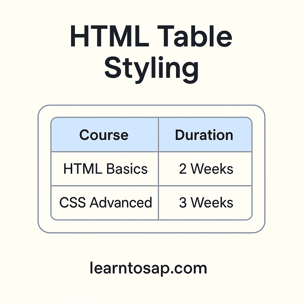
Why Table Styling Matters
A plain, unstyled HTML table is functional but visually unpleasant — borders default to a thin gray outline, header cells look identical to data cells unless you use <th>, and rows blend together with nothing to guide the reader's eye across a wide dataset. CSS is what turns raw <table>, <tr>, <td>, and <th> markup into something that looks intentional: clean borders, breathing-room padding, a shaded header row, alternating stripe colors, and a hover highlight that tracks the reader's position. None of this changes the underlying data or structure covered in the earlier tables tutorial — it's purely presentation, layered on top with CSS selectors targeting the same tags.
-)✅ Example 1: Basic Styled Table-👇
<style>
  table {
    border-collapse: collapse;
    width: 60%;
  }
  th, td {
    border: 1px solid black;
    padding: 10px;
  }
  th {
    background-color: #f2f2f2;
  }
</style>

<table>
  <tr>
    <th>Name</th>
    <th>Age</th>
  </tr>
  <tr>
    <td>Pramod</td>
    <td>25</td>
  </tr>
  <tr>
    <td>Madhu</td>
    <td>30</td>
  </tr>
</table>| Name | Age |
|---|---|
| Pramod | 25 |
| Madhu | 30 |
This first example is the foundation every other styled table in this guide builds on: border-collapse: collapse merges the cell borders into single clean lines, padding: 10px gives each cell breathing room instead of cramming text against the border, and setting a light gray background-color on th visually separates the header row from the data rows below it.
✅ Example 2: Hover Effect and Alternating Row Colors-👇
<style>
  table {
    width: 70%;
    border-collapse: collapse;
  }
  tr:nth-child(even) {
    background-color: #f9f9f9;
  }
  tr:hover {
    background-color: #d1e7dd;
  }
  th, td {
    border: 1px solid #ccc;
    padding: 12px;
    text-align: center;
  }
</style>

<table>
  <tr>
    <th>Product</th>
    <th>Price</th>
  </tr>
  <tr>
    <td>Laptop</td>
    <td>$300</td>
  </tr>
  <tr>
    <td>Mouse</td>
    <td>$10</td>
  </tr>
</table>| Product | Price |
|---|---|
| Laptop | $300 |
| Mouse | $10 |
Hover over either data row above and watch it highlight in green — that's the tr:hover rule at work. Combined with tr:nth-child(even) for a subtle zebra stripe, this pairing is one of the most common styling combinations used on real-world pricing tables, product listings, and comparison grids.
✅ Example 3: Rounded Corners and Shadows-👇
<style>
  table {
    width: 60%;
    border-collapse: separate;
    border-spacing: 0;
    border: 1px solid #ddd;
    border-radius: 10px;
    box-shadow: 2px 2px 8px #aaa;
  }
  th, td {
    padding: 12px;
    text-align: center;
  }
</style>

<table>
  <tr>
    <th>Course</th>
    <th>Duration</th>
  </tr>
  <tr>
    <td>HTML Basics Learning</td>
    <td>3 Weeks</td>
  </tr>
  <tr>
    <td>CSS Advanced Learningd</td>
    <td>4 Weeks</td>
  </tr>
</table>| Course | Duration |
|---|---|
| HTML Basics Learning | 3 Weeks |
| CSS Advanced Learning | 4 Weeks |
This example demonstrates the one crucial trade-off in table styling: rounded corners and box shadows only render correctly when border-collapse: separate is used instead of collapse, since a collapsed border layout has no true outer edge for border-radius to round. Pairing border-spacing: 0 with separate keeps the cells tight together while still allowing the table's outer border to curve and cast a shadow.
Core CSS Properties for Table Styling
| Property | What It Controls |
|---|---|
| border-collapse | Whether adjacent cell borders merge (collapse) or stay separate (separate) |
| border-spacing | Gap size between cells when border-collapse is separate |
| padding | Space inside each cell, between the border and the content |
| text-align | Horizontal alignment of cell content (left, center, right) |
| vertical-align | Vertical alignment of cell content (top, middle, bottom) |
| background-color | Fill color for a table, row, or individual cell |
| border-radius | Rounds the table's outer corners (requires border-collapse: separate) |
| box-shadow | Adds a drop shadow around the table's outer edge |
border-collapse: A Closer Look
Every table's border behavior starts with this single property, and the difference between its two values is the source of most beginner confusion.
| Value | Visual Result | Best For |
|---|---|---|
| collapse | Single shared border line between cells, no gaps | Clean grid layouts (Examples 1 and 2 above) |
| separate (default) | Each cell keeps its own border with visible spacing | Rounded corners, shadows, spaced-out card-style tables (Example 3) |
Zebra Striping in Depth
The tr:nth-child(even) selector used in Example 2 targets every second row starting from the second one, which is the standard convention for zebra striping. Swapping it for tr:nth-child(odd) instead shades the first, third, fifth rows and so on — purely a matter of preference, since both produce the same alternating effect, just offset by one row.
tr:nth-child(odd) {
  background-color: #eef2ff;
}
Hover States and Interactive Feedback
Example 2's tr:hover rule only affects desktop browsers with a mouse, since touchscreens have no true hover state, but it remains one of the highest-value, lowest-effort additions to any data table people will actually scan on a laptop or desktop screen. A subtle color shift, rather than a jarring one, keeps the interaction feeling polished:
tr:hover {
  background-color: #d1e7dd;
  transition: background-color 0.15s ease;
}
Adding a short transition makes the hover color fade in smoothly instead of switching instantly, which reads as noticeably more refined on a live website.
Text Alignment and Vertical Alignment
Example 2 applies text-align: center to every cell, which suits short values like prices and product names, but longer paragraph-style content usually reads better left-aligned.
| Content Type | Recommended Alignment |
|---|---|
| Numbers, prices, short codes | Right or center aligned |
| Names, short labels | Left or center aligned |
| Long descriptive text | Left aligned, for natural reading flow |
| Icons or short status badges | Center aligned, both horizontally and vertically |
Rounded Corners and Shadow Techniques
Building on Example 3, you can push the "card-style" table look further by softening the shadow and increasing the corner radius for a more modern feel:
table {
  border-collapse: separate;
  border-spacing: 0;
  border-radius: 14px;
  overflow: hidden;
  box-shadow: 0 4px 14px rgba(0,0,0,0.08);
}
Adding overflow: hidden is the trick that makes the header row's background color respect the table's rounded top corners instead of poking out past them in a sharp rectangle.
Building Color Themes for Tables
Rather than picking colors ad hoc, it helps to define a small, consistent palette and reuse it across every table on a site:
| Role | Example Color | Used On |
|---|---|---|
| Header background | #f2f2f2 or a brand-tinted light shade | th cells |
| Border | #dddddd or #cccccc | Cell and table borders |
| Stripe | #f9f9f9 | Even/odd row backgrounds |
| Hover | #d1e7dd or a light brand accent | tr:hover background |
Responsive Table Styling With CSS
The fixed-percentage widths used in these examples (60%, 70%) work well on desktop but can feel cramped or overly wide once the browser window shrinks. A simple safeguard is to combine a percentage width with a min-width and wrap the table in a scrollable container:
<div style="overflow-x:auto;">
  <table style="min-width:400px; width:100%;">
    ...
  </table>
</div>
This ensures the table never gets so narrow that its content becomes unreadable, while still allowing it to scroll horizontally rather than breaking the page layout on small screens.
🔍 Tag Breakdown-
-) Table Tag Breakdown -
| Tag | Purpose |
|---|---|
| <table> | Defines the table |
| <tr> | Table row |
| <th> | Table header (bold + centered by default) |
| <td> | Table data (cell content) |
| <caption> | Defines a table caption |
| <colgroup> | Specifies a group of one or more columns in a table for formatting |
| <col> | Specifies column properties for each column within a colgroup element |
| <thead> | Groups the header content in a table |
| <tbody> | Groups the body content in a table |
Accessibility When Styling Tables
- Keep text and background color combinations at a strong contrast ratio, especially for zebra-striped rows and hover states.
- Don't rely on hover color alone to convey important information, since touchscreen and keyboard-only users may never trigger it.
- Preserve a visible border or shading difference for header cells so <th> elements remain distinguishable from <td> cells even for users with low vision.
- Test tables with keyboard-only navigation to confirm focus states remain visible if any interactive elements are placed inside cells.
Common Styling Mistakes to Avoid
❌ Mistake 1 – Mixing border-collapse: collapse with border-radius
Rounded corners will not render correctly; use border-collapse: separate instead, as shown in Example 3.
❌ Mistake 2 – Forgetting padding
Text pressed directly against a cell border looks cramped and unprofessional; always add reasonable padding.
❌ Mistake 3 – Overly aggressive hover colors
A hover state that's too bright or high-contrast can feel jarring rather than helpful; keep transitions subtle.
❌ Mistake 4 – Fixed pixel widths on all columns
Rigid pixel widths often overflow on smaller screens; prefer percentages or a responsive wrapper.
❌ Mistake 5 – Styling td instead of th for headers
Losing the semantic th element for styling convenience removes built-in accessibility benefits discussed in the previous tutorial.
Table Styling Best Practices Checklist
✔️ 1) Choose border-collapse deliberately
Collapse for clean grids, separate for rounded or shadowed card-style tables.
✔️ 2) Give every cell adequate padding
8-12px is a comfortable starting point for most table designs.
✔️ 3) Add zebra striping for wide, data-heavy tables
It helps readers track a row across many columns without losing their place.
✔️ 4) Keep hover effects subtle and smooth
A short transition on background-color feels more polished than an instant switch.
✔️ 5) Build a small reusable color palette
Consistent header, border, stripe, and hover colors across all your site's tables.
✔️ 6) Wrap wide tables for smaller screens
An overflow-x: auto container keeps the layout intact on mobile.
Try It Yourself (Copy This Code and Paste. See how it works)
Live Code Preview
Practice Exercises: Test Table Styling
- Recreate Example 1, then change border-collapse to separate and observe how the borders change appearance.
- Add a tr:hover rule to Example 1 that wasn't there originally, and choose your own highlight color.
- Take Example 3's rounded-corner table and add overflow: hidden to fix the header's top corners.
- Build a 4-column pricing table using a consistent header, border, stripe, and hover color palette.
- Wrap one of your styled tables in a responsive overflow-x: auto container and test it at a narrow browser width.
Frequently Asked Questions About HTML Table Styling
How do I style an HTML table with CSS?
You style an HTML table using CSS properties like border, padding, background-color, and text-align, applied to the table, th, and td selectors, either in an embedded style block or an external stylesheet.
What does border-collapse: collapse do?
It merges the borders of adjacent table cells into a single shared line instead of showing doubled borders with a gap between each cell, giving the table a clean, unified grid look.
How do I add alternating row colors to a table?
Use the CSS selector tr:nth-child(even) or tr:nth-child(odd) with a background-color property to shade every other row, creating a zebra-striped effect that improves readability.
How do I add a hover effect to table rows?
Add a tr:hover CSS rule with a background-color property. The browser applies that style automatically whenever the visitor's cursor is over a row.
Can I give an HTML table rounded corners?
Yes. Use border-collapse: separate together with border-spacing: 0 and border-radius on the table element, since border-radius does not work correctly when border-collapse is set to collapse.
Should I use inline styles or a style block for table CSS?
For anything beyond a one-off test, an embedded style block or external stylesheet is preferred over inline styles, since it keeps styling centralized, reusable across multiple tables, and easier to maintain.