CSS Forms Tutorial: Style Inputs, Buttons & Validation States (2026-27 Guide)
Today we are discuss topic CSS Forms.Forms are how websites collect information from people - logins, sign-ups, search bars, checkout pages, contact forms - and they're also one of the trickiest things to style well, since browsers render form controls very differently by default. In this complete guide you will learn how to style text inputs with padding, borders, and a clean :focus glow, build :valid and :invalid validation states, create fully custom checkboxes, radio buttons, and toggle switches using only CSS, style a select dropdown with a custom arrow, design clickable buttons, and lay out a form responsively so it adapts cleanly from desktop to mobile. Includes live code panels, an interactive form playground, comparison tables, common mistakes, a quiz, and FAQ - everything you need to design forms that look professional and stay fully accessible.This tutorial or document breaks down the process step by step, using simple language and real-world examples to help you master the skill.
📋 Table of Contents
- What Is a CSS Form?
- Styling Text Inputs
- The :focus State
- Validation States: :valid & :invalid
- Custom Checkboxes & Radio Buttons
- Toggle Switch with CSS
- Styling Select Dropdowns
- Styling Form Buttons
- Responsive Form Layouts
- Form Pseudo-Classes – Reference Table
- Best Practices
- Common Mistakes to Avoid
- Try It Yourself – Interactive Editor
- 🎨 Interactive Form Playground
- Practice Quiz
- Frequently Asked Questions (FAQ)
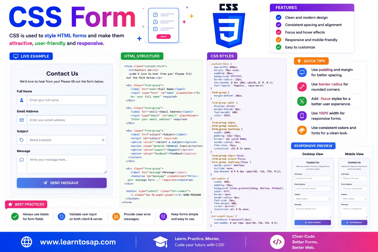
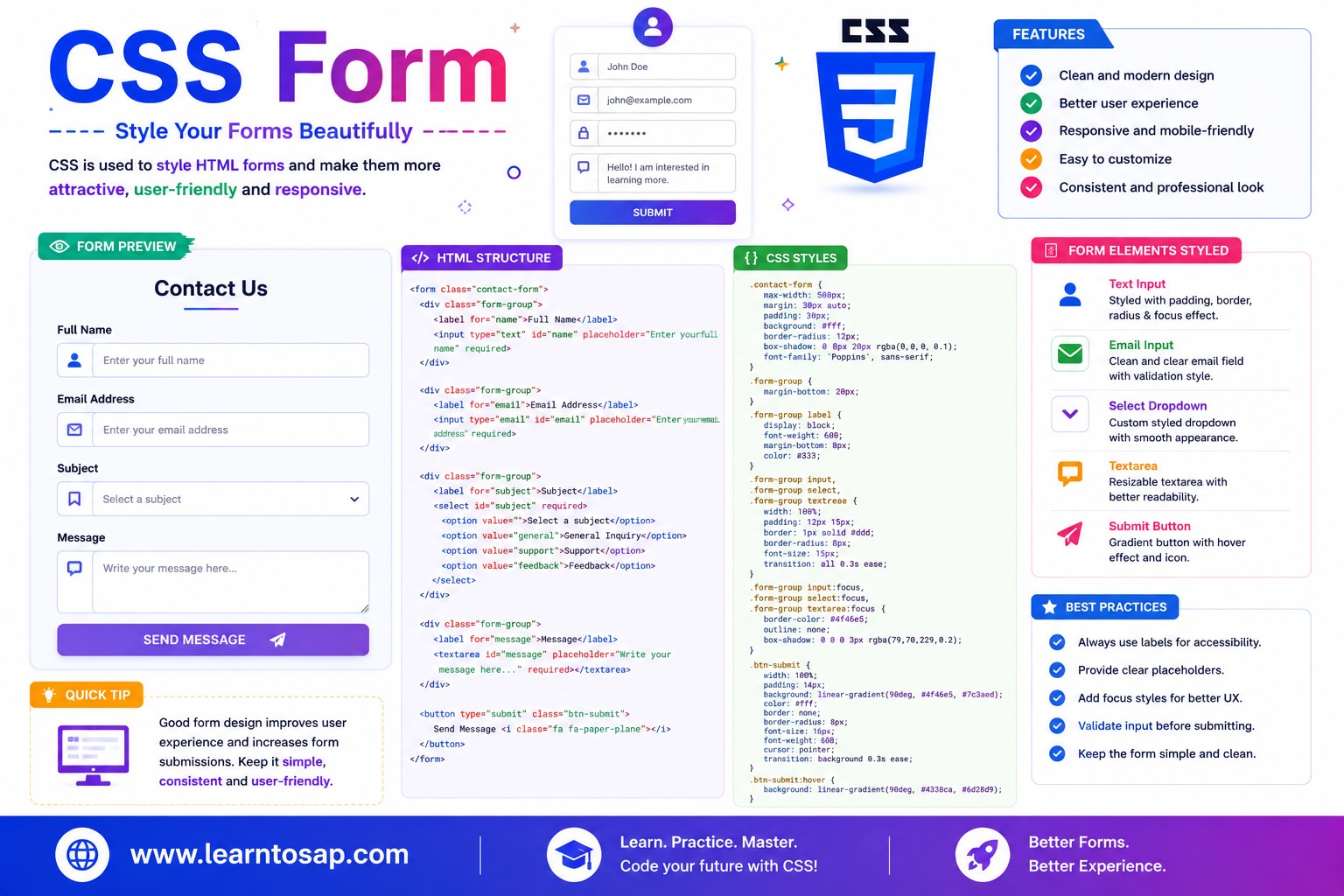
✅ What Is a CSS Form?
An HTML form is built from the <form> element wrapping individual controls like <input>, <select>, <textarea>, and <button>. Every browser ships its own default styling for these controls, and that default look varies noticeably between Chrome, Firefox, and Safari. CSS Forms styling is the practice of overriding those inconsistent defaults with a consistent, on-brand design - while preserving the native behavior (typing, clicking, keyboard navigation) that makes forms actually work.
<form>
  <label for="email">Email Address</label>
  <input type="email" id="email" name="email" required>

  <button type="submit">Subscribe</button>
</form>appearance: none;, and (2) using state-based pseudo-classes (:focus, :checked, :valid) to visually respond to what the user is doing.
✅ Styling Text Inputs
A clean text input needs comfortable padding, a visible border, rounded corners, and box-sizing: border-box; so padding doesn't unexpectedly inflate its total width:
input[type="text"],
input[type="email"],
textarea {
  width: 100%;
  padding: 10px 14px;
  border: 1.5px solid #ccc;
  border-radius: 6px;
  font-size: 14px;
  box-sizing: border-box;   /* padding stays INSIDE the declared width */
}

input::placeholder {
  color: #a0a5b1;
  font-style: italic;
}box-sizing: border-box;, setting width: 100%; plus padding makes the input wider than its container, since padding is added on top of the declared width by default - a very common layout bug.
✅ The :focus State
The :focus pseudo-class fires while an input is actively selected (clicked into, or reached via Tab). A clear focus style - usually a border color change plus a soft glow - is essential feedback that tells users exactly where they're typing:
input {
  border: 1.5px solid #ccc;
  transition: all 0.2s;
  outline: none;          /* remove default outline ONLY if replacing it */
}

input:focus {
  border-color: #0EA5E9;
  box-shadow: 0 0 0 3px rgba(14, 165, 233, 0.18);   /* soft glow ring */
}border-color: #0EA5E9;
box-shadow: 0 0 0 3px rgba(14,165,233,.18);
}
input:focus { outline: none; } without replacing it with an equally visible style like a border-color change or box-shadow ring - keyboard users rely entirely on a visible focus indicator to know which field is active.
✅ Validation States: :valid & :invalid
Browsers automatically apply :valid or :invalid to an input based on its type and any HTML validation attributes like required, minlength, or pattern - no JavaScript needed to detect the state:
input:invalid {
  border-color: #c0392b;
  background: #fdf3f2;
}

input:valid {
  border-color: #2e7d32;
  background: #f3fbf4;
}

/* Better UX: only show red before the user has interacted, avoid it */
input:invalid:not(:placeholder-shown) {
  border-color: #c0392b;
}:invalid with :not(:placeholder-shown) or only apply it after a :focus has occurred, so empty required fields don't show an alarming red border the instant the page loads - before the user has even had a chance to type.
✅ Custom Checkboxes & Radio Buttons
Native checkboxes and radio buttons look different in every browser and are hard to restyle directly. The standard technique: visually hide the real input, then style a sibling element to act as the visible control, driven by the :checked pseudo-class:
.custom-checkbox input {
  position: absolute;
  opacity: 0;          /* hidden but still focusable and functional */
  width: 0; height: 0;
}

.custom-checkbox .box {
  width: 22px; height: 22px;
  border: 2px solid #94a3b8;
  border-radius: 5px;
}

.custom-checkbox input:checked + .box {
  background: #0EA5E9;
  border-color: #0EA5E9;
}

.custom-checkbox input:checked + .box::after {
  content: '✓';
  color: #fff;
}<input> is hidden with opacity: 0; rather than display: none; - this keeps it focusable, clickable, and screen-reader accessible, while the visible .box or .circle sibling provides the custom look.
✅ Toggle Switch with CSS
A toggle switch is just a checkbox in disguise - the same hide-and-style-a-sibling technique, but shaped into a pill with a sliding circle:
.toggle-switch { position: relative; width: 46px; height: 26px; }
.toggle-switch input { opacity: 0; width: 0; height: 0; }

.toggle-slider {
  position: absolute;
  inset: 0;
  background: #cbd5e1;
  border-radius: 26px;
  transition: all 0.2s;
}

.toggle-slider::before {
  content: '';
  position: absolute;
  width: 20px; height: 20px;
  left: 3px; top: 3px;
  background: #fff;
  border-radius: 50%;
  transition: all 0.2s;
}

.toggle-switch input:checked + .toggle-slider {
  background: #0EA5E9;
}

.toggle-switch input:checked + .toggle-slider::before {
  transform: translateX(20px);   /* slides the circle to the right */
}transform: translateX(); transition on ::before, triggered by the checkbox's :checked state.
✅ Styling Select Dropdowns
Native <select> dropdowns ship with a browser-specific arrow that can clash with custom designs. Use appearance: none; to remove it, then add your own arrow using a wrapping container and a pseudo-element:
.select-wrap { position: relative; }

.custom-select {
  width: 100%;
  padding: 10px 36px 10px 14px;   /* extra right padding for the custom arrow */
  appearance: none;
  -webkit-appearance: none;
  border: 1.5px solid #ccc;
  border-radius: 6px;
}

.select-wrap::after {
  content: '▾';
  position: absolute;
  right: 14px; top: 50%;
  transform: translateY(-50%);
  pointer-events: none;   /* lets clicks pass through to the select */
}appearance: none; removes the arrow consistently across modern browsers, but very old browsers may need vendor prefixes like -webkit-appearance and -moz-appearance for full coverage.
✅ Styling Form Buttons
A submit button needs to look obviously clickable - solid background, comfortable padding, and a satisfying hover/active response:
button[type="submit"] {
  padding: 11px 26px;
  background: #0EA5E9;
  color: #fff;
  border: none;
  border-radius: 6px;
  font-weight: 700;
  cursor: pointer;
  transition: all 0.2s;
}

button[type="submit"]:hover {
  background: #0284C7;
  transform: translateY(-2px);
}

button:disabled {
  background: #e2e8f0;
  color: #94a3b8;
  cursor: not-allowed;
}cursor: not-allowed; and muted colors to clearly signal it can't be clicked right now.
✅ Responsive Form Layouts
CSS Grid makes multi-column form layouts (label/input pairs side by side) straightforward, with a media query to collapse to a single column on small screens:
.form-grid {
  display: grid;
  grid-template-columns: 1fr 1fr;
  gap: 16px;
}

.form-grid .full-width {
  grid-column: 1 / -1;   /* spans both columns, e.g. for a message textarea */
}

@media (max-width: 640px) {
  .form-grid {
    grid-template-columns: 1fr;   /* stacks into one column on mobile */
  }
}✅ Form Pseudo-Classes – Reference Table
| Pseudo-Class | Triggered When | Common Use |
|---|---|---|
:focus | Input is actively selected | Border glow, highlight active field |
:valid | Value passes HTML validation rules | Green border/checkmark feedback |
:invalid | Value fails HTML validation rules | Red border/error message |
:checked | Checkbox/radio is selected | Drives custom checkbox/radio/toggle visuals |
:disabled | Field has the disabled attribute | Muted colors, not-allowed cursor |
:placeholder-shown | Field is empty, showing its placeholder | Combined with :invalid to delay error styling |
✅ Best Practices for CSS Forms
✔️ 1) Always Pair Inputs with a Real <label>
<label for="email">Email</label>
<input type="email" id="email">
✔️ 2) Use box-sizing: border-box; Globally on Form Elements
input, select, textarea, button { box-sizing: border-box; }✔️ 3) Never Remove Focus Indicators Without a Replacement
A visible :focus style isn't optional polish - it's required for keyboard-only and low-vision users to navigate a form at all.
✔️ 4) Delay Invalid Styling Until the User Has Interacted
Showing red borders on empty required fields before the user even starts typing feels punishing. Combine :invalid with :not(:placeholder-shown) or trigger it after a blur event instead.
✔️ 5) Keep Custom Checkbox/Radio Inputs Focusable
Hide native inputs with opacity: 0;, not display: none; or visibility: hidden; - the latter two remove the element from keyboard Tab order entirely.
✅ Common Mistakes to Avoid
Setting
width: 100%; plus padding without box-sizing: border-box; makes inputs overflow their container, since padding adds to the declared width by default.
input:focus { outline: none; } alone strips all visual feedback for keyboard users navigating between fields. Always supply a replacement border or box-shadow style.
This removes the input from keyboard Tab order and screen reader access entirely. Use
opacity: 0; with absolute positioning instead, which keeps it functionally present.
Styling empty required fields with a red
:invalid border immediately on page load feels alarming and premature. Delay validation styling until after the user has typed or left the field.
Using only a placeholder as a stand-in for a label means the field's purpose disappears the moment the user starts typing, and screen readers may announce nothing useful. Always include a real, associated
<label>.
✅ Try It Yourself – Interactive CSS Form Editor
Edit the HTML and CSS below to experiment with form styling. Try the basic input style, the custom checkbox pattern, or a full contact form layout. The preview updates automatically.
✅ 🎨 Interactive Form Playground
Use the controls below to build a custom CSS input style in real time. Adjust border color, border radius, focus ring color, and padding - then copy the generated CSS in one click.
✅ Practice – Yes / No Quiz
1. box-sizing: border-box; ensures padding is included inside an input's declared width instead of adding to it?
2. The :valid and :invalid pseudo-classes require JavaScript to function?
3. Hiding a custom checkbox's native input with display: none; keeps it fully accessible to keyboard users?
4. appearance: none; on a select element removes its native dropdown arrow, letting you add a custom one?
5. A toggle switch in CSS is typically built by styling a hidden checkbox's sibling element based on the :checked state?
✅ Frequently Asked Questions (FAQ)
input[type=text] { padding: 10px 14px; border: 1.5px solid #ccc; border-radius: 6px; font-size: 14px; }. Adding box-sizing: border-box; ensures padding doesn't unexpectedly increase the input's total width.appearance: none; (or position it off-screen), then style a sibling element - often a span or a pseudo-element - to display as the visible box or circle. Use the :checked pseudo-class on the input to change that sibling's appearance when selected, e.g. input:checked + .custom-box { background: #0EA5E9; }.:valid and :invalid pseudo-classes, which are automatically applied by the browser based on the input's type and any HTML validation attributes like required, minlength, or pattern. For example: input:invalid { border-color: #c0392b; } input:valid { border-color: #2e7d32; }. Many developers only apply these styles after a :focus or once the user has interacted with the field, to avoid showing red borders before the user has typed anything.appearance: none; (along with vendor prefixes for older browser support) to the <select> element, which removes the native dropdown arrow. You can then add your own custom arrow using a background-image, an SVG icon, or a pseudo-element positioned absolutely inside a wrapping container.:focus applies whenever an input receives focus, whether by mouse click, touch, or keyboard Tab navigation. :focus-visible applies more selectively, typically only when the browser determines a visible focus indicator should be shown, which is most often for keyboard navigation - useful for showing a focus ring only to keyboard users.