CSS Fonts Explained: font-family, font-size, font-weight & Google Fonts (2026-27 Guide)
Today we are discuss topi CSS Fonts.Typography (printing) is the backbone of every great web design - and CSS gives you total control over how text looks and feels. In this complete guide you will master every CSS font property: font-family, font-size, font-weight, font-style, line-height, the font shorthand, web-safe fonts, importing Google Fonts, self-hosting with @font-face, and a reliable font fallback strategy. Includes live code panels, an interactive font playground, comparison tables, common mistakes, a quiz, and FAQ - everything you need to write professional, accessible CSS typography.This tutorial or document breaks down the process step by step, using simple language and real-world examples to help you master the skill.
📋 Table of Contents
- What Are CSS Font Properties?
- font-family
- Web-Safe Fonts
- font-size
- font-weight
- font-style
- line-height
- The font Shorthand Property
- Using Google Fonts
- Self-Hosting Fonts with @font-face
- Font Property Reference Table
- Best Practices
- Common Mistakes to Avoid
- Try It Yourself – Interactive Editor
- 🎨 Interactive Font Playground
- Practice Quiz
- Frequently Asked Questions (FAQ)
✅ What Are CSS Font Properties?
CSS font properties control how text is rendered - the typeface, size, weight, slant, and spacing. Good typography is one of the highest-leverage design decisions you can make: it directly affects readability, brand personality, and accessibility.
font-family declaration should be a stack of fallback fonts, ending in a generic family like sans-serif.
✅ font-family
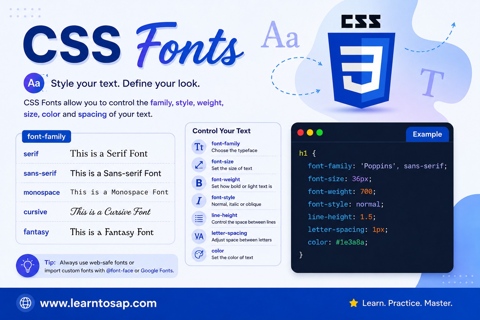
font-family sets the typeface for an element's text. You should always provide a fallback stack - a comma-separated list of fonts the browser tries in order, ending with a generic family:
/* Syntax: a list of fonts, most preferred first */
font-family: 'Inter', Arial, sans-serif;

/* Font names with spaces need quotes */
font-family: 'Times New Roman', serif;

/* Generic families (always include one as the final fallback) */
font-family: sans-serif;   /* clean, modern: Arial, Helvetica style */
font-family: serif;        /* traditional, has flourishes: Times style */
font-family: monospace;    /* fixed-width: code blocks */
font-family: cursive;      /* handwriting style */
font-family: fantasy; /* decorative */✅ Web-Safe Fonts
Web-safe fonts are typefaces pre-installed on the vast majority of devices, so they render instantly with zero download time. They make excellent fallback choices in your font stack:
| Font Name | Category | Common Use |
|---|---|---|
Arial | Sans-serif | Body text, UI elements |
Helvetica | Sans-serif | Clean modern body text |
Verdana | Sans-serif | High legibility at small sizes |
Tahoma | Sans-serif | UI text, compact layouts |
Times New Roman | Serif | Traditional, formal documents |
Georgia | Serif | Readable serif for long-form articles |
Courier New | Monospace | Code blocks, technical text |
✅ font-size
font-size controls the rendered size of text. CSS supports several units - choosing the right one matters for accessibility:
font-size: 16px;    /* fixed pixel size - does not scale with user settings */
font-size: 1rem;     /* relative to the root html font-size (usually 16px) */
font-size: 1.25em;   /* relative to the PARENT element's font-size */
font-size: 100%;     /* relative to the parent, percentage-based */
font-size: 1.5vw; /* relative to viewport width - fluid/responsive text */rem over px for font-size. rem values scale when a user increases their browser's default font size for accessibility - fixed px values do not, which can make text impossible to enlarge for low-vision users.
.base { font-size: 1rem; }
.large { font-size: 1.5rem; }
.xl { font-size: 2.25rem; }
0.875rem - small text (14px)
1rem - base text (16px)
1.5rem - large text (24px)
2.25rem - heading (36px)
✅ font-weight
font-weight controls how bold or light text appears. It accepts numeric values from 100 to 900, or keywords:
font-weight: normal;   /* same as 400 */
font-weight: bold;     /* same as 700 */
font-weight: 100;      /* Thin */
font-weight: 300;      /* Light */
font-weight: 400;      /* Regular / Normal */
font-weight: 500;      /* Medium */
font-weight: 600;      /* Semibold */
font-weight: 700;      /* Bold */
font-weight: 900; /* Black / Heavy */font-weight value only renders correctly if that exact weight was loaded for the font. Most Google Fonts only load weight 400 by default - if you use font-weight: 700 without explicitly requesting it, the browser may "fake bold" the text (lower quality) or ignore the weight.
✅ font-style
font-style controls slanted text - italic or oblique:
font-style: normal;   /* default - upright text */
font-style: italic;   /* uses the font's true italic design, if available */
font-style: oblique; /* slants the normal font artificially */italic uses a font's purpose-built italic design (different letterforms). oblique simply slants the regular characters mathematically. If a font has no true italic variant, browsers often fall back to a synthetic oblique automatically.
✅ line-height
line-height controls the vertical space between lines of text - one of the most important readability properties in CSS:
line-height: 1.6;     /* unitless - RECOMMENDED, scales with font-size */
line-height: 24px;    /* fixed pixel value - does not scale */
line-height: 150%;    /* percentage of the element's font-size */
line-height: normal; /* browser default, varies by font (~1.2) */1.6. Unitless values are inherited as a ratio and recalculated for each child's own font-size, while a fixed pixel value is inherited literally and can cause cramped or excessive spacing in nested elements with different font sizes.
✅ The font Shorthand Property
The font shorthand combines multiple font properties into a single declaration. The required order is:
/* font: style variant weight size/line-height family; */

font: italic 700 18px/1.6 'Inter', sans-serif;

/* Simpler version - only size and family are required */
font: 16px/1.5 Arial, sans-serif;

/* Full breakdown of the example above:
   font-style:   italic
   font-weight:  700
   font-size:    18px
   line-height:  1.6
   font-family:  'Inter', sans-serif
*/font shorthand resets font-variant, font-size-adjust, and font-stretch to their defaults, even if not mentioned. If you only want to change one property, use the longhand (font-size, font-weight, etc.) instead.
✅ Using Google Fonts
Google Fonts is the most popular way to add custom, professionally designed typefaces to a website for free. Two ways to include them:
✔️ Method 1: HTML <link> tag (recommended - faster)
<!-- In your HTML <head> -->
<link rel="preconnect" href="https://fonts.googleapis.com">
<link rel="preconnect" href="https://fonts.gstatic.com" crossorigin>
<link href="https://fonts.googleapis.com/css2?family=Inter:wght@400;600;700&display=swap" rel="stylesheet">

/* Then in your CSS */
body {
  font-family: 'Inter', sans-serif;
}
✔️ Method 2: CSS @import (simpler, slightly slower)
@import url('https://fonts.googleapis.com/css2?family=Inter:wght@400;700&display=swap');

body {
  font-family: 'Inter', sans-serif;
}wght@400;700) instead of importing the entire font family. This significantly reduces page load time. Also always add &display=swap to prevent invisible text while the font loads.
✅ Self-Hosting Fonts with @font-face
For full control (privacy, performance, offline availability), you can self-host font files using @font-face:
@font-face {
  font-family: 'MyCustomFont';
  src: url('/fonts/mycustomfont.woff2') format('woff2'),
       url('/fonts/mycustomfont.woff') format('woff');
  font-weight: 400;
  font-style: normal;
  font-display: swap;
}

body {
  font-family: 'MyCustomFont', sans-serif;
}h1 {
font: 700 1.8rem/1.3 'Poppins', sans-serif;
}
p {
font: 400 1rem/1.6 'Poppins', sans-serif;
}
Typography in Action
This paragraph demonstrates the font shorthand combining weight, size, line-height, and family in a single CSS declaration.
✅ CSS Font Properties – Reference Table
| Property | Default | Key Values | Use Case |
|---|---|---|---|
font-family | browser default | font names, generic families | Typeface selection |
font-size | 16px | rem, em, px, % | Text size |
font-weight | 400 | 100–900, normal, bold | Bold / light emphasis |
font-style | normal | italic, oblique | Slanted/emphasis text |
line-height | normal | unitless number (e.g. 1.6) | Vertical line spacing |
letter-spacing | normal | px, em (can be negative) | Character spacing |
font-variant | normal | small-caps | Stylistic capital variants |
font | - | shorthand for all above | Set multiple font properties at once |
✅ Best Practices for CSS Fonts
✔️ 1) Always Provide a Font Fallback Stack
/* ✅ Good - falls back gracefully */
font-family: 'Inter', -apple-system, 'Segoe UI', Roboto, Arial, sans-serif;

/* ❌ Risky - if Inter fails to load, browser uses an unpredictable default */
font-family: 'Inter';
✔️ 2) Use rem for Font Sizes, Unitless for Line-Height
html { font-size: 16px; }       /* 1rem = 16px baseline */
body { font-size: 1rem; line-height: 1.6; }
h1   { font-size: 2.25rem; line-height: 1.2; }
✔️ 3) Store Your Type Scale in CSS Variables
:root {
  --font-body:    'Inter', sans-serif;
  --font-heading: 'Poppins', sans-serif;
  --fs-sm:   0.875rem;
  --fs-base: 1rem;
  --fs-lg:   1.25rem;
  --fs-xl:   1.875rem;
}
✔️ 4) Only Load the Font Weights You Actually Use
Requesting every weight (100–900) from Google Fonts can add hundreds of KB to page load. Specify only what you need: family=Inter:wght@400;600;700.
✔️ 5) Use font-display: swap for Custom Fonts
This prevents invisible text while a custom font downloads, keeping content visible and readable from the first paint.
✅ Common Mistakes to Avoid
font-family: 'Inter'; - if "Inter" fails to load, the browser falls back to an unpredictable default. Always end your stack with a generic family: font-family: 'Inter', sans-serif;
Fixed
px font sizes do not scale when users adjust their browser's accessibility font-size settings. Use rem for better accessibility.
Setting
font-weight: 700 when only weight 400 was imported from Google Fonts causes synthetic ("fake") bolding, which looks blurry and unprofessional. Always import the weights you intend to use.
line-height: 20px; doesn't scale with nested font-size changes and can cause cramped text in larger headings. Use a unitless value like line-height: 1.6; instead.
Loading 6 font families with all 9 weights each can add over 1MB to your page. Audit your Google Fonts URL and remove unused weights and families to improve load speed.
✅ Try It Yourself – Interactive CSS Font Editor
Edit the HTML and CSS below to experiment with font properties. Try different font-family stacks, font-weight values, and the font shorthand. The preview updates automatically.
✅ 🎨 Interactive Font Playground
Use the controls below to build CSS font styling in real time. Adjust family, size, weight, style, and line-height - then copy the generated CSS in one click.
✅ Practice – Yes / No Quiz
1. rem is generally a better unit than px for font-size because it respects user accessibility settings?
2. A font-weight value will always render correctly even if that weight wasn't loaded for the font?
3. A unitless line-height value (like 1.6) scales better across nested elements than a fixed pixel value?
4. The font shorthand property requires at minimum font-size and font-family to be valid?
5. font-display: swap shows fallback text immediately while a custom font loads?
✅ Frequently Asked Questions (FAQ)
font-family sets only the typeface (e.g., Arial, sans-serif). font is a shorthand that can set font-style, font-variant, font-weight, font-size, line-height, and font-family all in one declaration. The shorthand requires at minimum a font-size and font-family value to be valid; omitting other sub-properties resets them to their initial values.rem is generally recommended over px because rem values scale relative to the root HTML element's font size, which respects a user's browser accessibility zoom and font-size settings. Pixel values are fixed and do not scale, which can hurt accessibility for users who increase their browser's default font size.font-family stack.<link> tag in your HTML head pointing to the Google Fonts stylesheet URL, then reference the font name in your CSS font-family property. Example: <link href="https://fonts.googleapis.com/css2?family=Inter:wght@400;700" rel="stylesheet"> followed by body { font-family: 'Inter', sans-serif; } in your CSS.font-display: swap, used inside an @font-face rule, tells the browser to show fallback text immediately using a system font, then swap in the custom web font once it finishes loading. This prevents invisible text (FOIT) during font loading and improves perceived page performance.font-weight value only renders correctly if that specific weight variant was actually loaded for the font family. Many Google Fonts only load the 400 (normal) weight by default - if you set font-weight: 700 without loading that weight, browsers may fake-bold the text or ignore it. Always specify the weights you need in your Google Fonts URL, e.g. family=Inter:wght@400;700.