HTML Div Element Tag Explained: Complete Guide, Examples, and Best Practices
HTML Tutorials · HTML Div Element Tag · Introduction
HTML Div Element Explained for Beginners: Structure, Attributes, and CSS Tips
HTML Div Element Tag - The <div> element in HTML is a generic container used to group together other HTML elements. It's short for "division" and is mostly used for styling (with CSS) or scripting (with JavaScript).
This tutorial covers four working examples, from a bare container to a fully colored CSS Grid layout, along with the common attributes divs carry, the difference between div and span, when to reach for a semantic HTML5 element instead, Flexbox and Grid layout techniques, accessibility considerations, and best practices for avoiding "divitis," plus a live playground further down the page where you can test any layout instantly.
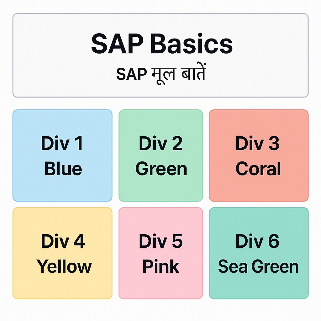
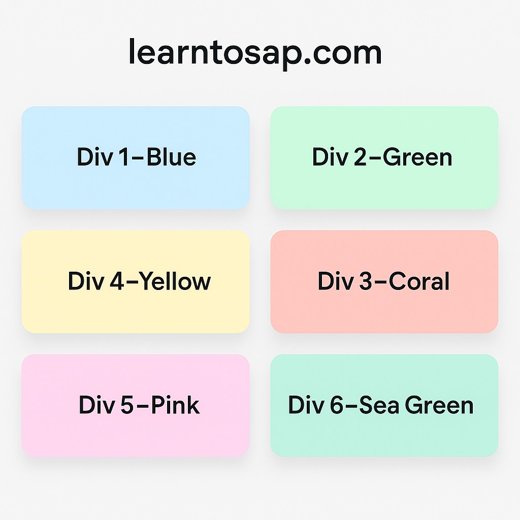
Div Examples
Four practical examples, from a bare-minimum container to a fully colored CSS Grid layout, each with the exact code and its rendered result.
✅ Basic Example
<div>
  <h1>Hello, Welcome to our Website!</h1>
  <p>www.learntosap.com</p>
</div>
Rendered Result
Hello, Welcome to our Website!
www.learntosap.com
✅ Example 1: Center Divs Using text-align: center
<!DOCTYPE html>
<html lang="en">
<head>
  <style>
    .container {
      text-align: center;
    }
    .box {
      display: inline-block;
      width: 100px;
      height: 100px;
      background: lightblue;
      margin: 10px;
    }
  </style>
</head>
<body>
  <div class="container">
    <div class="box">Box 1</div>
    <div class="box">Box 2</div>
    <div class="box">Box 3</div>
  </div>
</body>
</html>
Rendered Result
✅ Example 2: Center Divs Grid
<!DOCTYPE html>
<html lang="en">
<head>
  <meta charset="UTF-8">
  <title>Simple Grid</title>
  <style>
    .grid-container {
      display: grid;
      grid-template-columns: repeat(3, 1fr); /* 3 equal columns */
      gap: 10px; /* space between divs */
      padding: 10px;
    }
    .grid-item {
      background-color: lightblue;
      padding: 20px;
      text-align: center;
      font-size: 20px;
    }
  </style>
</head>
<body>

<div class="grid-container">
  <div class="grid-item">Div 1</div>
  <div class="grid-item">Div 2</div>
  <div class="grid-item">Div 3</div>
  <div class="grid-item">Div 4</div>
  <div class="grid-item">Div 5</div>
  <div class="grid-item">Div 6</div>
</div>

</body>
</html>
Rendered Result
✅ Example 3: Center Divs Grid in Color
<!DOCTYPE html>
<html lang="en">
<head>
    <meta charset="UTF-8">
    <meta name="viewport" content="width=device-width, initial-scale=1.0">
    <title>HTML Div Grid Example</title>
    <style>
        .container {
            display: grid;
            grid-template-columns: repeat(3, 1fr);
            grid-gap: 10px;
            padding: 20px;
        }
        .item1 { background-color: lightblue; padding: 20px; text-align: center; }
        .item2 { background-color: lightgreen; padding: 20px; text-align: center; }
        .item3 { background-color: lightcoral; padding: 20px; text-align: center; }
        .item4 { background-color: lightgoldenrodyellow; padding: 20px; text-align: center; }
        .item5 { background-color: lightpink; padding: 20px; text-align: center; }
        .item6 { background-color: lightseagreen; padding: 20px; text-align: center; }
    </style>
</head>
<body>

    <div class="container">
        <div class="item1">Div 1 - Blue</div>
        <div class="item2">Div 2 - Green</div>
        <div class="item3">Div 3 - Coral</div>
        <div class="item4">Div 4 - Yellow</div>
        <div class="item5">Div 5 - Pink</div>
        <div class="item6">Div 6 - Sea Green</div>
    </div>

</body>
</html>
Rendered Result
Try It Yourself (Copy This Code and Paste. See how it works). Paste any of the four examples above into the live playground below and adjust the colors, sizes, or grid columns to see the change instantly.
Live Code Preview
The <div> Tag's Common Attributes
A bare <div> with no attributes at all does nothing visible, its usefulness comes entirely from the attributes and CSS applied to it. A handful of attributes appear constantly across the examples on this page and in real code.
| Attribute | Purpose | Example |
|---|---|---|
| class | Applies a reusable CSS style to multiple divs | <div class="box"> |
| id | Uniquely identifies one specific div, for CSS or JavaScript | <div id="header"> |
| style | Applies inline CSS directly to that one div | <div style="color: red;"> |
| data-* | Stores custom data on the element for JavaScript to read | <div data-user-id="42"> |
Every example earlier on this page relies on class to connect a div to its CSS rules, exactly the pattern shown in the Center Divs Grid and Grid in Color examples, where classes like .grid-item, .item1, and .item2 each target a specific group or individual div.
div vs span: Block vs Inline Containers
<div> is not the only generic container HTML offers. Its close relative, <span>, serves a similar generic purpose but behaves completely differently in terms of layout.
| <div> | <span> |
|---|---|
| Block-level: starts on a new line, fills available width | Inline: sits within the flow of surrounding text |
| Used to group larger sections, like the box and grid examples on this page | Used to wrap a small piece of text or inline content |
| Common as a Flexbox/Grid container | Common for styling a single word or phrase mid-sentence |
<p>This sentence has a <span style="color: red;">highlighted word</span> inside it.</p>If you tried to use a <div> instead of <span> in the sentence above, it would force a line break before and after the highlighted word, breaking the sentence apart, exactly why choosing the right generic container, block or inline, matters.
div vs Semantic HTML5 Elements
Because <div> carries no meaning of its own, HTML5 introduced a set of semantic elements that behave identically to a div in terms of layout but also describe what role that section plays on the page.
| Instead of | Consider Using |
|---|---|
| <div class="header"> | <header> |
| <div class="nav"> | <nav> |
| <div class="main-content"> | <main> |
| <div class="post"> | <article> |
| <div class="footer"> | <footer> |
This does not mean <div> is wrong to use, every grid item and box in the examples on this page is correctly a div, since none of them represent a page-level section like a header or article. The guideline is simply: reach for a semantic tag first when one genuinely fits, and fall back to a generic div for styling wrappers, grid items, and groupings that have no more specific meaning.
CSS Layout Techniques for Divs: Flexbox and Grid
Examples 2 and 3 on this page already use CSS Grid (display: grid;) to lay out several divs into equal columns. Flexbox is the other major modern layout technique, and it is worth knowing when each one tends to fit better.
| Technique | Best Suited For |
|---|---|
| display: flex; | A single row or column of items, like a navigation bar or a row of buttons |
| display: grid; | A two-dimensional layout with both rows and columns, like the 3-column grids on this page |
<style>
    .row {
        display: flex;
        gap: 10px;
    }
    .card {
        background: lightblue;
        padding: 20px;
        flex: 1;
    }
</style>

<div class="row">
    <div class="card">Card 1</div>
    <div class="card">Card 2</div>
    <div class="card">Card 3</div>
</div>
This Flexbox example produces a very similar visual result to the Center Divs Grid example earlier on this page, three equal boxes in a row, but using flex: 1; instead of grid-template-columns. Both are valid, modern approaches, and many real projects use Flexbox for simpler one-directional layouts and Grid for more complex, two-dimensional ones.
Best Practices for Using <div> Effectively
- Use a semantic element first whenever one genuinely describes the content's role, reserving div for generic grouping and styling wrappers.
- Give meaningful class names like .grid-item or .card rather than purely presentational ones like .blue-box, so the markup still makes sense if the styling changes later.
- Avoid deeply nesting divs unnecessarily, since each extra wrapper layer adds complexity without adding meaning.
- Prefer CSS classes over excessive inline styles once a project grows beyond a handful of quick practice examples, for the same maintainability reasons covered earlier in this tutorial series.
- Use Flexbox or Grid, not floats, for laying out groups of divs, since both are purpose-built, modern layout tools well suited to exactly this job.
Common Mistakes: Avoiding "Divitis"
"Divitis" is a term web developers use, half-jokingly, for HTML that overuses <div> for absolutely everything, even where a more specific or semantic tag would fit better, resulting in bloated, hard-to-read markup.
- Wrapping a single paragraph in an unnecessary div when the paragraph tag itself already provides everything needed.
- Using nested divs where a list (<ul>/<li>) would better represent the content's actual structure.
- Replacing every semantic section with a generically named div, such as <div class="header"> instead of the built-in <header> tag.
- Adding wrapper divs purely out of habit, without a genuine styling or scripting reason for that extra layer to exist.
None of this means divs are bad, every example on this page uses them correctly and effectively, the goal is simply to reach for a div deliberately, because it is genuinely the right generic container for the job, rather than by default for every piece of markup.
Practice Exercises: Build Your Own Div Layouts
The fastest way to make div layouts feel natural is to build a few variations yourself. Try each of these directly in the live editor above:
- Recreate the Basic Example, then wrap it in an outer div with a background color.
- Recreate the Center Divs Using text-align example, then change it to use Flexbox instead of inline-block.
- Add a fourth column to the Center Divs Grid example and adjust grid-template-columns accordingly.
- Give one div a meaningful id and style just that one div differently from its siblings.
- Replace one wrapping div in your own markup with the semantic tag that best fits it, such as <section> or <article>.
Working through these five exercises covers every div technique discussed in this tutorial, from a bare container to a fully colored, grid-based layout.
Div as the Foundation of CSS Frameworks
Popular CSS frameworks such as Bootstrap and Tailwind CSS rely heavily on plain, generic divs combined with utility or component class names, exactly the pattern shown throughout this tutorial. Understanding how divs and classes work together by hand, as this page demonstrates, makes frameworks like these far easier to pick up later.
<div class="card shadow rounded p-4">
    <h3>Framework-Style Card</h3>
    <p>A div with several utility classes applied at once.</p>
</div>
This "card" pattern, a div with several short utility class names stacked together, is one of the most common building blocks across modern front-end frameworks, and it builds directly on the same class attribute and CSS styling fundamentals already covered on this page.
Accessibility Considerations for Divs
Because a plain <div> carries no semantic meaning, it also carries no accessibility information by default, screen readers announce it as an unremarkable, generic container, nothing more.
- A div styled to look like a button is not automatically operable by keyboard or announced as a button to a screen reader, unlike a real <button> element.
- Where interactivity is needed, prefer the native interactive element (button, a, input) over a div with a click handler attached through JavaScript.
- Where ARIA roles are genuinely necessary on a div, such as role="dialog" for a custom modal, they should supplement, not replace, proper keyboard and focus handling.
This is one more practical reason, alongside the SEO benefits of semantic HTML5 elements covered earlier, to reach for a more specific tag whenever one genuinely fits, rather than defaulting to a div and trying to recreate its native behavior manually.
Nesting Divs: How Deep Is Too Deep?
Every layout on this page nests at least one div inside another, a container div wrapping several item divs, which is completely normal and expected. The question worth asking is not whether nesting is allowed, but whether each layer of nesting serves a genuine purpose.
<div class="container">
    <div class="grid-item">Div 1</div>
    <div class="grid-item">Div 2</div>
</div><div>
<div>
<div>
<div class="grid-item">Div 1</div>
</div>
</div>
</div>The first example, matching the Center Divs Grid pattern used earlier on this page, nests exactly one level deep because that single wrapper genuinely serves the grid layout. The second example wraps the same content in three extra, purposeless divs, adding complexity with no styling or scripting reason behind any of them. A simple rule of thumb: every div in your markup should exist because it serves a genuine layout, styling, or scripting purpose, not because it "felt safer" to add another wrapper.
Frequently Asked Questions About the HTML Div Element
What is the div tag used for in HTML?
The div element is a generic container used to group together other HTML elements. It is short for division and is mostly used for styling with CSS or scripting with JavaScript.
What is the difference between div and span?
A div is a block-level container that starts on a new line and stretches to fill available width, used to group larger sections of content. A span is an inline container used to wrap a small piece of text or an element within a line, without breaking the flow.
Should I use div for everything or use semantic HTML5 tags instead?
Use a semantic tag like header, nav, main, section, article, or footer whenever one accurately describes the content's role. Reserve div for generic grouping that has no more specific semantic meaning.
What attributes are commonly used on a div tag?
The most common attributes are class and id for CSS and JavaScript targeting, style for inline CSS, and data-* attributes for storing custom data used by JavaScript.
What is "divitis" and why is it considered a bad practice?
Divitis refers to overusing div elements for every piece of markup, even where a more specific or semantic tag would fit better, resulting in bloated, hard-to-read HTML with no structural meaning.
Can I use Flexbox or Grid to lay out divs?
Yes. Divs are commonly used as Flexbox or Grid containers and items, since their generic, unstyled nature makes them a flexible building block for any modern CSS layout technique.
Is a div styled as a button accessible?
Not by default. A div styled to look like a button is not automatically keyboard-operable or announced as a button by screen readers. A real button element should be used instead whenever a clickable action is needed.
Why do frameworks like Bootstrap rely so heavily on divs?
Because a div carries no built-in meaning or styling, it is a flexible, neutral building block that frameworks combine with utility or component class names to create reusable layout patterns like cards, grids, and containers.