HTML TUTORIALS-
-HTML Layout Elements and Techniques Tag –
Introduction-
HTML Layout Elements & Techniques Explained: Build Modern Web Page Layouts
🔹This HTML, layout elements and techniques are used to structure and organize content on a web pages. They help developers and Coders design pages that are clear, responsive, and visually appealing....
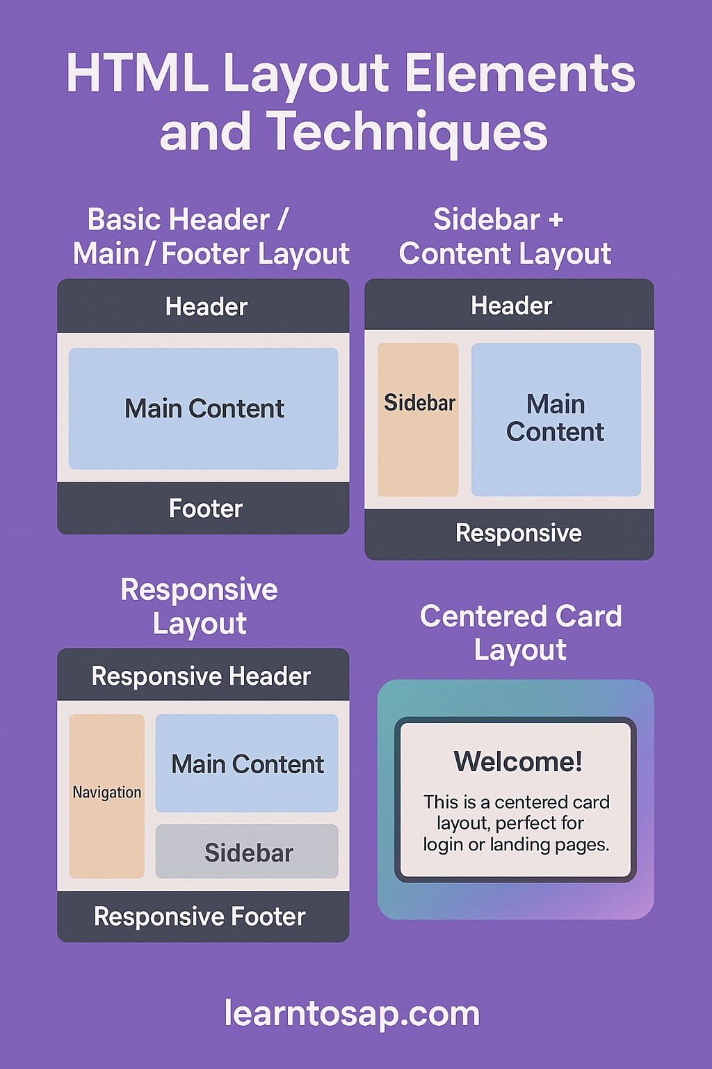
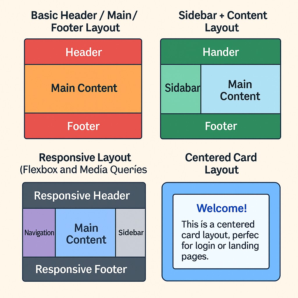
🧱 Common HTML Layout Elements;-
| Element | Purpuse |
|---|---|
| <header> | Defines the header of a page or section |
| <nav> | Contains navigation links |
| <section> | Groups related content |
| <aside> | Sidebar or content tangential to main content |
| <footer> | Footer for a page or section |
| <div> | Generic container for grouping elements (non-semantic) |
| <span> | Inline container, used for styling small text parts |
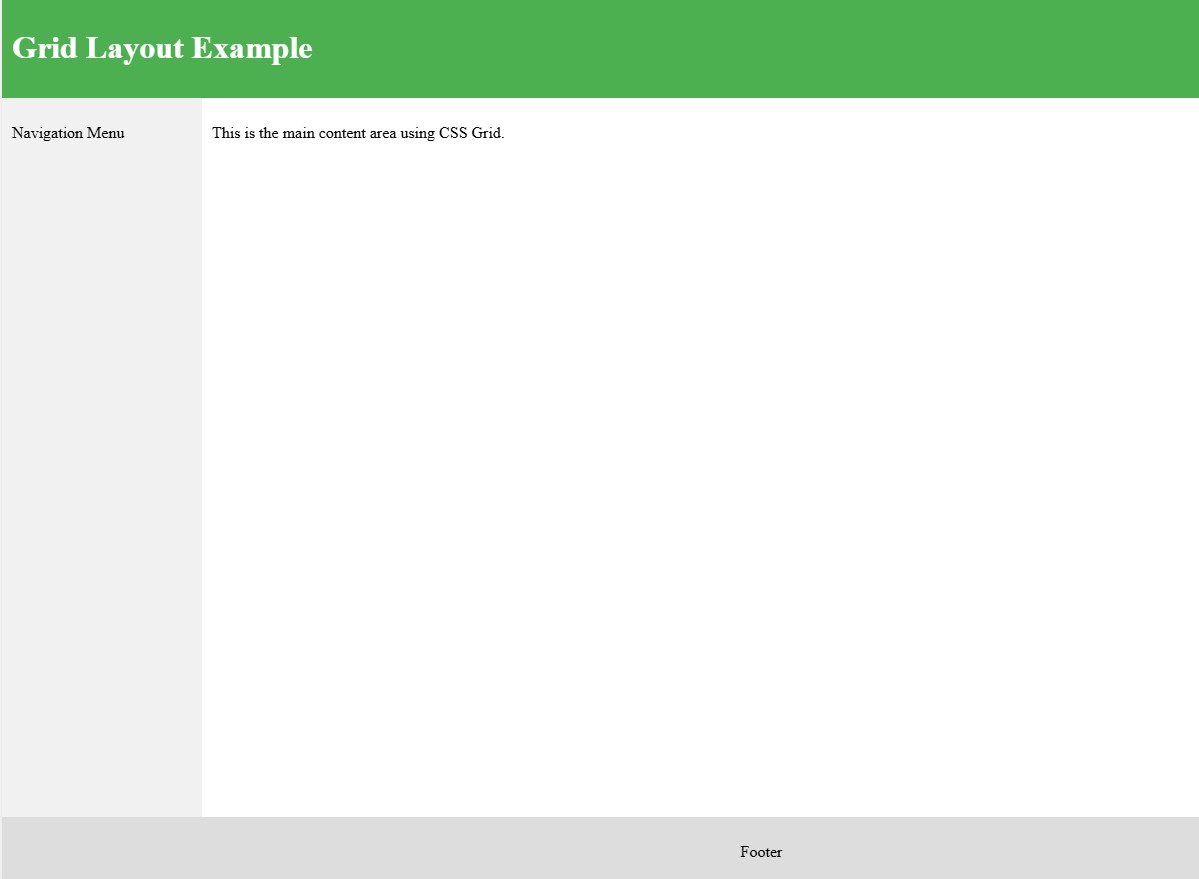
✅ 1)-Example Layout Using CSS Grid:-👇
<!DOCTYPE html>
<html lang="en">
<head>
  <meta charset="UTF-8">
  <title>Grid Layout</title>
  <style>
    body {
      display: grid;
      grid-template-areas:
        "header header"
        "nav main"
        "footer footer";
      grid-template-columns: 200px 1fr;
      grid-template-rows: auto 1fr auto;
      height: 100vh;
      margin: 0;
    }
    header {
      grid-area: header;
      background: #4CAF50;
      padding: 10px;
      color: white;
    }
    nav {
      grid-area: nav;
      background: #f1f1f1;
      padding: 10px;
    }
    main {
      grid-area: main;
      padding: 10px;
    }
    footer {
      grid-area: footer;
      background: #ddd;
      text-align: center;
      padding: 10px;
    }
  </style>
</head>
<body>
  <header><h1>Grid Layout Example</h1></header>
  <nav><p>Navigation Menu</p></nav>
  <main><p>This is the main content area using CSS Grid.</p></main>
  <footer><p>Footer</p></footer>
</body>
</html>
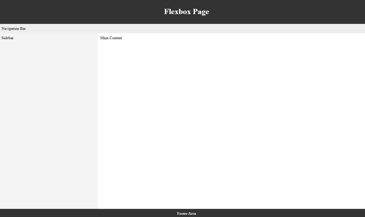
✅ 2)-Examples Layout Using Flexbox:-👇
<!DOCTYPE html>
<html lang="en">
<head>
  <meta charset="UTF-8">
  <title>Flexbox Layout</title>
  <style>
    body {
      display: flex;
      flex-direction: column;
      min-height: 100vh;
      margin: 0;
    }
    header, footer {
      background: #333;
      color: white;
      padding: 10px;
      text-align: center;
    }
    nav {
      background: #eee;
      padding: 10px;
    }
    main {
      flex: 1;
      display: flex;
    }
    aside {
      width: 25%;
      background: #f4f4f4;
      padding: 10px;
    }
    section {
      flex: 1;
      padding: 10px;
    }
  </style>
</head>
<body>
  <header><h1>Flexbox Page</h1></header>
  <nav>Navigation Bar</nav>
  <main>
    <aside>Sidebar</aside>
    <section>Main Content</section>
  </main>
  <footer>Footer Area</footer>
</body>
</html>
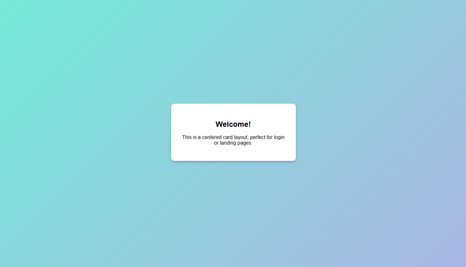
✅ 3)-Centered Card Layout (Flexbox, Great for Landing Pages):-👇
<!DOCTYPE html>
<html lang="en">
<head>
  <meta charset="UTF-8" />
  <meta name="viewport" content="width=device-width, initial-scale=1.0"/>
  <title>Centered Layout</title>
  <style>
    * { box-sizing: border-box; }
    body, html {
      margin: 0;
      padding: 0;
      height: 100%;
      font-family: sans-serif;
    }
    .center-wrapper {
      display: flex;
      justify-content: center;
      align-items: center;
      height: 100%;
      background: linear-gradient(135deg, #74ebd5, #acb6e5);
    }
    .card {
      background: white;
      padding: 2em;
      border-radius: 10px;
      box-shadow: 0 4px 8px rgba(0,0,0,0.2);
      max-width: 400px;
      text-align: center;
    }
  </style>
</head>
<body>
  <div class="center-wrapper">
    <div class="card">
      <h2>Welcome!</h2>
      <p>This is a centered card layout, perfect for login or landing pages.</p>
    </div>
  </div>
</body>
</html>
-HTML Favicon Tag -How to Add, Customize, and Optimize Website Icons for All Browsers
-What is the HTML Page Title Tag, why it’s important for SEO HTML Page Title Tag
-HTML Tables Tag Explained: How to Create Responsive HTML Table with
-HTML Table Sizes Tag Explained: Complete Beginner’s Guide with Examples, Syntax