HTML Input Types Explained with Examples | Complete Guide to All HTML Form Input Types
HTML Tutorials · HTML Input Types Tag · Introduction
HTML Form Input Types Explained | Practical Guide for Beginners
🔹 HTML provides a vast range of input types that you can use in forms to collect different types of users data. All these input types are defined using the type attribute in the <input> element. Here's a categorized list of common HTML input types:
🔹 Before HTML5, developers had only a handful of input types — text, password, checkbox, radio, submit, and a few others — and everything else (dates, colors, numeric ranges) had to be built manually with JavaScript widgets or third-party plugins. HTML5 introduced more than a dozen new input types specifically to move that responsibility into the browser itself, which is why modern forms need far less custom JavaScript than they used to.
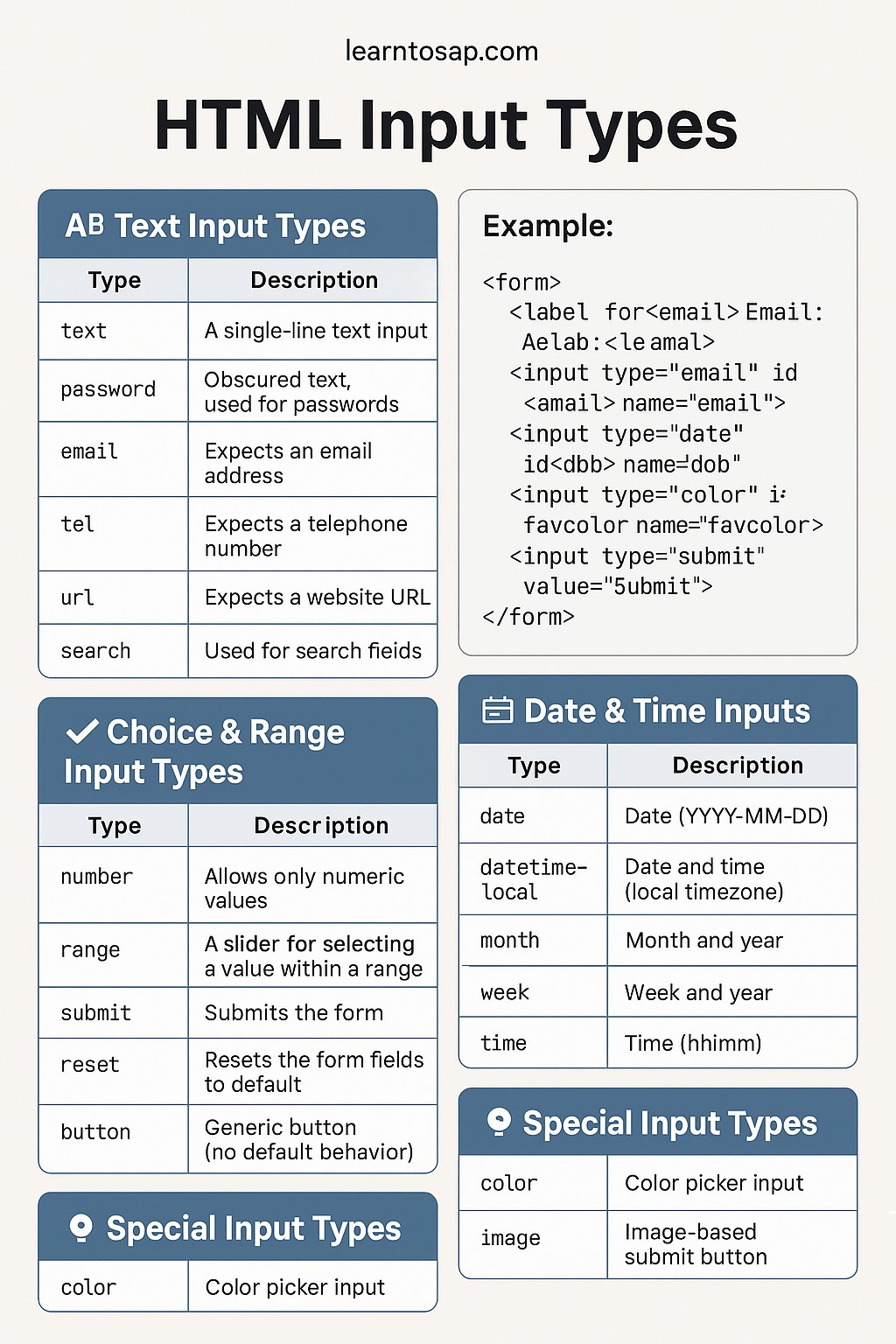
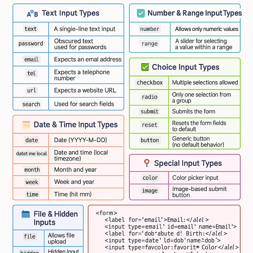
🔤 Text Input Types
| Type | Description |
|---|---|
| text | A single-line text input |
| password | Obscured text, used for passwords |
| Expects an email address | |
| tel | Expects a telephone number |
| url | Expects a website URL |
| search | Used for search fields |
🔹 Even though email, tel, and url look like plain text boxes, the browser applies basic built-in validation and, on mobile devices, automatically switches the on-screen keyboard to match — an email keyboard shows the @ key, and a tel keyboard shows a numeric pad.
🔢 Number & Range Input Types
| Type | Description |
|---|---|
| number | Allows only numeric values |
| range | A slider for selecting a value within a range |
🔹 Both of these pair well with the min, max, and step attributes, which control the allowed range and increment — for example, a range input for volume might use min="0" max="100" step="5".
📆 Date & Time Input Types
| Type | Description |
|---|---|
| date | Date (YYYY-MM-DD) |
| datetime-local | Date and time (local timezone) |
| month | Month and year |
| week | Week and year |
| time | Time (hh:mm) |
🔹 These types hand off the picker UI to the browser itself — a calendar widget for date, a clock widget for time — so you get a native, accessible date picker without writing any JavaScript.
✅ Choice Input Types
| Type | Description |
|---|---|
| checkbox | Multiple selections allowed |
| radio | Only one selection from a group |
| submit | Submits the form |
| reset | Resets the form fields to default |
| button | Generic button (no default behavior) |
🔹 Radio buttons only behave as a single-choice group when they share the same name attribute; giving each one a different name accidentally turns them into independent, unrelated toggles.
📂 File & Hidden Inputs
| Type | Description |
|---|---|
| file | Allows file upload |
| hidden | Hidden input, not visible to user but included on submit |
🔹 Remember that a file input needs its form's enctype set to multipart/form-data to actually transmit the file content, not just the file name. You can also restrict which files a user is allowed to pick with the accept attribute, and allow more than one file at once with the multiple attribute, for example <input type="file" accept="image/*" multiple> for a photo gallery uploader.
📍 Special Input Types
| Type | Description |
|---|---|
| color | Color picker input |
| image | Image-based submit button |
✅ HTML Input Types Example
<form>
  <label for="email">Email:</label>
  <input type="email" id="email" name="email">

  <label for="dob">Date of Birth:</label>
  <input type="date" id="dob" name="dob">

  <label for="favcolor">Favorite Color:</label>
  <input type="color" id="favcolor" name="favcolor">

  <input type="submit" value="Submit">
</form>Accessibility and Mobile Behavior of Input Types
🔹 Picking the right input type isn't only about validation — it directly changes what happens on a phone or with a screen reader. On iOS and Android, type="email" swaps the on-screen keyboard to show the @ and .com keys, type="tel" brings up a numeric dial pad, and type="number" shows a similar numeric layout but is still treated as text-with-spinners by some browsers rather than a strict numeric filter, so pairing it with inputmode="numeric" is a common extra safeguard.
🔹 Screen readers announce the input's role based on its type — a checkbox is announced as "checkbox, not checked," a radio as "radio button, 1 of 3," and so on. This only works correctly if the input is properly labeled, which is why a matching <label for="..."> matters just as much as choosing the right type.
Input Types and Native Browser Pickers
🔹 One of the biggest advantages of using the specific input types above instead of plain text fields is that the browser does the heavy UI lifting for you, for free.
| Input Type | Native UI Provided by the Browser |
|---|---|
| date / month / week | A calendar-style date picker |
| time / datetime-local | A clock-style time picker, often combined with the date picker |
| color | A full color-swatch/wheel picker |
| range | A draggable slider control |
| file | The operating system's native file browser dialog |
🔹 Because these pickers are built into the browser and operating system, they automatically match the user's device conventions and language settings — something that's difficult and expensive to replicate well with a custom JavaScript widget.
Common Input Validation Attributes
🔹 Input types work hand in hand with a small set of validation attributes that tighten up what counts as valid input, without writing any JavaScript.
| Attribute | What It Does |
|---|---|
| required | Field must be filled in before the form can submit |
| placeholder | Shows light example/hint text inside an empty field |
| min / max | Sets the lowest/highest allowed value for number, range, and date types |
| minlength / maxlength | Limits how many characters can be typed into a text-based field |
| pattern | A regular expression the value must match, e.g. a ZIP code format |
| step | Sets the increment allowed for number and range inputs |
Fallback Behavior in Older Browsers
🔹 A useful safety net built into HTML5 input types is graceful degradation: if a browser doesn't recognize a specific type value, it simply treats the field as type="text" instead of breaking the form. This means it's safe to use newer types like color or range even if a small slice of your visitors are on very old browsers — those users just see a plain text box where everyone else sees a color swatch or a slider, and the form still works end to end.
Which Input Type Should You Use? Decision Guide
- 🔹 Collecting an email address? Use type="email", never plain text — you get free format validation and the right mobile keyboard.
- 🔹 Need a birthdate or appointment date? Use type="date" instead of asking users to type it manually in a text box.
- 🔹 Letting a user pick exactly one option from a small, visible set? Use radio. For more than about five options, a <select> dropdown is usually cleaner.
- 🔹 Letting a user pick any number of options, including zero or all? Use checkbox.
- 🔹 Collecting a rough, approximate value like volume or brightness? Use range. For a precise number like age or quantity, use number instead.
- 🔹 Accepting a document or photo? Use file, and don't forget enctype="multipart/form-data" on the form.
Common Mistakes with HTML Input Types
- 🔹 Using type="text" for everything: missing out on built-in validation and the correct mobile keyboard for emails, phone numbers, and URLs.
- 🔹 Grouping radio buttons with different name values: breaks the single-choice behavior users expect.
- 🔹 Uploading files without the right enctype: the file name reaches the server but the file content does not.
- 🔹 Skipping <label> elements: makes fields harder to tap on mobile and harder to use with screen readers.
- 🔹 Relying only on required and pattern for security: client-side validation is for user experience, not for securing your server — always validate again on the backend.
HTML Input Types Best Practices
- 🔹 Always pair an input with a <label for="..."> that matches its id.
- 🔹 Choose the most specific input type available (email, tel, date) instead of defaulting to text.
- 🔹 Add placeholder text as a hint, not as a replacement for a visible label.
- 🔹 Use required, min/max, and pattern together for quick client-side validation, but still validate on the server.
- 🔹 Test date, color, and file inputs on both desktop and mobile — their native pickers look and behave differently across platforms.
Try It Yourself (Copy This Code and Paste. See how it works). Paste any input type into the live playground below.
Live Code Preview
Frequently Asked Questions About HTML Input Types
What are HTML input types?
HTML input types define the type of data a user can enter in a form field.
Which input type is used for email?
The input type email is used to collect email addresses.
What is the use of checkbox?
Checkbox allows users to select one or more options.
Why are input types important?
They improve form usability and help validate user input.
Does every browser support all HTML input types?
Most modern browsers support all HTML5 input types, though unsupported types simply fall back to a plain text field.
What is the difference between radio and checkbox?
Radio buttons in the same group allow only one selection, while checkboxes allow multiple selections at once.
Conclusion
🔹 Choosing the right HTML input type for each field is one of the simplest ways to make a form feel polished — it gives users the correct on-screen keyboard, a native picker where one makes sense, and free built-in validation before a single line of JavaScript is written. Work through the categories above, match each field in your own forms to the most specific type available, and add validation attributes like required, min/max, and pattern to tighten things up further.