CSS 3D Transforms: perspective, rotateX, rotateY & translateZ Explained (2026-27)
Today we are discuss topic CSS 3D Transforms. Flat 2D rotation and scaling can only get an interface so far — real depth needs a third dimension. CSS 3D Transforms add the perspective property, transform-style: preserve-3d, and a full set of Z-axis functions — rotateX(), rotateY(), rotateZ(), translateZ(), scaleZ(), and the low-level matrix3d() — that let you build rotating cubes, realistic flip cards, tilted product previews, and convincing depth effects, all without a single line of JavaScript or any 3D library. In this complete guide you will master every one of these properties, the crucial backface-visibility property, transform-origin in 3D space, and how to combine them into a real rotating cube and flip card. Includes live code panels, an interactive 3D transform playground, comparison tables, common mistakes, a quiz, and FAQ — everything you need to build professional, polished CSS 3D effects. This tutorial or document breaks down the process step by step, using simple language and real-world examples to help you master the skill.
📋 Table of Contents
- What Are CSS 3D Transforms?
- The CSS perspective Property
- transform-style: preserve-3d
- rotateX(), rotateY() & rotateZ()
- The translateZ() Function
- scaleZ() & scale3d()
- backface-visibility Property
- transform-origin in 3D Space
- The matrix3d() Function
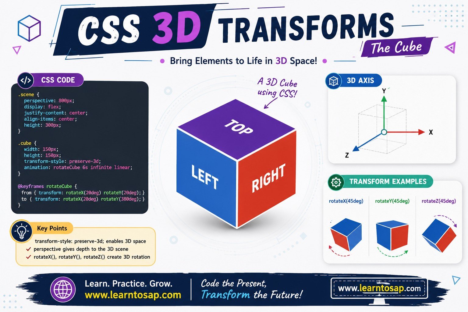
- Building a Rotating 3D Cube
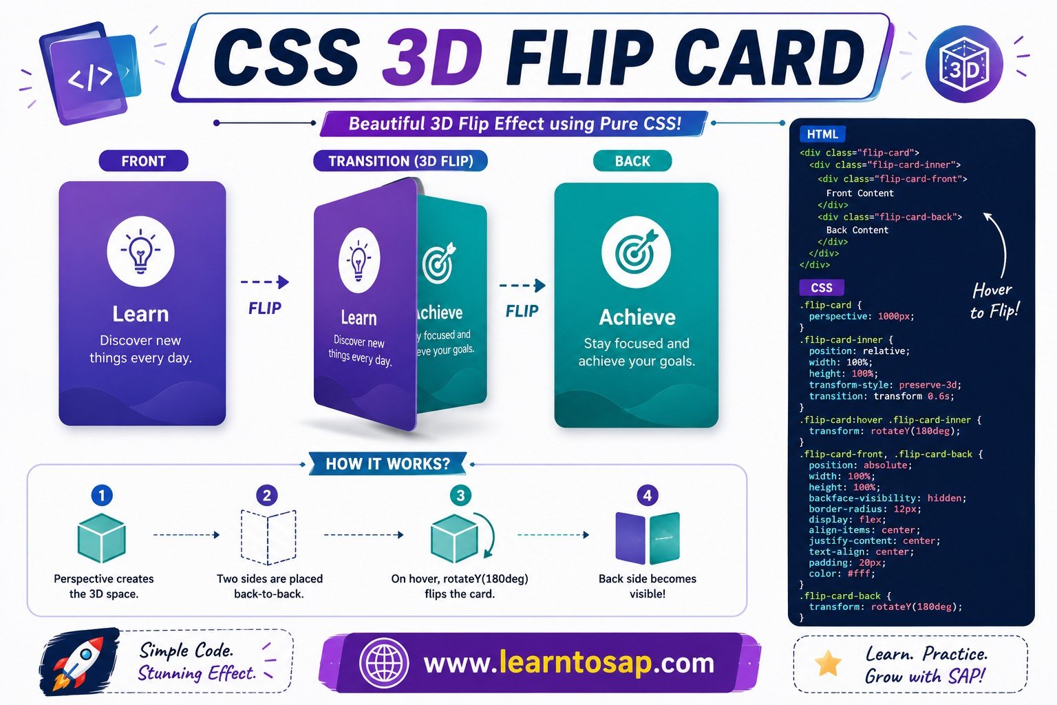
- Building a 3D Flip Card
- 3D Transform Functions – Reference Table
- Best Practices
- Common Mistakes to Avoid
- Live Code Example
- Try It Yourself – Interactive Editor
- 🎨 Interactive 3D Transform Playground
- Practice Quiz
- Frequently Asked Questions (FAQ)
✅ What Are CSS 3D Transforms?
CSS 3D transforms extend the standard 2D transform functions into a third axis — the Z-axis — which points directly out of (or into) the screen toward the viewer. Combined with the perspective property, this lets the browser render true depth: elements can tilt away from you, swing open like a door, or move closer and farther from the camera.
✅ The CSS perspective Property
perspective defines the distance between the viewer and the z=0 plane. It must be set on the parent (containing) element — not on the element being rotated — because it defines the "camera" through which all 3D-transformed children are viewed.
perspective: 200px; /* dramatic */
}
.stage-2 {
perspective: 1500px; /* subtle */
}
.box {
transform: rotateY(45deg);
}
perspective set, 3D transforms still technically work, but the browser uses an infinite-distance flat projection — so rotations on the X or Y axis show almost no visible depth at all.
✅ transform-style: preserve-3d
By default, child elements are flattened onto their parent's 2D plane (transform-style: flat). Setting transform-style: preserve-3d on a parent tells the browser to keep its children positioned in real 3D space — essential any time you nest multiple 3D-transformed elements, like the six faces of a cube.
perspective: 800px;
}
.cube {
transform-style: preserve-3d; /* required */
}
transform-style: preserve-3d is the single most common reason a 3D cube or flip card "doesn't look 3D" — without it, every face collapses onto the same flat plane regardless of its rotateX/rotateY/translateZ values.
✅ rotateX(), rotateY() & rotateZ()
These three functions rotate an element around a specific axis. rotateX() spins around a horizontal axis (top tips toward/away from you), rotateY() spins around a vertical axis (like a swinging door), and rotateZ() spins around the axis pointing out of the screen — visually identical to the 2D rotate() function.
.y { transform: rotateY(45deg); }
.z { transform: rotateZ(25deg); }
/* Shorthand: rotate3d(x, y, z, angle) */
.combo {
transform: rotate3d(1, 1, 0, 35deg);
}
rotateZ() looks identical to the 2D rotate() function, you only need it when you're already inside a 3D scene and want consistency with the other axis functions.
✅ The translateZ() Function
translateZ() moves an element along the Z-axis — positive values bring it closer to the viewer (appearing larger, when perspective is set), negative values push it farther away (appearing smaller). It does not change the element's actual width or height.
.far { transform: translateZ(-80px); }
/* Shorthand: translate3d(x, y, z) */
.move3d {
transform: translate3d(20px, 0, 60px);
}
translateZ() has zero visible effect without a perspective set on the parent. The depth illusion comes entirely from the perspective projection, not from the translation itself.
✅ scaleZ() & scale3d()
scaleZ() scales an element along the Z-axis. Because a flat element has no actual depth, scaleZ() alone is rarely visible on its own — it becomes meaningful combined inside scale3d(x, y, z) alongside rotation, or applied to true 3D-positioned groups.
/* scaleZ() rarely shows much alone — combine with rotation */
.deep {
  transform: scale3d(1, 1, 2) rotateX(40deg);
}scaleZ() is used far less often than rotateX()/rotateY() and translateZ() — most realistic 3D UI relies primarily on rotation + translation + perspective.
✅ backface-visibility Property
backface-visibility: hidden hides an element when its back is facing the viewer — for example, after rotating past 90° on rotateY(). This is the key property that makes realistic flip cards possible: without it, you'd see a mirrored, backwards version of the front face during the flip.
transform-style: preserve-3d;
transition: transform .8s;
}
.flip-stage:hover .flip-inner {
transform: rotateY(180deg);
}
.flip-face {
backface-visibility: hidden;
}
backface-visibility only matters once an element is rotated past 90° on the X or Y axis. Setting it on an element with no rotation applied has no visible effect at all.
✅ transform-origin in 3D Space
In 3D, transform-origin accepts an optional third value for the Z-axis: transform-origin: x y z;. This shifts the pivot point that rotations and scales happen around — useful for making an element rotate around its edge (like a door hinge) instead of its center.
.door {
transform-origin: left center;
transform: rotateY(-60deg);
}
✅ The matrix3d() Function
matrix3d() is the low-level function that every other 3D transform compiles down to internally — a 4×4 transformation matrix passed as 16 comma-separated values. It's rarely written by hand; it's mostly generated by animation libraries or browser dev tools, but it's useful to recognize.
/* Identity matrix - no visible change */
.raw {
  transform: matrix3d(1,0,0,0, 0,1,0,0, 0,0,1,0, 0,0,0,1);
}matrix3d(). Stick to rotateX()/rotateY()/rotateZ(), translateZ(), and scale3d() for everyday work — they're far easier to read and maintain.
✅ Building a Rotating 3D Cube
A classic CSS-only 3D cube combines everything above: a perspective on the stage, transform-style: preserve-3d on the cube, and each of the six faces positioned with a rotation plus translateZ().
.cube {
transform-style: preserve-3d;
animation: spin 9s infinite linear;
}
.face { position: absolute; }
.front { transform: translateZ(75px); }
.back { transform: rotateY(180deg) translateZ(75px); }
.right { transform: rotateY(90deg) translateZ(75px); }
.left { transform: rotateY(-90deg) translateZ(75px); }
.top { transform: rotateX(90deg) translateZ(75px); }
.bottom { transform: rotateX(-90deg) translateZ(75px); }
✅ Building a 3D Flip Card
The flip card pattern combines perspective, preserve-3d, rotateY(), and backface-visibility: hidden — triggered on :hover with a CSS transition for a smooth animated flip.
.flip-inner {
transform-style: preserve-3d;
transition: transform .8s;
}
.flip-back { transform: rotateY(180deg); }
✅ 3D Transform Functions – Reference Table
| Property / Function | Syntax Example | What It Does |
|---|---|---|
perspective | perspective(800px) | Distance from viewer to the z=0 plane (set on parent) |
perspective-origin | perspective-origin: 30% 70% | Vanishing point position for the perspective |
transform-style | preserve-3d | Renders children in real 3D space instead of flattening |
rotateX() | rotateX(45deg) | Rotation around the horizontal (X) axis |
rotateY() | rotateY(45deg) | Rotation around the vertical (Y) axis |
rotateZ() | rotateZ(25deg) | Rotation around the depth (Z) axis — same as 2D rotate() |
rotate3d() | rotate3d(1,1,0,35deg) | Rotation around a custom 3D vector axis |
translateZ() | translateZ(80px) | Moves element nearer/farther from the viewer on Z-axis |
translate3d() | translate3d(20px,0,60px) | Shorthand to move on all three axes at once |
scaleZ() / scale3d() | scale3d(1,1,2) | Scales along the Z-axis (depth) |
backface-visibility | hidden | Whether the back side of a rotated element is rendered |
transform-origin | left center 0 | Pivot point that rotation/scale happens around, incl. Z-axis |
matrix3d() | matrix3d(16 values) | Low-level 4×4 matrix all 3D transforms compile down to |
✅ Best Practices
✔️ 1) Always Set perspective on the Parent, Not the Child
perspective defines the camera distance for all 3D-transformed children — applying it directly to the rotated element itself produces a very different (usually undesired) result.
✔️ 2) Add preserve-3d to Every Ancestor That Needs Depth
If a 3D-transformed element has its own 3D-transformed children, every level in that chain needs transform-style: preserve-3d, or depth collapses at whichever level is missing it.
✔️ 3) Pair backface-visibility: hidden with Flip Animations
Any time you rotate a card past 90° on rotateY, hide the backface on both front and back faces to avoid mirrored, backwards text flashing into view.
✔️ 4) Animate the Full transform Value, Not Individual 3D Functions
Write the complete transform property and let CSS transition/animation handle it as one unit, rather than animating rotateX and translateZ as if they were separate properties.
✔️ 5) Use will-change: transform for Smoother Animation
On heavier 3D scenes — rotating cubes, many flip cards — add will-change: transform; to hint the browser to optimize rendering ahead of time.
✅ Common Mistakes to Avoid
Without any
perspective on a parent, rotateX/rotateY transforms render almost flat — there's no vanishing point for the browser to project depth toward.
Nested 3D children, like cube faces, collapse onto a flat plane the moment any ancestor in the chain is missing
preserve-3d.
Without it, the back of the front face becomes visible (mirrored) mid-flip, creating a confusing, "glitchy" looking animation.
translateZ() never changes actual width/height — any apparent size change is purely the perspective projection's visual illusion.
Applying
perspective directly on the element being rotated, instead of its parent, changes the projection math and usually produces a flatter, less convincing result than intended.
✅ Complete Live Example
A pricing card that flips on hover to reveal details, combining perspective, preserve-3d, rotateY(), and backface-visibility:
.pricing-inner {
transform-style: preserve-3d;
transition: transform .6s;
}
.pricing-stage:hover .pricing-inner {
transform: rotateY(180deg);
}
✅ Try It Yourself – Interactive Editor
Edit the HTML and CSS below to experiment with 3D transforms. Try combining perspective, rotateX/rotateY, and translateZ on the same element. The preview updates automatically.
✅ 🎨 Interactive 3D Transform Playground
Drag the sliders to combine perspective, rotateX, rotateY, rotateZ, and translateZ in real time, and watch the shape and generated CSS update live.
✅ Practice – Yes / No Quiz
1. Should perspective be set directly on the element being rotated, rather than on its parent?
2. Is transform-style: preserve-3d required for nested 3D faces, like a cube, to render correctly?
3. Does translateZ() change an element's actual width or height?
4. Does rotateZ(45deg) produce the same visual result as the 2D rotate(45deg) function?
5. Is backface-visibility: hidden commonly used to prevent a mirrored back face from showing during a card flip?
✅ Frequently Asked Questions (FAQ)
perspective property defines how far the viewer is from the z=0 plane, creating the illusion of 3D depth for child elements. Smaller values like 300px create a strong, dramatic 3D effect, while larger values like 1500px create a subtler, more realistic effect. It must be applied to the parent element, not the element being transformed.transform-style: preserve-3d tells the browser to position child elements in real 3D space relative to their parent, instead of flattening them onto one plane. Without it, nested 3D elements like cube faces collapse visually and the depth effect breaks.rotateX spins an element around a horizontal axis, so the top edge tips toward or away from the viewer. rotateY spins it around a vertical axis, like a swinging door. rotateZ spins it around the axis pointing out of the screen — visually identical to the 2D rotate() function.translateZ moves an element along the z-axis, closer to or farther from the viewer, but it never changes its actual size. Combined with a perspective value, moving closer can make it appear larger, but this is a visual illusion of depth, not an actual resize.backface-visibility: hidden prevents the back side of a 3D-transformed element from rendering once it's rotated away from the viewer, for example past 90 degrees on rotateY. This is essential for realistic flip cards, since without it the mirrored back of the front face would show during the flip.perspective value on the parent element. Without it, the browser renders 3D transforms with little to no visible depth. Adding perspective: 800px or similar on the container fixes this in almost every case.