CSS 2D Transforms: rotate(), scale(), skew() & matrix() Explained (2026-27)
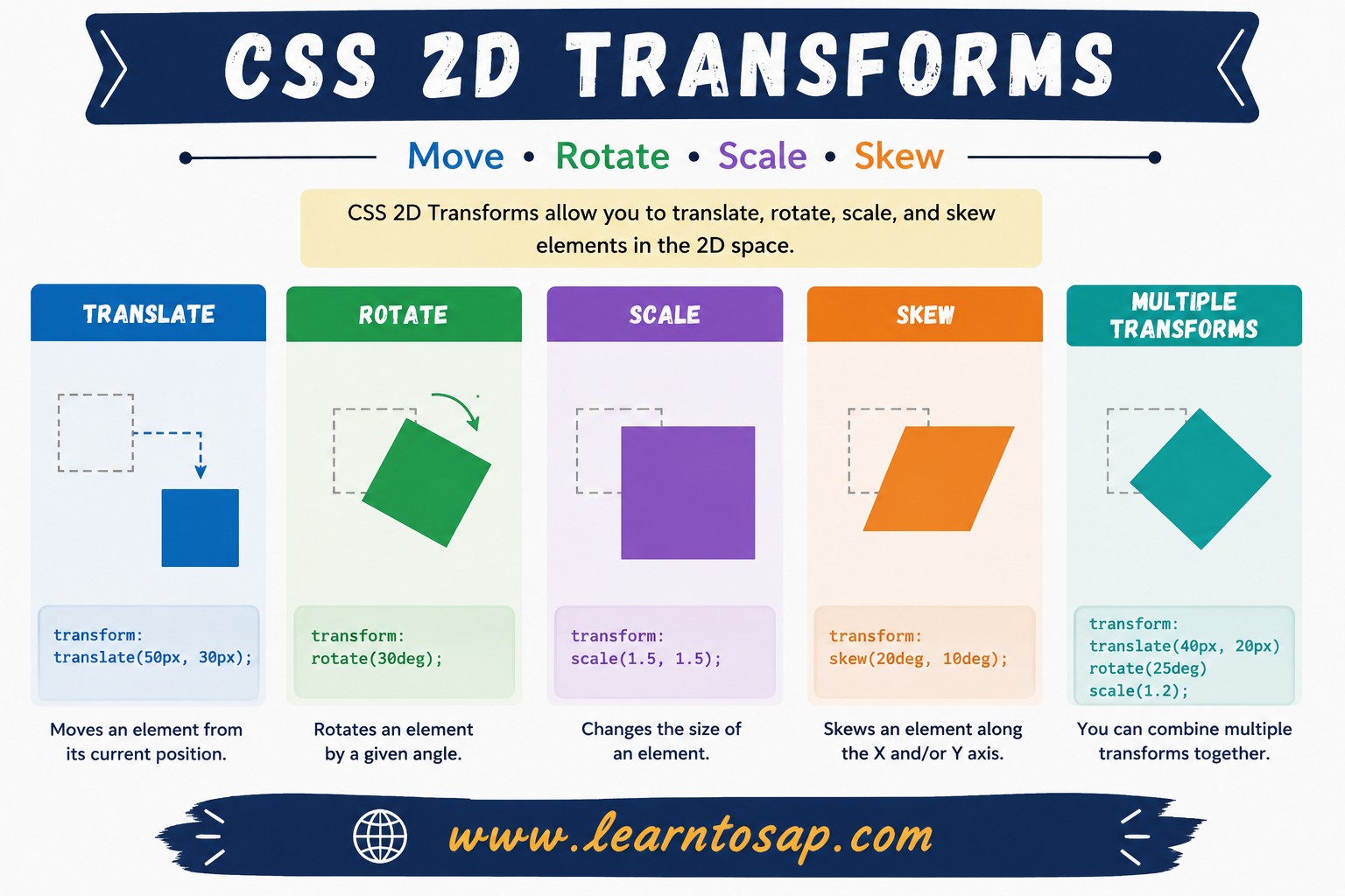
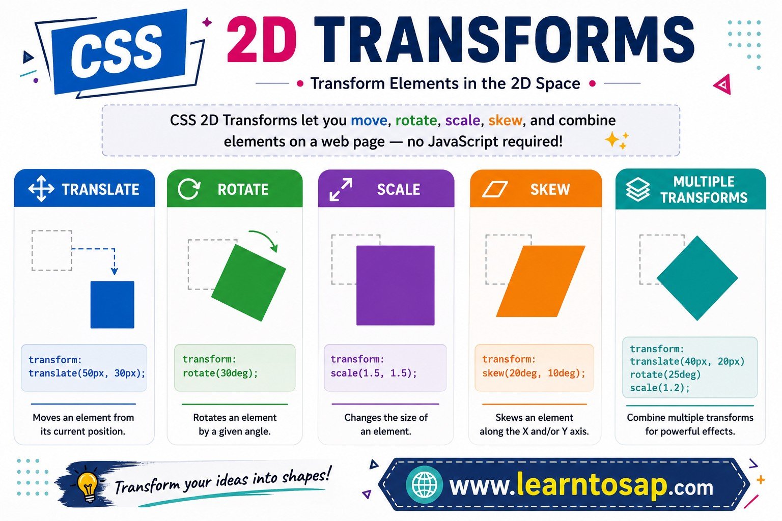
Today we are discuss topic CSS 2D Transforms. Tilted product cards on hover, buttons that grow slightly when clicked, skewed banner ribbons, spinning loading icons — almost all of these polished interface details come from a single, powerful CSS property: transform. 2D transforms let you rotate, resize, slant, and reposition any element purely visually, without disturbing the layout of anything around it, and without touching your HTML. In this complete guide you will master the rotate() function, the scale() function, skew()/skewX()/skewY(), translate(), the low-level matrix() function, the crucial transform-origin property, and how to safely combine multiple transforms together. Includes live code panels, an interactive transform playground, comparison tables, common mistakes, a quiz, and FAQ — everything you need to build professional, polished CSS transform effects. This tutorial or document breaks down the process step by step, using simple language and real-world examples to help you master the skill.
📋 Table of Contents
- What Are CSS 2D Transforms?
- The CSS rotate() Function
- The scale() Function
- skew(), skewX() & skewY()
- The translate() Function
- The matrix() Function
- transform-origin – Changing the Pivot Point
- Combining Multiple Transforms
- Real-World Hover Effects
- 2D Transform Functions – Reference Table
- Best Practices
- Common Mistakes to Avoid
- Live Code Example
- Try It Yourself – Interactive Editor
- 🎨 Interactive Transform Playground
- Practice Quiz
- Frequently Asked Questions (FAQ)
✅ What Are CSS 2D Transforms?
CSS 2D transforms let you rotate, resize, slant, and reposition an element visually on a flat (X/Y) plane — without ever touching its position in the document's normal flow, and without writing any HTML changes. They are all applied through a single property: transform.
width, top, or margin.
✅ The CSS rotate() Function
rotate(angle) spins an element clockwise (for positive values) or counter-clockwise (for negative values) around its transform-origin point, which defaults to the element's exact center.
transform: rotate(15deg);
}
.box-2 {
transform: rotate(-30deg);
}
deg (degrees, 0–360), but CSS also accepts rad (radians), grad (gradians), and turn (full rotations — 1turn = 360deg).
✅ The scale() Function
scale(factor) enlarges or shrinks an element by a multiplier. 1 is the original size, values above 1 enlarge it, and values between 0 and 1 shrink it. scale(x, y) lets you scale each axis independently.
transform: scale(0.6);
}
.box-2 {
transform: scale(1.4, 0.8); /* x, y */
}
scaleX(value) and scaleY(value) scale only one axis — equivalent to scale(value, 1) or scale(1, value) respectively, and often more readable in your CSS.
✅ skew(), skewX() & skewY()
skew(x-angle, y-angle) slants an element along both axes at once, distorting its shape into a parallelogram. skewX() and skewY() slant along a single axis only — often clearer to read when you only need one direction.
transform: skewX(20deg);
}
.box-2 {
transform: skew(10deg, 10deg);
}
rotate(), which keeps an element's shape intact and just turns it, skew() actually changes the shape into a parallelogram — useful for ribbon banners and slanted dividers, but easy to overuse.
✅ The translate() Function
translate(x, y) shifts an element from its normal position, without affecting the layout of any surrounding elements — unlike changing top/left or margin, which can push neighboring content around.
transform: translate(20px, -15px);
}
/* Centering trick using translate */
.centered {
position: absolute;
top: 50%;
left: 50%;
transform: translate(-50%, -50%);
}
top: 50%; left: 50%; transform: translate(-50%, -50%); is one of the most widely used CSS patterns ever written — it perfectly centers an absolutely-positioned element of any size, because the translate percentages are relative to the element's own width/height, not its container.
✅ The matrix() Function
matrix(a, b, c, d, tx, ty) is the low-level mathematical form that every 2D transform function — translate, rotate, scale, skew — ultimately compiles down to internally. It's rarely written by hand, but understanding it demystifies what's "really" happening under the hood.
/* These two declarations produce the IDENTICAL result: */
transform: rotate(45deg);
transform: matrix(0.7071, 0.7071, -0.7071, 0.7071, 0, 0);

/* matrix(a, b, c, d, tx, ty) maps to this 2x3 matrix:
   | a  c  tx |
| b d ty | */transform: rotate(45deg);
}
.box-2 {
transform:
matrix(0.7071, 0.7071, -0.7071, 0.7071, 0, 0);
}
✅ transform-origin – Changing the Pivot Point
transform-origin controls the point around which rotate() and scale() operate. By default this is the element's exact center (50% 50%) — changing it dramatically changes how the same transform visually behaves.
transform-origin: center; /* default */
transform: rotate(25deg);
}
.box-2 {
transform-origin: top left;
transform: rotate(25deg);
}
transform-origin on it.
✅ Combining Multiple Transforms
You can list multiple transform functions inside one transform property, separated by spaces. Order matters — each function operates on the coordinate system produced by the previous one, not on the original untransformed element.
.box-1 {
transform: translate(30px, 0) rotate(35deg);
}
/* rotate THEN translate — different result! */
.box-2 {
transform: rotate(35deg) translate(30px, 0);
}
✅ Real-World Hover Effects
The most common practical use of 2D transforms is subtle interactive feedback — buttons and cards that respond to hover or focus, paired with a smooth transition.
transition: transform 0.2s ease;
}
.card:hover {
transform: scale(1.08) rotate(-2deg);
}
✅ 2D Transform Functions – Reference Table
| Function | Syntax Example | What It Does |
|---|---|---|
rotate() | rotate(45deg) | Spins the element by an angle around transform-origin |
scale() | scale(1.5) or scale(x, y) | Enlarges/shrinks by a multiplier, per axis if needed |
scaleX() / scaleY() | scaleX(2) | Single-axis scaling shortcut |
skew() | skew(10deg, 5deg) | Slants the element on both axes into a parallelogram |
skewX() / skewY() | skewX(15deg) | Single-axis skew shortcut |
translate() | translate(20px, -10px) | Shifts the element without affecting layout |
translateX() / translateY() | translateX(20px) | Single-axis translate shortcut |
matrix() | matrix(a, b, c, d, tx, ty) | Low-level form every other 2D function compiles to |
✅ Best Practices
✔️ 1) Always Pair Transforms with a transition for Hover/Focus States
An instant snap from one transform to another feels jarring — add transition: transform 0.15s–0.3s ease; for a polished feel.
✔️ 2) Combine Functions in One transform Property, Not Multiple Declarations
transform: rotate(10deg); followed later by transform: scale(1.2); on the same element OVERWRITES the rotation entirely — combine them: transform: rotate(10deg) scale(1.2);.
✔️ 3) Prefer transform Over Animating top/left for Performance
Transform and opacity changes can typically be handled by the browser's compositor without recalculating page layout, making them smoother to animate than position-based properties.
✔️ 4) Use Single-Axis Functions for Clarity When Only One Axis Changes
scaleX(1.2) reads more clearly than scale(1.2, 1) when you only intend to affect one direction.
✔️ 5) Set transform-origin Explicitly When the Default Center Doesn't Match Your Intent
A growing badge anchored to a corner, or a flap that "opens" from an edge, needs its transform-origin set deliberately rather than left at the default center.
transform value combinations professional sites use for subtle, tasteful interactivity.
✅ Common Mistakes to Avoid
Writing two separate
transform rules that each only set one function (e.g. one for rotate, one for scale) means the second declaration completely overwrites the first — combine them into a single value.
rotate() preserves the element's rectangular shape and simply turns it; skew() actually distorts the shape into a parallelogram. Using skew when you wanted a simple tilt produces a visibly warped result.
translate() rotate() and rotate() translate() are NOT interchangeable — each function operates on the coordinate system left behind by the one before it.
Scaling or translating an element does not push neighboring elements out of the way, since the element's original space in the flow is preserved — this surprises developers expecting layout-affecting behavior like
width changes produce.
Heavily skewing or rotating elements containing paragraphs of text quickly becomes unreadable — reserve dramatic transforms for decorative shapes, icons, or short labels.
✅ Complete Live Example
A card that combines a hover-triggered scale, slight rotation, and a corner-anchored badge using transform-origin:
transition: transform 0.25s ease;
}
.product-card:hover {
transform: scale(1.05) rotate(1deg);
}
.badge {
transform-origin: top left;
transform: rotate(-8deg);
}
Hover for a subtle lift effect.
✅ Try It Yourself – Interactive Editor
Edit the HTML and CSS below to experiment with 2D transforms. Try combining rotate, scale, and skew on the same element. The preview updates automatically.
✅ 🎨 Interactive Transform Playground
Drag the sliders to combine rotate, scale, skew, and translate in real time, and watch the shape and generated CSS update live.
✅ Practice – Yes / No Quiz
1. Does transform: rotate(45deg); change the element's space/footprint in the document's normal flow?
2. Does skew() distort an element's shape into a parallelogram, unlike rotate()?
3. Do transform: translate(30px,0) rotate(20deg); and transform: rotate(20deg) translate(30px,0); always produce the exact same visual result?
4. Is matrix() the low-level form that translate, rotate, scale, and skew all ultimately compile down to?
5. Does transform-origin default to the exact center of the element (50% 50%) if not set explicitly?
✅ Frequently Asked Questions (FAQ)
rotate() spins an element around its transform-origin point by a specified angle, typically in degrees. Positive values rotate clockwise and negative values rotate counter-clockwise. For example, transform: rotate(45deg); tilts an element 45 degrees clockwise without affecting the layout of surrounding elements.scale(1.5) enlarges an element to 150% of its original size along both the X and Y axes simultaneously. You can also scale each axis independently with scale(x, y), such as scale(1.5, 1) to stretch only horizontally, or use scaleX()/scaleY() for single-axis scaling.skew(x-angle, y-angle) slants an element along both axes at once using two angle values. skewX(angle) slants only along the horizontal axis, and skewY(angle) slants only along the vertical axis. Using the single-axis functions is often clearer when you only need to skew in one direction.matrix(a, b, c, d, tx, ty) is the underlying mathematical representation that every other 2D transform function — translate, rotate, scale, skew — ultimately compiles down to internally. It directly specifies a 2x3 transformation matrix and is rarely written by hand, but is useful for advanced cases or values generated programmatically, such as by JavaScript animation libraries.top, left, width, or margin, which do affect surrounding layout.transform list operates on the coordinate system produced by the previous function, not on the original untransformed element. So transform: translate(50px, 0) rotate(45deg); produces a different visual result than transform: rotate(45deg) translate(50px, 0); because the translate direction is itself affected by whether the rotation has already been applied.