CSS Tables Tutorial: border-collapse, Striped Rows And Responsive Tables (2026-27 Guide)
Today we are discuss topic CSS Tables.The HTML
<table> element is the correct, accessible way to display genuinely tabular data - price lists, schedules, comparison charts, data reports - but its default browser styling is plain and cramped. CSS transforms a bare table into something clean and readable. In this complete guide you will learn border-collapse and border-spacing, table sizing with width and table-layout, building striped (zebra) rows with :nth-child(), adding row hover effects, creating a sticky table header that stays visible while scrolling, and making any table fully responsive on mobile devices using horizontal scroll containers. Includes live code panels, an interactive table playground, comparison tables, common mistakes, a quiz, and FAQ - everything you need to design professional, accessible data tables.This tutorial or document breaks down the process step by step, using simple language and real-world examples to help you master the skill.
📋 Table of Contents
- What Are CSS Tables?
- border-collapse Property
- border-spacing Property
- Table Width & table-layout
- Striped (Zebra) Rows
- Row Hover Effects
- Sticky Table Header
- Responsive Tables
- CSS Table Properties Reference Table
- Best Practices
- Common Mistakes to Avoid
- Try It Yourself - Interactive Editor
- 🎨 Interactive Table Playground
- Practice Quiz
- Frequently Asked Questions (FAQ)
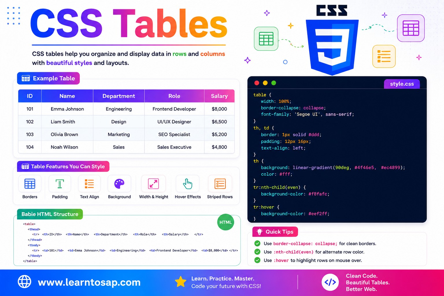
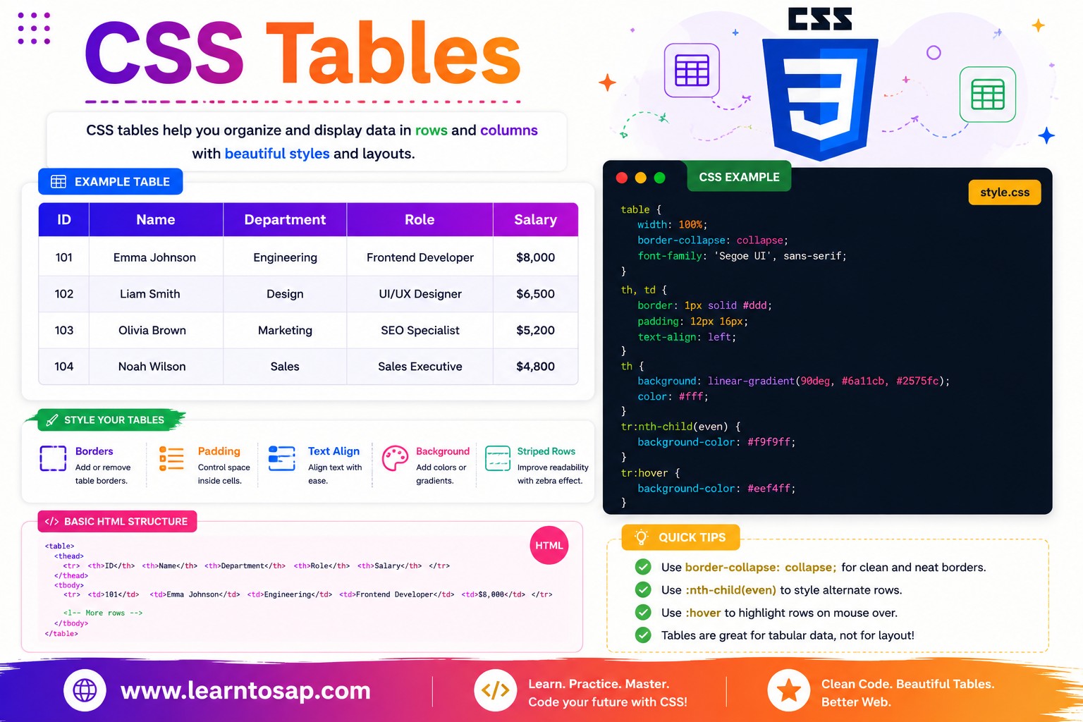
✅ What Are CSS Tables?
An HTML table is built from <table>, with rows defined by <tr>, header cells by <th>, and data cells by <td>. Grouping rows into <thead> and <tbody> adds semantic structure that both CSS and screen readers can target. CSS itself doesn't create the table, but it controls every visual detail - borders, spacing, row colors, hover states, and responsiveness.
<table>
  <thead>
    <tr>
      <th>Product</th>
      <th>Price</th>
      <th>Stock</th>
    </tr>
  </thead>
  <tbody>
    <tr>
      <td>Notebook</td>
      <td>$4.50</td>
      <td>In Stock</td>
    </tr>
  </tbody>
</table><table> when your data is genuinely row-and-column structured - it's more accessible to screen readers than recreating a grid with <div>s, and CSS gives you full visual control anyway.
✅ border-collapse Property
By default, table borders are separate - each cell has its own border, creating a doubled-line look at shared edges. border-collapse: collapse; merges adjacent borders into a single clean line:
table {
  border-collapse: collapse;  /* merged, single borders */
}

table {
  border-collapse: separate;  /* default - each cell has its own border */
}
border-collapse: separate
| Item | Qty |
|---|---|
| Pen | 12 |
| Notebook | 5 |
border-collapse: collapse
| Item | Qty |
|---|---|
| Pen | 12 |
| Notebook | 5 |
border-collapse: collapse; as one of the very first rules applied - it's the foundation for clean grid lines.
✅ border-spacing Property
border-spacing only has an effect when border-collapse is separate (the default). It controls exactly how much horizontal and vertical gap appears between neighboring cells:
table {
  border-collapse: separate;
  border-spacing: 6px;        /* equal horizontal and vertical gap */
}

table {
  border-collapse: separate;
  border-spacing: 10px 4px;   /* 10px horizontal, 4px vertical */
}border-collapse: separate;
border-spacing: 10px;
}
| A | B |
|---|---|
| 1 | 2 |
border-spacing is silently ignored if border-collapse: collapse; is set, since collapsed borders share a single line with no room for a gap.
✅ Table Width & table-layout
Set width on the <table> to control its overall size, and use table-layout: fixed; to make column widths predictable and based on the <th>/<td> widths rather than content length:
table {
  width: 100%;
  table-layout: fixed;   /* columns size evenly, ignoring content length */
}

th:nth-child(1) { width: 40%; }
th:nth-child(2) { width: 30%; }
th:nth-child(3) { width: 30%; }table-layout: fixed; also makes large tables render faster, since the browser doesn't need to inspect every cell's content before deciding column widths - it uses only the first row (or explicit widths) to set column sizing immediately.
✅ Striped (Zebra) Rows
Alternating row background colors - "zebra striping" - is one of the most effective ways to make a wide data table easier to scan. Achieve it with the :nth-child() pseudo-class:
tbody tr:nth-child(even) {
  background-color: #F0F9FF;
}

tbody tr:nth-child(odd) {
  background-color: #ffffff;
}| Employee | Department | Status |
|---|---|---|
| Pooja Sharma | Sales | Active |
| Rohit Phalke | Marketing | Active |
| Riya Nair | Finance | On Leave |
| Suresh Veer | IT Support | Active |
| Megha Patil | HR | Active |
:nth-child() to tbody tr rather than just tr, so the striping logic only counts data rows and doesn't accidentally include the header row in the alternating pattern.
✅ Row Hover Effects
Highlighting the row under the user's mouse pointer makes it much easier to track which row you're reading across a wide table, especially with many columns:
tbody tr:hover td {
  background-color: #E0F2FE;
  transition: background-color 0.15s;
}| Product | Category | Price |
|---|---|---|
| Wireless Mouse | Electronics | ₹699 |
| Office Chair | Furniture | ₹4,299 |
| Notebook Pack | Stationery | ₹199 |
| LED Desk Lamp | Electronics | ₹899 |
✅ Sticky Table Header
For long tables, pinning the header row in place while the body scrolls keeps column labels visible at all times. Wrap the table in a scrollable container and apply position: sticky; to the header cells:
.scroll-container {
  max-height: 300px;
  overflow-y: auto;
}

thead th {
  position: sticky;
  top: 0;
  z-index: 2;
  background-color: #1E3A5F;   /* must have a background to cover scrolling rows */
}| Order ID | Customer | Amount |
|---|---|---|
| #1001 | Ankit Bhat | ₹2,450 |
| #1002 | Sneha Kulkarni | ₹1,200 |
| #1003 | Vikram Rathod | ₹3,800 |
| #1004 | Pooja Mehara | ₹950 |
| #1005 | Ramesh Malhotra | ₹4,600 |
| #1006 | Divya Patel | ₹1,750 |
| #1007 | Arjun Desai | ₹2,100 |
✅ Responsive Tables
Wide tables can break a mobile layout by forcing horizontal page scroll. The simplest, most reliable fix is to wrap the table in a container with overflow-x: auto;, so only the table itself scrolls horizontally:
.table-scroll {
  overflow-x: auto;
  -webkit-overflow-scrolling: touch;  /* smooth momentum scroll on iOS */
}

.table-scroll table {
  width: 100%;
  min-width: 600px;   /* prevents columns from squashing too tightly */
}| Order Date | Product | Quantity | Unit Price | Total | Payment Method | Status |
|---|---|---|---|---|---|---|
| 12 Jun 2026 | Mechanical Keyboard | 1 | ₹3,499 | ₹3,499 | UPI | Delivered |
| 15 Jun 2026 | USB-C Hub | 2 | ₹899 | ₹1,798 | Card | Shipped |
| 18 Jun 2026 | Monitor Stand | 1 | ₹1,299 | ₹1,299 | UPI | Processing |
✅ CSS Table Properties - Reference Table
| Property | Purpose | Common Values |
|---|---|---|
border-collapse | Merge or keep separate adjacent cell borders | collapse, separate |
border-spacing | Gap between cells (only with separate borders) | 6px, 10px 4px |
table-layout | How column widths are calculated | auto, fixed |
:nth-child(even/odd) | Target alternating rows for striping | used on tbody tr |
position: sticky | Pin header row while body scrolls | combined with top: 0; |
overflow-x: auto | Enable horizontal scroll on a wrapper | used on a container <div> |
✅ Best Practices for CSS Tables
✔️ 1) Use Semantic Table Markup
Always structure tables with <thead>, <tbody>, and proper <th scope="col"> attributes - this isn't just good practice, it directly improves how screen readers announce table data.
✔️ 2) Collapse Borders First
table { border-collapse: collapse; width: 100%; }✔️ 3) Always Wrap Wide Tables for Mobile
.table-scroll { overflow-x: auto; }✔️ 4) Use Zebra Striping on Data-Heavy Tables
Any table with more than 5-6 rows benefits significantly from alternating row colors via :nth-child() - it reduces eye strain when scanning across long rows.
✔️ 5) Keep Header Background Solid for Sticky Headers
When using position: sticky; on header cells, always give them an opaque background-color - otherwise scrolling content will show through the "sticky" header as it passes underneath.
vertical-align: middle; on table cells with consistent padding to keep multi-line content visually balanced, especially in tables mixing short and long text cells.
✅ Common Mistakes to Avoid
Leaving the default
border-collapse: separate; often produces an unintentional doubled-border look. Add border-collapse: collapse; as a baseline reset for most tables.
A table with many columns and no
overflow-x: auto; wrapper will force the entire page to scroll horizontally on mobile, breaking the layout. Always wrap wide tables in a scrollable container.
Applying
:nth-child() to all tr elements (including inside <thead>) can accidentally stripe the header too. Scope the selector to tbody tr instead.
position: sticky; without a solid background-color lets scrolling rows show through the header visually. Always set an opaque background on sticky <th> elements.
Tables should hold genuinely tabular data, not be used as a layout tool for arranging unrelated page sections - that's what CSS Grid and Flexbox are for, and using tables for layout creates accessibility problems.
✅ Try It Yourself - Interactive CSS Table Editor
Edit the HTML and CSS below to experiment with table styling. Try different border-collapse values, striped rows, or hover effects. The preview updates automatically.
✅ 🎨 Interactive Table Playground
Use the controls below to build a custom CSS table style in real time. Adjust border style, header color, row striping, and hover effect - then copy the generated CSS in one click.
| Name | Score |
|---|---|
| Aditi | 92 |
| Rahul | 85 |
| Sneha | 78 |
✅ Practice - Yes / No Quiz
1. border-collapse: collapse; merges adjacent table cell borders into a single shared line?
2. border-spacing has a visible effect even when border-collapse is set to collapse?
3. tbody tr:nth-child(even) is used to create alternating striped row colors?
4. A sticky table header needs an opaque background-color, or scrolling rows will show through it?
5. Wrapping a wide table in a container with overflow-x: auto; is a common way to make it responsive?
✅ Frequently Asked Questions (FAQ)
border-collapse: collapse; merges the borders of adjacent table cells into a single shared border line, removing the default gap and doubled-border appearance you get with the default border-collapse: separate. It's one of the very first properties most developers apply when styling a table.:nth-child() pseudo-class on table rows, e.g. tbody tr:nth-child(even) { background-color: #f5f7fb; }. This applies a background color to every second row, creating the classic alternating zebra-stripe pattern that makes wide tables easier to scan.<table> in a <div> with overflow-x: auto;, which lets the table scroll horizontally on narrow screens instead of squeezing or breaking the layout. For more advanced cases, CSS can also reflow a table into stacked card-like rows using display: block on rows and cells at small breakpoints.border-collapse controls whether adjacent cell borders merge into one (collapse) or remain separate with gaps (separate, the default). border-spacing only has an effect when border-collapse is separate, and it controls exactly how much space appears between neighboring cells.position: sticky; top: 0; to the <th> elements (or the <thead>, depending on browser support) inside a scrollable container. This keeps the header row pinned at the top of the visible area as the user scrolls down through the table body.<table> element is still the right, most accessible choice. CSS Grid and Flexbox are better suited for general page layout rather than for data that is inherently row-and-column structured, since tables provide built-in semantics for screen readers.