HTML Table Sizes Tag Explained: Complete Beginner's Guide with Examples, Syntax, and Best Practices
HTML Tutorials · HTML Table Sizes Tag · Introduction
How to Use HTML Table Sizes Tag: Step-by-Step Guide for New Learners
When user or coder working with HTML tables, controlling the size of the table and its elements (like rows, columns, and cells) is essential for layout and design. Here's a breakdown of how you can manage HTML table sizes, follow this examples code:
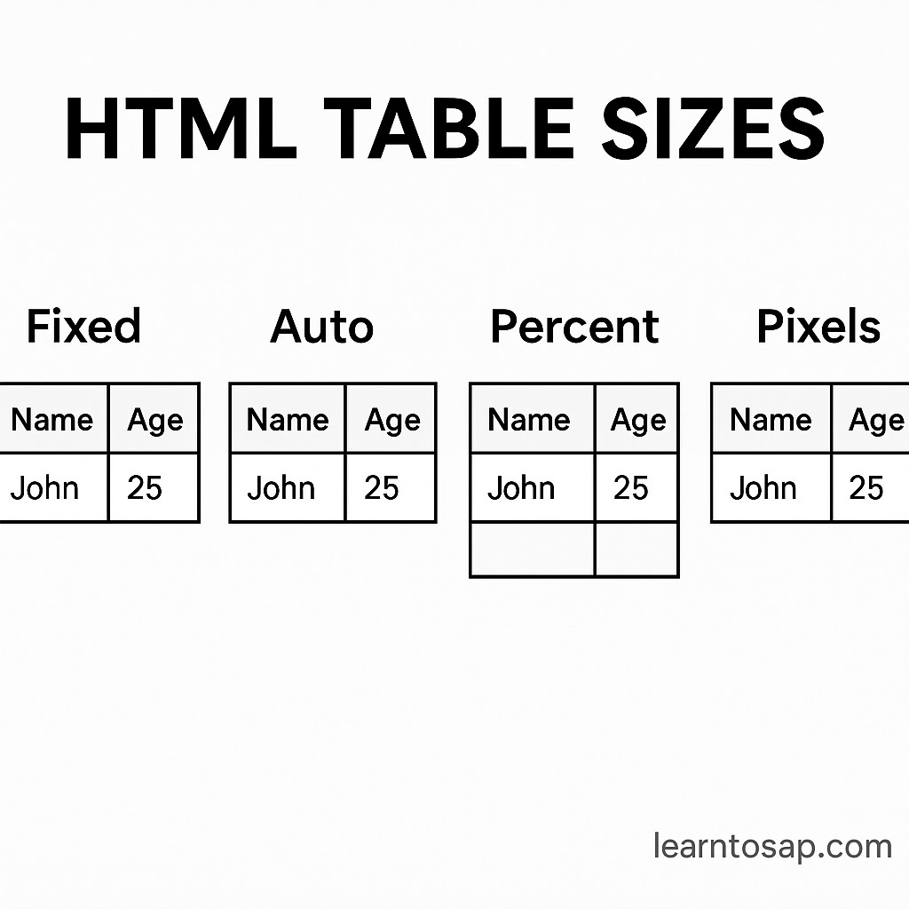
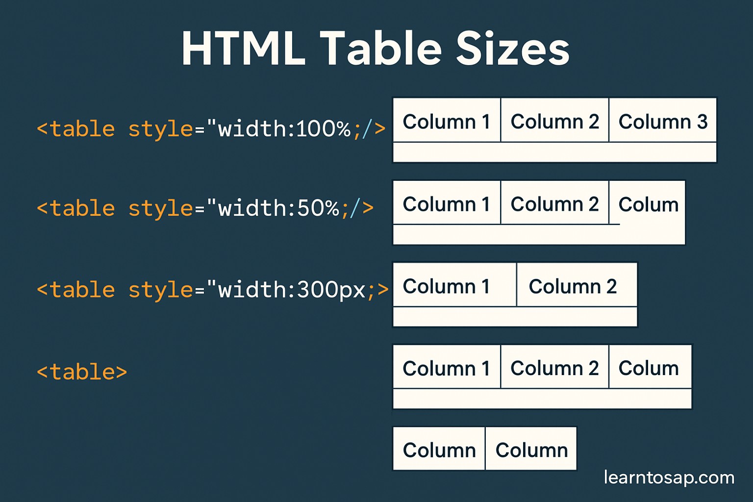
Table Size Control Examples
Four practical ways to control a table's size, from the default automatic behavior to a fully fixed layout, each with its exact code and rendered result.
📋 1. Default Table Size
HTML table will automatically adjust its size based on its content. That means if the text or image inside a table cell is wide, the column will expand to fit the content.
<table border="1">
  <tr>
    <th>Name</th>
    <th>Age</th>
  </tr>
  <tr>
    <td>Pooja</td>
    <td>30</td>
  </tr>
</table>
Rendered Result
| Name | Age |
|---|---|
| Pooja | 30 |
🧹 2. Setting Table Width and Height
<table width="700" height="200" border="1">
  ...
</table>
Filled in with real rows, the same width and height attributes look like this:
<table width="700" height="200" border="1">
  <tr>
    <th>Name</th>
    <th>Age</th>
  </tr>
  <tr>
    <td>Pooja</td>
    <td>30</td>
  </tr>
</table>
Rendered Result
| Name | Age |
|---|---|
| Pooja | 30 |
🧹 3. Controlling Column and Row Sizes
<table border="1">
  <colgroup>
    <col style="width: 70%;">
    <col style="width: 30%;">
  </colgroup>
  <tr>
    <th>Name</th>
    <th>Age</th>
  </tr>
  <tr>
    <td>Pooja</td>
    <td>30</td>
  </tr>
  <tr>
    <td>Sonali</td>
    <td>30</td>
  </tr>
</table>
Rendered Result
| Name | Age |
|---|---|
| Pooja | 30 |
| Sonali | 30 |
🧹 4. Auto vs Fixed Table Layout
<!DOCTYPE html>
<html>
<head>
  <style>
    table {
      table-layout: fixed;
      width: 500px;
      border-collapse: collapse;
    }

    th, td {
      border: 1px solid #000;
      padding: 10px;
      text-align: left;
      overflow: hidden;
      text-overflow: ellipsis;
      white-space: nowrap;
    }
  </style>
</head>
<body>

<h2>Fixed Layout Table</h2>

<table>
  <tr>
    <th>Name</th>
    <th>Email</th>
    <th>Phone</th>
  </tr>
  <tr>
    <td>Pooja shinde</td>
    <td>Pooja@learntosap.com</td>
    <td>123-456-7890</td>
  </tr>
  <tr>
    <td>Pramod Behera</td>
    <td>pramod@learntosap.com</td>
    <td>098-765-4321</td>
  </tr>
</table>

</body>
</html>
Rendered Result
🔍 Table Tag Breakdown
| Tag | Purpose |
|---|---|
| <table> | Defines the table |
| <tr> | Table row |
| <th> | Table header (bold + centered by default) |
| <td> | Table data (cell content) |
| <caption> | Defines a table caption |
| <colgroup> | Specifies a group of one or more columns in a table for formatting |
| <col> | Specifies column properties for each column within a colgroup element |
| <thead> | Groups the header content in a table |
| <tbody> | Groups the body content in a table |
Try It Yourself (Copy This Code and Paste. See how it works). Paste any of the four sizing examples above into the live playground below and adjust the width, height, or column percentages to see the change instantly.
Live Code Preview
Understanding table-layout: auto vs fixed
Example 4 above sets table-layout: fixed;, a property worth understanding on its own since it fundamentally changes how a browser calculates column widths.
| Value | How Column Widths Are Calculated |
|---|---|
| table-layout: auto; (default) | The browser measures every cell's content first, then decides column widths, which can be slow on large tables |
| table-layout: fixed; | Column widths come from the table's own width and the first row's cell widths, rendering faster and more predictably |
This is exactly why Example 4 pairs table-layout: fixed; with overflow: hidden;, text-overflow: ellipsis;, and white-space: nowrap;, once the browser stops resizing columns to fit long content automatically, those three properties are what politely truncate a long email address or name instead of letting it awkwardly overflow the cell.
Percentage vs Pixel Widths for Table Columns
The Controlling Column and Row Sizes example above uses percentages (width: 70%; and width: 30%;) rather than a fixed pixel value, which is a deliberate, common choice worth understanding.
- Percentage widths resize proportionally with the table's own container, which adapts naturally across different screen sizes.
- Pixel widths stay exactly the same regardless of screen size, which is predictable but can force horizontal scrolling on a narrow device if the total exceeds the available space.
- Mixing the two is common in practice: an overall table width in pixels or percent, with individual column widths set in percentages so they always add up proportionally within it.
For most modern, responsive websites, percentage-based column widths, similar to the 70/30 split shown in Example 3, are the safer default, reserving fixed pixel widths for situations where an exact, unchanging layout genuinely matters more than adapting to screen size.
min-width and max-width for Responsive Table Sizing
Beyond a plain width value, CSS offers min-width and max-width, which set a floor and a ceiling rather than one fixed number, giving a table room to flex between the two.
<table style="width: 100%; min-width: 320px; max-width: 700px; border-collapse: collapse;">
  <tr>
    <th style="border:1px solid #000; padding:8px;">Name</th>
    <th style="border:1px solid #000; padding:8px;">Age</th>
  </tr>
</table>
Here, the table tries to fill 100% of its container, but never shrinks below 320 pixels, wide enough to stay readable on a small phone, and never grows beyond 700 pixels, keeping columns from stretching uncomfortably wide on an extra-large monitor. This combination is one of the most reliable, low-effort ways to make a table's size feel appropriate across a wide range of devices without writing separate rules for each screen size.
Common Mistakes With HTML Table Sizing
- Setting a table's width in pixels only, which can force horizontal scrolling or an awkwardly narrow table on very different screen sizes.
- Forgetting table-layout: fixed; when trying to enforce exact, unchanging column widths, since the default auto layout can still expand a column for a single long word.
- Using colgroup/col widths that do not add up sensibly, such as several columns each set to 50%, which forces the browser to resolve the conflict in ways that may not match what was intended.
- Applying text-overflow: ellipsis; without also setting overflow: hidden; and white-space: nowrap;, since all three properties are required together for the truncation effect to actually work.
- Ignoring how a sized table behaves on mobile, forgetting to test a fixed-width table on a narrow screen before publishing.
Practice Exercises: Try Every Sizing Technique
The fastest way to make table sizing feel natural is to build a few variations yourself. Try each of these directly in the live editor above:
- Build a simple table with no sizing at all, then add width="700" and compare how the layout changes.
- Add a colgroup with two columns split 60/40 instead of the 70/30 example on this page.
- Convert a table to table-layout: fixed; and add a very long word to one cell to see the truncation in action.
- Give a table min-width and max-width instead of a single fixed width, and resize your browser window to see it flex.
- Wrap a wide, fixed-width table in a container with overflow-x: auto; to make it scrollable on small screens.
Working through these five exercises covers every sizing technique discussed in this tutorial, from the simplest default behavior to a fully responsive, fixed-layout table.
Frequently Asked Questions About HTML Table Sizes
How do I set the width and height of an HTML table?
You can set width and height directly on the table tag, such as width="700" height="200", or with CSS using style="width: 700px; height: 200px;" for more flexible control.
What is the difference between auto and fixed table-layout?
With table-layout: auto (the default), column widths adjust based on their content. With table-layout: fixed, column widths are set by the table's own width and the first row's cell widths, making rendering faster and more predictable.
How do I control individual column widths in a table?
Use a colgroup element containing col elements, each with its own width or style, placed right after the opening table tag and before the first row.
Should I use pixels or percentages for table width?
Percentages make a table resize relative to its container, which works better for responsive layouts. Pixels give an exact, fixed width, which is more predictable but does not adapt to different screen sizes.
Why does long text overflow or break my table layout?
With the default auto layout, a very long word or unbroken string can force a column to expand well beyond its intended width. Using table-layout: fixed along with overflow and text-overflow properties keeps long content contained.
Can table sizing affect how a table looks on mobile devices?
Yes. A table with a large fixed pixel width can force horizontal scrolling on a narrow screen, while percentage-based widths combined with a scrollable wrapper generally adapt better to smaller devices.