CSS Navigation Bars: Horizontal And Vertical Navbar Tutorial (2026-27 Guide)
Today we are discuss topic CSS Navigation Bars. Every website needs a way for visitors to move between pages, and that job almost always falls to a navigation bar - built from nothing more than a humble
<nav>, <ul>, and a handful of <li><a> links. CSS is what transforms that plain, unstyled list into a polished Horizontal Navigation Bar across the top of a page, or a Vertical Navigation Bar running down a sidebar. In this complete guide you will master both layout directions using Flexbox, active/hover states, dropdown submenus, sticky navbars that stay pinned while scrolling, sidebar layouts, and fully responsive mobile menus. Includes live code panels, an interactive navbar playground, comparison tables, common mistakes, a quiz, and FAQ - everything you need to write professional, accessible CSS navigation bars. This tutorial or document breaks down the process step by step, using simple language and real-world examples to help you master the skill.
📋 Table of Contents
- What Is a CSS Navigation Bar?
- The Base HTML Markup for Any Navbar
- Horizontal Navigation Bar
- Vertical Navigation Bar
- Vertical Navbar as a Sidebar Layout
- Active & Hover Link States
- Dropdown Submenus
- Sticky Navigation Bars
- Responsive & Mobile Navigation Bars
- Horizontal vs Vertical – Comparison Table
- Best Practices
- Common Mistakes to Avoid
- Live Code Example
- Try It Yourself – Interactive Editor
- 🎨 Interactive Navbar Playground
- Practice Quiz
- Frequently Asked Questions (FAQ)
✅ What Is a CSS Navigation Bar?
A CSS navigation bar (or "navbar") is a styled list of links that lets visitors move between the main sections or pages of a website. Structurally, it is almost always built from the same simple, semantic HTML - a <nav> element wrapping a <ul> of <li><a> links - and CSS is entirely responsible for turning that plain list into a recognizable navbar.
There are two fundamental layout directions:
flex-direction. Master one, and you've effectively mastered both.
✅ The Base HTML Markup for Any Navbar
Every navbar in this guide starts from the same semantic foundation. Getting this right matters for both accessibility and SEO:
<nav>
  <ul>
    <li><a href="#" class="active">Home</a></li>
    <li><a href="#">About</a></li>
    <li><a href="#">Services</a></li>
    <li><a href="#">Contact</a></li>
  </ul>
</nav>

/* Reset default list styling first */
nav ul {
  list-style: none;
  margin: 0;
  padding: 0;
}<nav> landmark element tells screen readers and search engines "this is a navigation region," distinct from regular body content - an accessibility and SEO win that a plain <div> cannot provide.
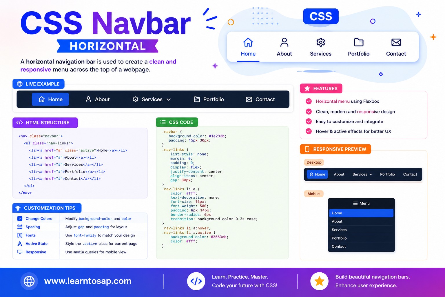
✅ Horizontal Navigation Bar
A Horizontal Navigation Bar lays its links out in a single row. The modern approach is simply display: flex; on the <ul> - flexbox's default flex-direction is row, so this is all you need.
list-style: none;
margin: 0;
padding: 10px;
display: flex; /* row by default */
gap: 6px;
background: #1E3A5F;
border-radius: 8px;
}
nav a {
display: block;
color: #fff;
padding: 8px 14px;
border-radius: 6px;
}
justify-content: flex-end; or justify-content: space-between; on the <ul> to push the links to the right edge, or to spread a logo and links to opposite ends of a header bar.
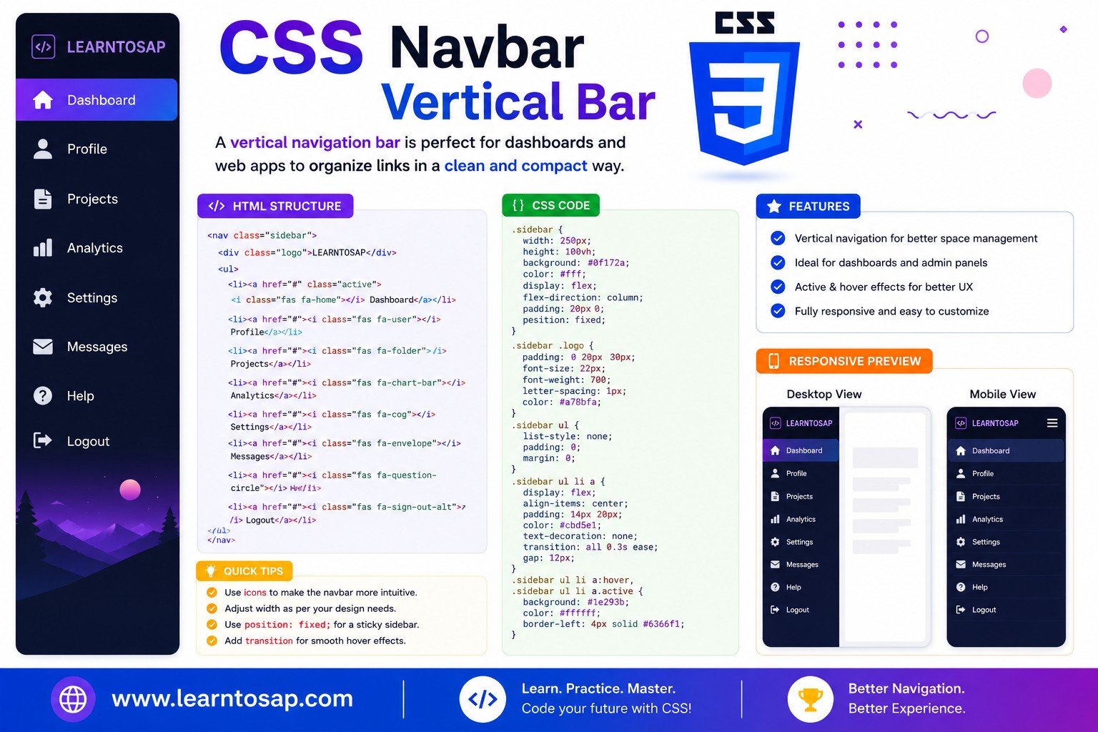
✅ Vertical Navigation Bar
A Vertical Navigation Bar stacks its links in a column. The only change from the horizontal version is adding flex-direction: column; to the same flex container.
list-style: none;
margin: 0;
padding: 10px;
display: flex;
flex-direction: column; /* ← the key change */
gap: 4px;
width: 180px;
background: #1E3A5F;
border-radius: 8px;
}
nav a {
display: block;
color: #fff;
padding: 10px 14px;
border-radius: 6px;
}
row, leaving flex-direction unset (or setting it to row) gives you a horizontal navbar; adding flex-direction: column; gives you a vertical one. Everything else - gap, padding, colors, hover states - usually stays identical.
✅ Vertical Navbar as a Sidebar Layout
The most common real-world use of a vertical navbar is a sidebar sitting beside the main page content - the classic dashboard/admin-panel layout pattern.
display: flex;
}
.sidebar {
width: 150px;
background: #1E3A5F;
flex-shrink: 0;
}
.sidebar a.active {
border-left: 3px solid #0EA5E9;
}
.content {
flex: 1;
padding: 16px;
}
✅ Active & Hover Link States
A good navbar always gives the user two kinds of feedback: which link they're hovering, and which page they're currently on (the active state).
nav a {
  color: #fff;
  padding: 8px 14px;
  border-radius: 6px;
  transition: background 0.15s;
}

/* Mouse hover feedback */
nav a:hover {
  background: #0EA5E9;
}

/* Current page indicator - toggled by your server/CMS/JS */
nav a.active {
  background: #0EA5E9;
  font-weight: bold;
}:active only applies during the exact moment a link is being clicked (a fraction of a second). To mark "this is the current page," you need a real CSS class like .active, added manually or by your templating engine/JavaScript - not the :active pseudo-class.
✅ Dropdown Submenus
A dropdown submenu is built by nesting a second <ul> inside an <li>, hiding it by default, and revealing it on hover (or via JavaScript for touch devices).
display: none;
position: absolute;
top: 100%;
background: #fff;
box-shadow: 0 6px 18px rgba(0,0,0,.15);
}
li:hover > ul {
display: block;
}
li:hover > ul) don't work well for touch screens or keyboard navigation. Production navbars should also toggle a CSS class via JavaScript on click/tap, and ensure submenu links are reachable with the Tab key.
✅ Sticky Navigation Bars
A sticky navbar stays pinned to the top of the viewport once the page scrolls past its original position - extremely common on modern websites.
nav {
  position: sticky;
  top: 0;
  z-index: 1000;
  background: #1E3A5F;  /* must be opaque! */
}background-color, page content will visually show through the sticky navbar as it scrolls underneath it. Always pair position: sticky with a solid background.
✅ Responsive & Mobile Navigation Bars
On narrow screens, a horizontal navbar with many links quickly runs out of room. The standard fix is a media query that switches the layout - either stacking links vertically, or hiding them behind a hamburger toggle button.
nav ul {
display: flex;
gap: 8px;
}
/* Mobile: stack vertically below 600px */
@media (max-width: 600px) {
nav ul {
flex-direction: column;
}
}
On a desktop-width screen, the navbar stays in a row. Once the viewport shrinks below the breakpoint, the same markup re-flows into a column automatically - no JavaScript required for this basic reflow.
<ul> by default on mobile (display: none;), add a toggle <button>, and use a small amount of JavaScript to add/remove a .open class that switches the <ul> back to display: flex;.
✅ Horizontal vs Vertical – Comparison Table
| Aspect | Horizontal Navbar | Vertical Navbar |
|---|---|---|
| flex-direction | row (the flexbox default) | column |
| Typical placement | Top of the page, beneath a logo/header | Sidebar, beside the main content area |
| Best for | Sites with 4–7 top-level links | Dashboards, admin panels, docs sites with many sections |
| Mobile behavior | Often collapses into a hamburger menu | Often collapses into an off-canvas drawer |
| Width handling | Spans the available width of its container | Usually a fixed width (e.g. 180–260px) |
✅ Best Practices
✔️ 1) Always Use Semantic <nav> and <ul> Markup
Even for a heavily customized navbar, keep the underlying <nav>>ul>>li>>a> structure for accessibility and SEO.
✔️ 2) Use a Real .active Class for the Current Page
Don't rely on :active for "current page" styling - it only fires during a click. Use a dedicated class set by your server, CMS, or router.
✔️ 3) Always Pair Sticky Navbars with an Opaque Background
A transparent sticky navbar lets scrolling content show through underneath it - always set a solid background-color.
✔️ 4) Make Dropdowns Keyboard- and Touch-Accessible
Pure :hover dropdowns fail for touch and keyboard users. Add a click/tap-toggled class with JavaScript as the primary interaction, with hover as a bonus for mouse users.
✔️ 5) Test Real Content Lengths, Not Just "Home / About / Contact"
Long link labels or many menu items can break a horizontal navbar's layout - always test with your actual, real-world link text and item count.
flex-shrink: 0; on the sidebar so it keeps its fixed width even if the page content tries to compress it in a flex layout.
✅ Common Mistakes to Avoid
Skipping this leaves stray bullets and unexplained indentation on what should be a clean navbar.
nav a:active only applies for the instant of a mouse click - it cannot persistently highlight the current page like a manually-applied .active class can.
position: sticky; with no background-color lets page content visibly scroll underneath/through the navbar, which looks broken.
A dropdown that only opens with
:hover is effectively unusable on touch devices, where there is no persistent hover state.
Giving every
<li> the same fixed pixel width breaks as soon as one link's text is longer than expected - use padding and flexbox sizing instead of hardcoded widths.
✅ Complete Live Example
A combined horizontal top navbar with an active state and hover feedback, ready to drop into a real page:
position: sticky;
top: 0;
z-index: 100;
background: #1E3A5F;
}
.site-nav ul {
list-style: none;
margin: 0;
padding: 10px;
display: flex;
gap: 6px;
}
.site-nav a {
color: #fff;
padding: 8px 14px;
border-radius: 6px;
transition: background .15s;
}
.site-nav a:hover,
.site-nav a.active {
background: #0EA5E9;
}
✅ Try It Yourself – Interactive Editor
Edit the HTML and CSS below to experiment with navigation bars. Try switching between horizontal, vertical, and dropdown layouts. The preview updates automatically.
✅ 🎨 Interactive Navbar Playground
Choose a layout direction, background color, hover color, padding, and gap to instantly preview your own custom navbar. Copy the generated CSS with one click.
✅ Practice – Yes / No Quiz
1. Is flex-direction: row the default value applied by display: flex when nothing else is specified?
2. Does adding flex-direction: column; turn a horizontal navbar into a vertical one?
3. Does the CSS pseudo-class :active persistently highlight the current page a user is on?
4. Does a sticky navbar need an opaque background color to avoid letting scrolling content show through it?
5. Are hover-only dropdown menus (li:hover > ul) fully reliable on touch-screen mobile devices?
✅ Frequently Asked Questions (FAQ)
display: flex; on the containing ul (the default flex-direction is row). A vertical navigation bar stacks its links in a column, typically down a sidebar, and is built the same way but with flex-direction: column; added.nav > ul > li > a structure, remove default list styling with list-style: none; margin: 0; padding: 0;, then apply display: flex; to the ul. By default, flexbox lays children out in a row, producing a horizontal navigation bar. Add gap for spacing between items.nav > ul > li > a structure and list-style reset, but apply display: flex; flex-direction: column; to the ul instead. This stacks the list items one above another, which is the standard approach for sidebar or admin-panel style navigation menus.position: sticky; top: 0; and a reasonably high z-index (e.g. z-index: 1000;) to the nav element. The navbar will then remain pinned to the top of the viewport once the page scrolls past its original position, while still behaving like a normal block element until that point.ul inside the li you want to have a submenu, set that nested ul to display: none; position: absolute; by default, and then reveal it using li:hover > ul (for desktop hover-based menus) or by toggling a CSS class with JavaScript on click (recommended for touch-friendly, accessible mobile menus).ul/li links when that button is clicked, typically by toggling a CSS class with a small amount of JavaScript.