CSS Border Images: border-image-source, slice, width And repeat Explained (2026-27)
Today we are discuss topic CSS Border Images. A plain
border: 2px solid #000; can only ever look like a flat line — no texture, no pattern, no decorative frame. The border-image family of properties changes that completely, letting you slice up any image or gradient into a 3×3 grid and use the pieces to build textured frames, rope borders, torn-paper edges, gradient outlines, and classic 9-slice UI panels — all in pure CSS. In this complete guide you will master border-image-source, border-image-slice, border-image-width, border-image-outset, border-image-repeat, the compact border-image shorthand, using gradients as border images, and the 9-slice scaling technique behind it all. Includes live code panels, an interactive border-image builder, comparison tables, common mistakes, a quiz, and FAQ — everything you need to build professional, polished decorative borders. This tutorial or document breaks down the process step by step, using simple language and real-world examples to help you master the skill.

📋 Table of Contents
- What Is CSS border-image?
- border-image-source – Choosing the Image
- border-image-slice – The 9-Slice Grid
- border-image-width – Sizing the Border
- border-image-outset – Extending Beyond the Box
- border-image-repeat – stretch, repeat, round & space
- The border-image Shorthand
- Using Gradients as Border Images
- The 9-Slice Scaling Technique Explained
- border-image Properties – Reference Table
- Best Practices
- Common Mistakes to Avoid
- Live Code Example
- Try It Yourself – Interactive Editor
- 🎨 Interactive Border-Image Builder
- Practice Quiz
- Frequently Asked Questions (FAQ)
✅ What Is CSS border-image?
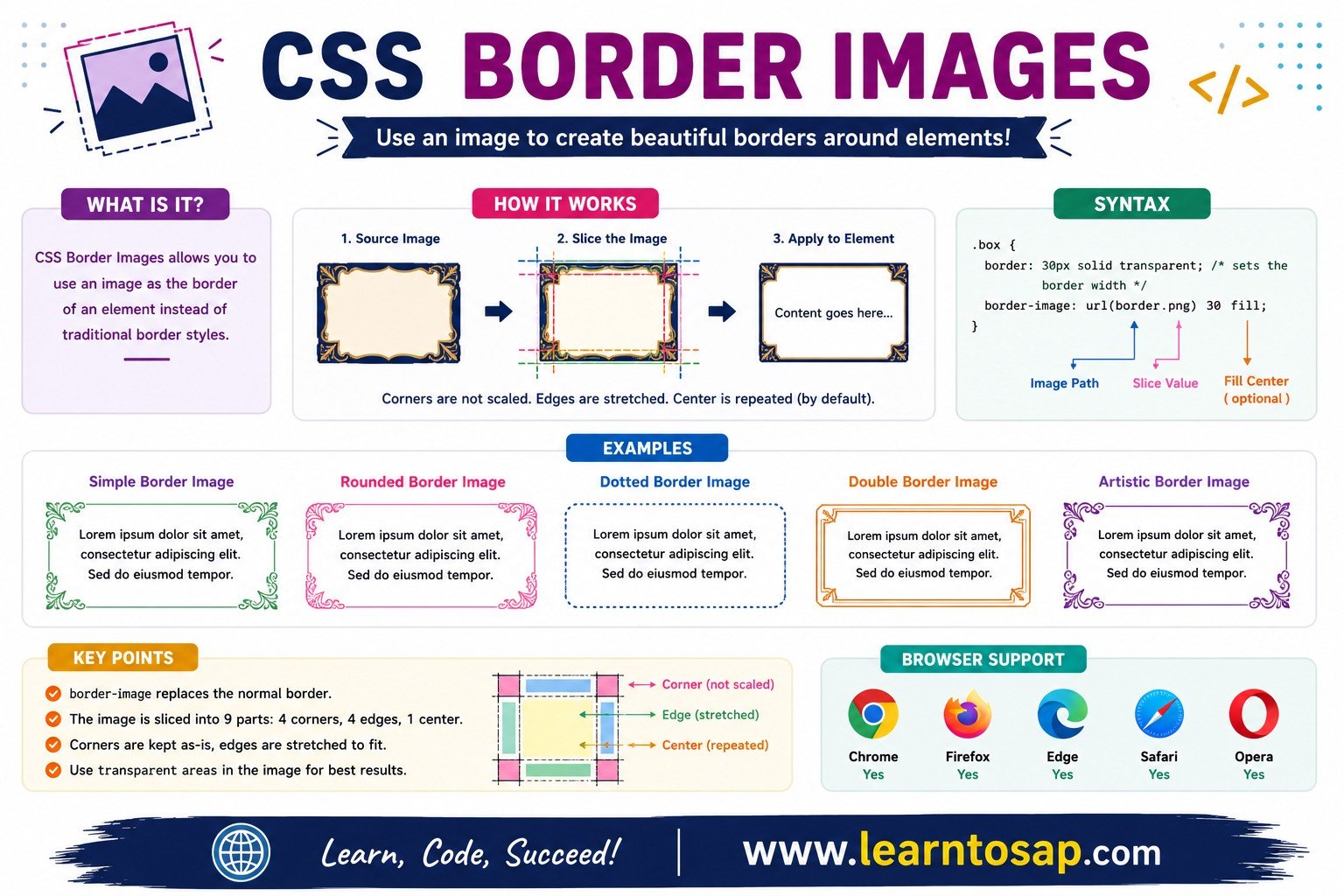
border-image replaces a plain border-color border with a sliced-up image (or gradient) that wraps around an element's edges and corners. It's made up of five longhand properties — border-image-source, border-image-slice, border-image-width, border-image-outset, and border-image-repeat — plus a combined shorthand.
✅ border-image-source – Choosing the Image
border-image-source sets which image (or any valid CSS image value, including gradients) will be sliced and used as the border. It always needs border-image-slice alongside it, and a real border-width/border-style for the browser to have space to render into.
border-style: solid;
border-width: 24px;
border-image-source:
url('frame.png');
border-image-slice: 30;
}
/* A gradient works too - shown live → */
.box-2 {
border-image-source:
conic-gradient(...);
border-image-slice: 1;
}
border-color and border-style too — if the image fails to load (broken URL, slow network), the browser falls back to that solid border instead of rendering nothing at all.
✅ border-image-slice – The 9-Slice Grid
border-image-slice cuts the source image into a 3×3 grid using four inset values (top, right, bottom, left) measured inward from each edge — producing four corners, four edge strips, and one center region (the center is discarded by default unless you add the fill keyword).
border-image-slice: 20; /* all sides equal */
}
.box-2 {
border-image-slice: 10 30 10 30; /* T R B L */
}
border-image-slice values describe positions inside the source image, not the rendered border thickness on your element — the actual rendered size is controlled separately by border-image-width (or border-width).
✅ border-image-width – Sizing the Border
border-image-width controls how large the border-image area renders on the actual element — independent of how the source image was sliced. If omitted, it falls back to whatever border-width is set to.
border-width: 20px; /* default = border-width */
}
.box-2 {
border-width: 20px;
border-image-width: 36px;
}
border-image-width is separate from border-width, you can keep layout spacing (which respects border-width in the box model) while rendering a visually thicker or thinner decorative border-image on top.
✅ border-image-outset – Extending Beyond the Box
border-image-outset lets the border-image extend beyond the element's actual border box, without changing the element's footprint in the page's layout — useful for decorative frames or ornate corners that should overhang the content slightly.
border-image-outset: 0; /* default */
}
.box-2 {
border-image-outset: 12px;
}
border-image-outset doesn't push surrounding elements away — like all border-image properties, it's purely visual, so leave a little extra margin around elements using a large outset to avoid visual overlap with neighbors.
✅ border-image-repeat – stretch, repeat, round & space
border-image-repeat controls how the sliced edge strips fill the available border length once the unscaled corners are placed: stretch (default) scales a single tile to fit, repeat tiles it as many times as it takes (clipping the last one), round scales tiles to fit a whole number exactly, and space tiles them with even gaps.
.repeat { border-image-repeat: repeat; }
.round { border-image-repeat: round; }
.space { border-image-repeat: space; }
repeat to round — it scales tiles to always fit a whole number across the length, keeping the pattern seamless.
✅ The border-image Shorthand
border-image combines all five longhand properties into one compact declaration, in this specific order: source slice / width / outset repeat; — the two forward slashes are required once you include width or outset.
/* Longhand */
.box {
  border-image-source: linear-gradient(135deg, #0EA5E9, #1E3A5F);
  border-image-slice: 1;
  border-image-width: 16px;
  border-image-outset: 4px;
  border-image-repeat: stretch;
}

/* Identical result, using the shorthand */
.box {
  border-style: solid;
  border-width: 16px;
  border-image: linear-gradient(135deg, #0EA5E9, #1E3A5F) 1 / 16px / 4px stretch;
}✅ Using Gradients as Border Images
border-image-source accepts any valid CSS image value — not just url() — including linear-gradient(), radial-gradient(), and conic-gradient(). This is a popular way to build colorful, animated-looking borders without needing an actual image file at all.
border-style: solid;
border-width: 18px;
border-image-source:
conic-gradient(from 0deg,
#0EA5E9, #38bdf8, #1E3A5F, #0EA5E9);
border-image-slice: 1;
}
border-image-slice: 1 is the standard value for gradient borders — it tells the browser to treat almost the entire gradient as the four edge/corner regions, with virtually nothing left for the (discarded) center.
✅ The 9-Slice Scaling Technique Explained
The "9-slice" name comes from how border-image-slice divides any source image into nine regions: 4 corners (never scaled), 4 edges (scaled along one axis only), and 1 center (used only if you add the fill keyword). This is the exact same technique game engines and UI frameworks use for scalable buttons, dialog boxes, and panels.
border-style: solid;
border-width: 28px;
border-image-source:
url('ui-panel.png');
border-image-slice: 28;
border-image-repeat: round;
}
✅ border-image Properties – Reference Table
| Property | Syntax Example | What It Does |
|---|---|---|
border-image-source | url('frame.png') or linear-gradient(...) | The image/gradient that gets sliced and used as the border |
border-image-slice | 30 or 10 30 10 30 | Cuts the source into a 9-slice grid (T R B L insets) |
border-image-width | 16px or 1 2 1 2 | How large the rendered border-image area is |
border-image-outset | 6px | How far the border-image extends beyond the border box |
border-image-repeat | stretch · repeat · round · space | How edge tiles fill the remaining border length |
border-image (shorthand) | source slice / width / outset repeat | Combines all five longhand properties into one declaration |
✅ Best Practices
✔️ 1) Always Pair border-image-source with a Fallback border-color
If the image fails to load or the browser doesn't support a particular gradient syntax, a sensible fallback border still appears instead of nothing.
✔️ 2) Use round Instead of repeat for Pattern-Based Borders
Textures like rope, brick, or dashed-rivet patterns look noticeably cleaner with border-image-repeat: round, since it avoids the clipped partial tile that repeat can leave at the end of an edge.
✔️ 3) Keep border-image-slice Proportional to Your Source Image
Slice values should roughly match the actual corner/edge regions baked into your source image — slicing too little or too much distorts the intended design.
✔️ 4) Use Gradients for Borders That Need to Match a Brand Palette
A conic-gradient() or linear-gradient() border-image is easy to recolor by editing two or three color stops, with zero image-editing software required.
✔️ 5) Test border-image-width Separately from border-width
Since they can diverge, always preview both your layout spacing (governed by border-width) and the visual border thickness (governed by border-image-width) together before shipping.
✅ Common Mistakes to Avoid
border-image-source has nothing to render into without an actual border area — always set border-style: solid; and a non-zero border-width alongside it.
border-radius generally does not clip border-image pixels in most browsers — for rounded decorative borders, bake the rounded corners directly into the source image instead.
Tiled patterns with
border-image-repeat: repeat often end in a visibly clipped partial tile — switch to round for seamless results on repeating textures.
Slicing 40px corners out of a 60px-corner source image stretches or squashes the design unexpectedly — measure your actual source image before choosing slice values.
Changing
border-image-width alone does not affect how much space the element reserves in the page's layout — that's still controlled by border-width, which can lead to visual overlap if the two values differ significantly.
✅ Complete Live Example
A notice/alert box combining a gradient border-image, a custom border-image-width, and a small outset for a "floating frame" look:
border-style: solid;
border-width: 16px;
border-image-source:
linear-gradient(135deg, #f9a825, #fff3cd, #f9a825);
border-image-slice: 1;
border-image-outset: 12px;
}
✅ Try It Yourself – Interactive Editor
Edit the HTML and CSS below to experiment with border-image. Try swapping the gradient, slice value, or repeat mode. The preview updates automatically.
✅ 🎨 Interactive Border-Image Builder
Pick a gradient style, then drag the sliders to combine slice, width, outset, and repeat mode in real time, and watch the box and generated CSS update live.
✅ Practice – Yes / No Quiz
1. Does border-image-source require a real border-width on the element to have any visible space to render into?
2. Are the four corner tiles produced by border-image-slice stretched or repeated to fill space, the same as the edge tiles?
3. Can border-image-source accept a CSS gradient, such as linear-gradient(), instead of an image file?
4. Does border-image-repeat: round scale tiles so a whole number of them always fits exactly along each edge?
5. Does border-radius reliably round off the actual pixels of a border-image in most browsers?
✅ Frequently Asked Questions (FAQ)
border-image-slice cuts the source image into a 3x3 grid using four inset values (top, right, bottom, left), creating four corner pieces, four edge pieces, and one center piece. The four corner pieces are placed at the element's corners unscaled, while the edge pieces are stretched, repeated, or rounded to fill the remaining border length, depending on border-image-repeat.border-width sets the thickness of a normal CSS border. border-image-width specifically controls how large the border-image area is rendered on the element, and can be a different value entirely — if border-image-width is omitted, it falls back to whatever border-width is set to.border-image-source accepts any valid CSS image value, not just url() references — this includes linear-gradient(), radial-gradient(), and conic-gradient(). This is a popular technique for colorful borders without needing an actual image file, often combined with a transparent background and border-image-slice: 1.round scales the edge tiles up or down so that a whole number of them fits exactly along each side, avoiding the partial, clipped tile that can appear with the repeat value. This keeps repeating patterns, like brick or rope textures, looking seamless at any element size.border-width (or border-image-width). border-image only has space to render within the element's actual border area, so if that area is zero pixels wide, there is nothing visible for the sliced image to fill, even if border-image-source and border-image-slice are both set correctly.border-radius clips a plain background or border color into rounded corners, but it generally has no effect on the actual border-image pixels, which are square slices from the source image. For rounded decorative borders, it's usually better to bake the rounded corners directly into the source image itself.