CSS Website Layout Tutorial: Flexbox, Grid & Header-Sidebar-Footer Structures (2026-27)
Today we are discuss topic CSS Website Layout. Every website — no matter how simple or complex — is fundamentally an arrangement of regions: a header at the top, navigation, the main content, maybe a sidebar, and a footer at the bottom. CSS gives you several tools to build that arrangement, and choosing the right one for the job is what separates a fragile, hacky page from a clean, maintainable one. In this complete guide you will master normal flow, the display property, position, building page structure with Flexbox and CSS Grid, the classic holy grail layout, and fully responsive layout techniques that adapt from desktop down to mobile. Includes live code panels, an interactive layout builder, comparison tables, common mistakes, a quiz, and FAQ — everything you need to structure professional, accessible CSS website layouts. This tutorial or document breaks down the process step by step, using simple language and real-world examples to help you master the skill.
📋 Table of Contents
- What Is CSS Website Layout?
- Normal Flow – The Foundation of Every Layout
- The display Property
- Semantic Page Regions
- Building Layout with Flexbox
- Building Layout with CSS Grid
- The Holy Grail Layout
- Using position for Overlays & Fine Adjustments
- Float-Based Layout (Legacy)
- Responsive Layout with Media Queries
- Flexbox vs Grid – Comparison Table
- Best Practices
- Common Mistakes to Avoid
- Live Code Example
- Try It Yourself – Interactive Editor
- 🎨 Interactive Layout Builder
- Practice Quiz
- Frequently Asked Questions (FAQ)
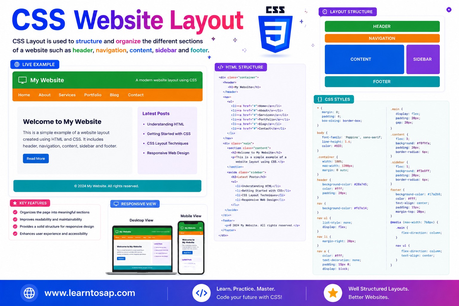
✅ What Is CSS Website Layout?
CSS website layout is the set of techniques used to arrange a page's regions — header, navigation, main content, sidebar, footer — into a coherent, predictable structure. Modern CSS layout relies on a small number of core tools, each suited to a different job:
position handles small overlay details on top of it all.
✅ Normal Flow – The Foundation of Every Layout
Before any layout technique is applied, every HTML element follows CSS's normal flow: block-level elements (div, p, header, section) stack vertically, one after another, while inline elements (span, a, strong) flow horizontally within their line, wrapping like text.
div, p {
/* block: stacks vertically by default */
}
span, a {
/* inline: flows horizontally, wraps */
}
Inline elements flow side-by-side:
position don't replace normal flow — they take an element out of it (Grid/Flex children) or layer it on top of it (position: absolute/fixed). Understanding what you're overriding makes every other layout technique easier to reason about.
✅ The display Property
The display property is the single most important layout switch in CSS — it determines how an element and its children participate in the page.
| Value | Behavior |
|---|---|
block | Takes full available width, stacks vertically (divs, headings, paragraphs by default) |
inline | Flows within text, no forced line break (span, a, strong by default) |
inline-block | Flows inline but accepts width/height/margin like a block |
flex | Turns children into flex items laid out in a row or column |
grid | Turns children into grid items placed in rows AND columns |
none | Removes the element entirely — takes up no space |
✅ Semantic Page Regions
Before writing any layout CSS, structure your HTML using semantic landmark elements. Browsers, search engines, and assistive technology all use these tags to understand the page:
<body>
  <header>...</header>
  <nav>...</nav>
  <main>
    <aside>...</aside>
    <section>...</section>
  </main>
  <footer>...</footer>
</body>display: grid;
grid-template-columns: 150px 1fr;
grid-template-areas:
"header header"
"nav nav"
"aside main"
"footer footer";
}
header { grid-area: header; }
✅ Building Layout with Flexbox
Flexbox excels at one-dimensional layout — arranging items in a single row or a single column, with powerful control over spacing, alignment, and wrapping.
display: flex;
gap: 10px;
}
.row div {
flex: 1;
}
✅ Building Layout with CSS Grid
CSS Grid excels at two-dimensional layout — controlling rows AND columns simultaneously — making it the natural choice for an entire page skeleton.
display: grid;
grid-template-columns: repeat(3, 1fr);
gap: 10px;
}
✅ The Holy Grail Layout
The holy grail layout is a classic, instantly recognizable web design pattern: a full-width header, a middle row with a left sidebar, main content, and a right sidebar, and a full-width footer. It was notoriously fiddly to build with floats — CSS Grid makes it simple.
display: grid;
grid-template-columns: 120px 1fr 120px;
grid-template-rows: auto 1fr auto;
grid-template-areas:
"head head head"
"left main right"
"foot foot foot";
}
.left { grid-area: left; }
.right { grid-area: right; }
"head head head" "left main right" "foot foot foot" can visualize the layout instantly, without mentally tracing column/row numbers.
✅ Using position for Overlays & Fine Adjustments
The position property is not meant for primary page structure — it's for layering elements on top of your main Flex/Grid layout: modals, tooltips, badges, and sticky headers.
.badge {
position: absolute;
top: 8px;
right: 8px;
}
| Value | Behavior |
|---|---|
static (default) | Normal flow position; top/left/right/bottom have no effect |
relative | Offset from its normal position; still occupies its original space |
absolute | Removed from flow; positioned relative to nearest positioned ancestor |
fixed | Positioned relative to the browser viewport; ignores scrolling |
sticky | Acts relative until a scroll threshold, then sticks like fixed |
✅ Float-Based Layout (Legacy)
Before Flexbox and Grid existed, float was the standard technique for building multi-column layouts. It is now considered legacy for page structure.
/* Old-style float layout (avoid for new projects) */
.sidebar { float: left; width: 25%; }
.content { float: left; width: 75%; }
.footer { clear: both; } /* clearfix needed! */clearfix hacks to prevent the parent container from collapsing, behave unpredictably when content heights vary, and offer none of the alignment/gap/wrapping controls that Flexbox and Grid provide natively. Reserve float today mainly for wrapping body text around a small image.
✅ Responsive Layout with Media Queries
A robust website layout adapts to the viewport. The standard pattern is to define the desktop multi-column structure, then use a media query to collapse it into a single stacked column on narrow screens.
/* Desktop: holy grail with sidebars */
.layout {
  display: grid;
  grid-template-columns: 120px 1fr 120px;
  grid-template-areas:
    "head head head"
    "left main right"
    "foot foot foot";
}

/* Mobile: stack everything in one column */
@media (max-width: 700px) {
  .layout {
    grid-template-columns: 1fr;
    grid-template-areas:
      "head"
      "main"
      "left"
      "right"
      "foot";
  }
}grid-template-areas in the mobile media query (e.g. putting main before the sidebars) lets you prioritize the most important content first on small screens, without touching your HTML source order.
✅ Flexbox vs Grid – Comparison Table
| Aspect | Flexbox | CSS Grid |
|---|---|---|
| Dimensions | One-dimensional (row or column) | Two-dimensional (rows and columns together) |
| Best for | Navbars, button groups, wrapping card rows | Full page skeletons, dashboards, photo galleries |
| Sizing model | Content-driven, flexible sizing (grow/shrink) | Explicit track sizing (fr units, fixed, auto) |
| Key property | flex-direction | grid-template-areas / grid-template-columns |
| Typical role | Arranging items WITHIN a region | Arranging the regions of the WHOLE page |
✅ Best Practices
✔️ 1) Use Grid for the Page Skeleton, Flexbox for Components Inside It
Don't fight one tool to do the other's job — combine them based on dimensionality.
✔️ 2) Always Start with Semantic HTML
Lay out real <header>, <nav>, <main>, <aside>, <footer> elements before applying any layout CSS.
✔️ 3) Name Your Grid Areas Clearly
grid-template-areas with short, descriptive names ("head", "main", "foot") makes a stylesheet far easier for the next developer (including future you) to understand at a glance.
✔️ 4) Reserve position for Overlays, Not Structure
If you find yourself absolutely-positioning every section of a page to line things up, that's a sign to switch to Flexbox or Grid instead.
✔️ 5) Test the Layout at Real Breakpoints Early
Don't bolt on responsiveness at the very end — check tablet and mobile widths as soon as the desktop skeleton is in place, so grid-area reordering decisions are made deliberately.
fr unit (fraction of remaining space) in Grid track definitions — grid-template-columns: 200px 1fr; gives a fixed 200px sidebar and lets the main content fill all remaining space automatically, with no manual percentage math.
✅ Common Mistakes to Avoid
Float-based layout requires clearfix hacks and breaks unpredictably with mismatched content heights. Use Flexbox or Grid for any new project.
Absolutely positioning every major section removes elements from the flow entirely, making the layout brittle and hard to make responsive. Use it only for overlays.
A one-dimensional row of links is simpler and more idiomatic with Flexbox than with Grid — save Grid for genuinely two-dimensional structures.
Designing only for desktop and retrofitting responsiveness later often forces awkward compromises. Sketch the mobile stacked order while building the desktop grid.
A layout built entirely from generic
<div> elements loses accessibility landmarks that <header>, <nav>, <main>, and <footer> provide for free.
✅ Complete Live Example
A full responsive page shell combining Grid for the skeleton and Flexbox for the navbar inside the header:
display: grid;
grid-template-columns: 160px 1fr;
grid-template-areas:
"head head"
"side main";
}
header {
grid-area: head;
display: flex;
justify-content: space-between;
}
1fr grid track.✅ Try It Yourself – Interactive Editor
Edit the HTML and CSS below to experiment with website layout. Try switching between Flexbox, Grid, and the holy grail layout. The preview updates automatically.
✅ 🎨 Interactive Layout Builder
Choose a layout type, sidebar width, and which regions to show, to instantly preview your own page shell. Copy the generated CSS with one click.
✅ Practice – Yes / No Quiz
1. Is CSS Grid generally better suited than Flexbox for a full two-dimensional page skeleton (rows and columns together)?
2. Does position: absolute remove an element entirely from the normal flow of the page?
3. Is float still the recommended way to build a new multi-column page layout in 2026?
4. Does the holy grail layout consist of a header, a footer, and a middle row with a left sidebar, main content, and a right sidebar?
5. Do block-level elements stack vertically by default in CSS's normal flow, without any layout CSS applied?
✅ Frequently Asked Questions (FAQ)
grid-template-areas property makes it straightforward with just a few lines of CSS.float is now considered a legacy layout technique. It was the standard way to build multi-column layouts before Flexbox and CSS Grid existed, but it requires clearfix hacks and behaves unpredictably with varying content heights. Modern CSS layout should use Flexbox and Grid; float is now reserved mainly for wrapping text around an image.flex-direction from row to column, or changing a Grid's grid-template-columns and grid-template-areas so a sidebar drops below the main content on narrow screens.relative positions an element offset from its normal position while still taking up space in the flow. absolute removes it from the flow entirely and positions it relative to its nearest positioned ancestor. fixed positions it relative to the browser viewport, ignoring scrolling. sticky behaves like relative until a scroll threshold is crossed, then sticks like fixed within its container. These are typically used for overlays and headers, not for primary page structure.