CSS Gradients: Linear, Radial & Conic Gradients Explained with Examples (2026-27)
Today we are discuss topic CSS Gradients. A flat, single-color background can only ever look so interesting - CSS gradients let you blend two or more colors smoothly without needing a single image file. In this complete guide you will master all three gradient functions: linear-gradient() for straight-line color transitions, radial-gradient() for circular and elliptical color blends radiating from a point, and conic-gradient() for colors that sweep around a center like a clock hand or color wheel. You'll learn color stops, angles and direction keywords, repeating gradients for stripes and patterns, layering multiple gradients, and applying gradients to text and borders, not just backgrounds. Includes live code panels, an interactive gradient generator, comparison tables, common mistakes, a quiz, and FAQ - everything you need to build colorful, modern CSS gradients. This tutorial or document breaks down the process step by step, using simple language and real-world examples to help you master the skill.
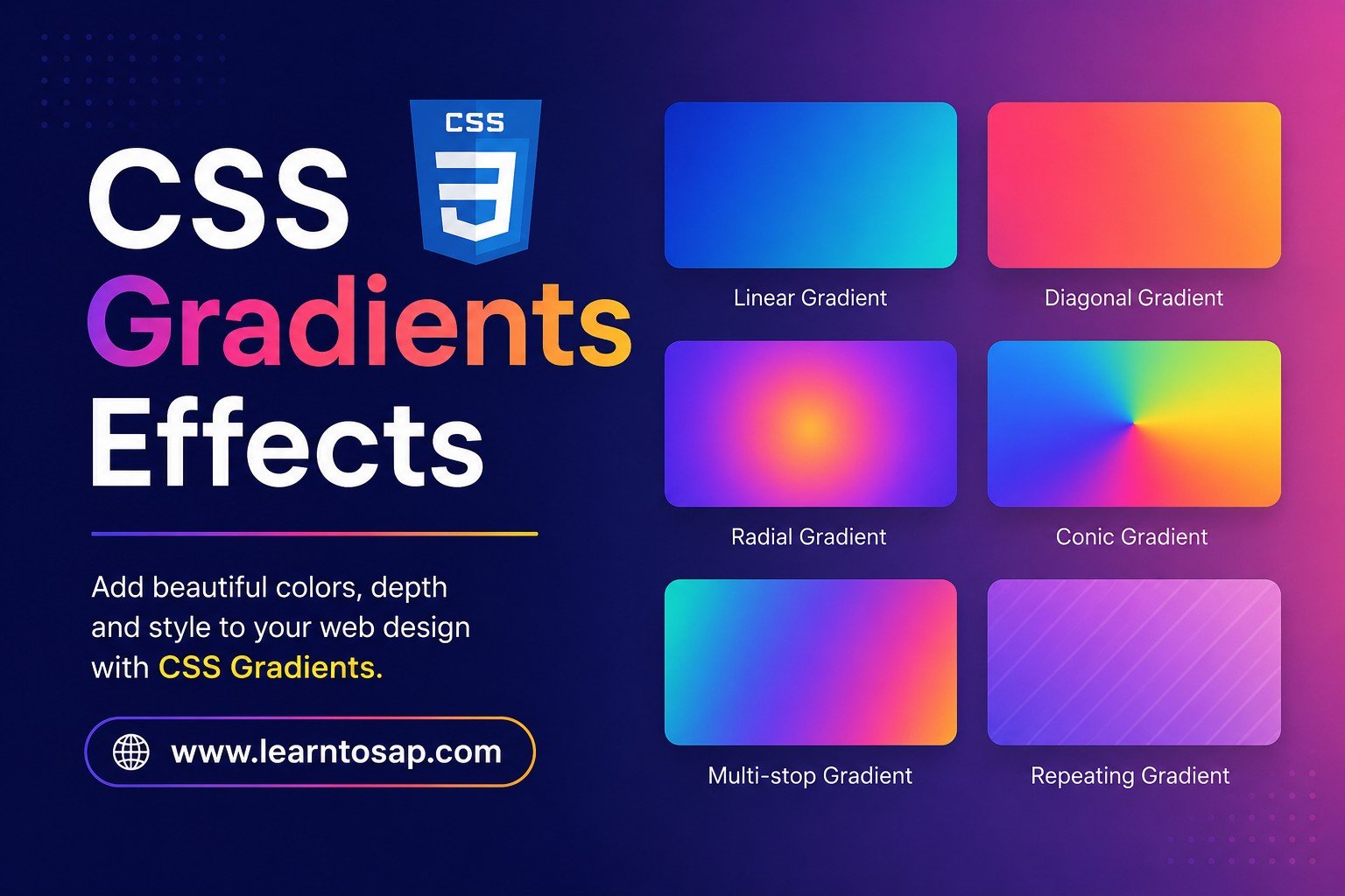
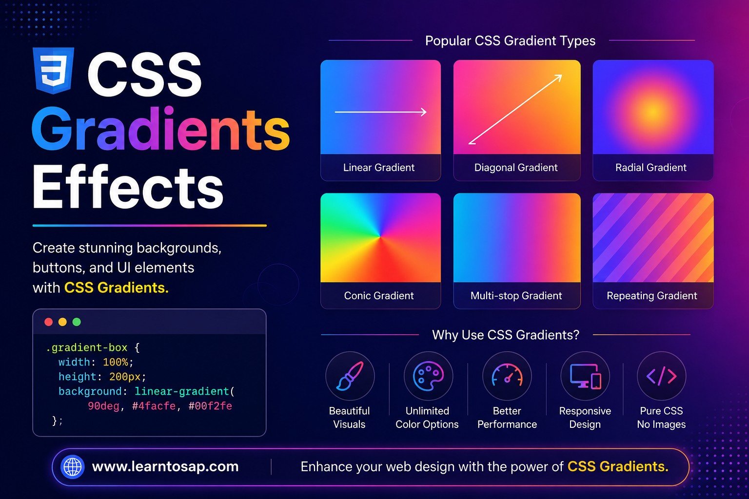
📋 Table of Contents
- What Are CSS Gradients?
- linear-gradient() – Straight-Line Color Blends
- Controlling Direction with Angles & Keywords
- Color Stops – Controlling Where Colors Change
- radial-gradient() – Circular & Elliptical Blends
- Positioning a Radial Gradient's Center
- conic-gradient() – Sweeping Color Wheels
- Repeating Gradients – Stripes & Patterns
- Layering Multiple Gradients
- Gradient Text with background-clip
- Gradient Borders
- Gradient Functions – Reference Table
- Best Practices
- Common Mistakes to Avoid
- Live Code Example
- Try It Yourself – Interactive Editor
- 🎨 Interactive Gradient Generator
- Practice Quiz
- Frequently Asked Questions (FAQ)
✅ What Are CSS Gradients?
CSS gradients are a special type of CSS image, created entirely with code, that smoothly blend two or more colors together. Because they're treated as images, gradients can be used anywhere a regular background image can - including background-image, multiple stacked layers, and even border-image-source.
background-image or the background shorthand - never in background-color, which only accepts solid colors.
✅ linear-gradient() – Straight-Line Color Blends
linear-gradient() blends colors along a straight line. With no direction specified, the gradient runs from top to bottom by default.
background:
linear-gradient(#0EA5E9, #1E3A5F);
}
/* default direction: top to bottom */
✅ Controlling Direction with Angles & Keywords
You can change the gradient's direction either with a degree angle (precise control) or a "to" keyword (easier to read), placed as the first argument.
background:
linear-gradient(to right, #0EA5E9, #1E3A5F);
}
.box-2 {
background:
linear-gradient(45deg, #0EA5E9, #1E3A5F);
}
0deg points up, 90deg points right, 180deg points down, and 270deg points left - angles increase clockwise, the same convention used by rotateZ().
✅ Color Stops – Controlling Where Colors Change
Each color inside a gradient is a color stop, optionally followed by a position (percentage or length). Without explicit positions, colors space evenly; adding positions gives precise control over each transition.
background:
linear-gradient(to right,
red, yellow, green);
}
.box-2 {
background:
linear-gradient(to right,
red 0%, red 30%, yellow 30%, yellow 70%, green 70%);
}
red 30%, yellow 30%) creates a hard, sharp color band instead of a smooth blend - this is a deliberate, common technique for solid-color stripes.
✅ radial-gradient() – Circular & Elliptical Blends
radial-gradient() blends colors outward from a center point, by default forming an ellipse that matches the element's aspect ratio. Adding the circle keyword forces a perfect circle instead.
background:
radial-gradient(#fff, #0EA5E9);
}
.box-2 {
background:
radial-gradient(circle, #fff, #0EA5E9);
}
✅ Positioning a Radial Gradient's Center
Adding at <position> moves the radial gradient's starting point anywhere within the element, instead of the default center - useful for spotlight and glow effects.
background:
radial-gradient(circle at top left,
#fff, #0EA5E9 60%, #1E3A5F 100%);
}
top left, 30% 70%, center) - not the directional keywords used by linear-gradient (to right, etc.).
✅ conic-gradient() – Sweeping Color Wheels
conic-gradient() sweeps colors around a center point like the hands of a clock - completely different from linear or radial gradients, which blend outward or along a line. This makes it perfect for pie charts, color wheels, and loading-spinner effects.
background:
conic-gradient(from 0deg,
red, yellow, lime, cyan, blue, magenta, red);
border-radius: 50%;
}
conic-gradient(#0EA5E9 0% 40%, #2e7d32 40% 100%)) is a popular pure-CSS way to draw simple pie/donut charts without any JavaScript or SVG.
✅ Repeating Gradients – Stripes & Patterns
repeating-linear-gradient() and repeating-radial-gradient() tile a short color-stop pattern repeatedly across the element's entire background area - the standard technique for stripes, hazard patterns, and checkerboards.
background:
repeating-linear-gradient(45deg,
#0EA5E9 0 14px, #1E3A5F 14px 28px);
}
✅ Layering Multiple Gradients
Because gradients are CSS images, the background property accepts a comma-separated list of several gradients stacked on top of each other - a popular way to build colorful "mesh gradient" backgrounds.
background:
radial-gradient(at 20% 20%, rgba(14,165,233,.7), transparent 50%),
radial-gradient(at 80% 0%, rgba(46,125,50,.6), transparent 50%),
radial-gradient(at 0% 100%, rgba(192,57,43,.6), transparent 50%),
#1E3A5F; /* base color last */
}
✅ Gradient Text with background-clip
Gradient text works by applying the gradient as a background, then using background-clip: text; together with color: transparent; to clip that background so it only shows through the actual text characters.
background:
linear-gradient(90deg, #0EA5E9, #a78bfa, #f472b6);
background-clip: text;
color: transparent;
}
-webkit-background-clip: text; and -webkit-text-fill-color: transparent; prefixed versions alongside the standard properties for the widest possible browser support.
✅ Gradient Borders
Gradient borders typically use border-image-source set to a gradient, combined with border-image-slice: 1; - covered in full detail in our dedicated CSS Border Images guide.
border-style: solid;
border-width: 4px;
border-image-source:
linear-gradient(135deg, #0EA5E9, #a78bfa, #f472b6);
border-image-slice: 1;
}
✅ Gradient Functions – Reference Table
| Function | Syntax Example | What It Does |
|---|---|---|
linear-gradient() | linear-gradient(to right, red, blue) | Blends colors along a straight line |
radial-gradient() | radial-gradient(circle, white, blue) | Blends colors outward from a center point |
conic-gradient() | conic-gradient(from 0deg, red, blue) | Sweeps colors around a center point |
repeating-linear-gradient() | repeating-linear-gradient(45deg, ...) | Tiles a linear gradient pattern repeatedly |
repeating-radial-gradient() | repeating-radial-gradient(circle, ...) | Tiles a radial gradient pattern repeatedly (rings) |
| Color stop with position | red 25% | Places a color at a specific point along the gradient |
| Multiple layered gradients | background: g1(...), g2(...), color; | Stacks several gradients into one background |
✅ Best Practices
✔️ 1) Use Keyword Directions for Readability, Angles for Precision
to right is easier for a teammate to scan quickly; a specific degree value is better when you need an exact, repeatable angle.
✔️ 2) Always Include a Solid Fallback Color in Layered Gradients
Place a plain color as the last value in a multi-gradient background so any transparent gaps are still covered.
✔️ 3) Include -webkit- Prefixes for Gradient Text
background-clip: text still benefits from the prefixed -webkit-background-clip and -webkit-text-fill-color for wider compatibility.
✔️ 4) Use Hard Color Stops for Pie Charts and Stripes, Soft Stops for Smooth Blends
Decide upfront whether you want a smooth blend or distinct bands, and choose your color-stop positions accordingly.
✔️ 5) Keep Gradient Color Counts Reasonable
Two or three well-chosen colors almost always look more polished than five or six competing hues in one gradient.
--brand-gradient: linear-gradient(90deg, #0EA5E9, #1E3A5F);) so the same gradient can be reused consistently across buttons, headers, and text.
✅ Common Mistakes to Avoid
Gradients are images, not solid colors - they must go in
background-image or the background shorthand, never background-color.
to right only works in linear-gradient; radial-gradient positioning uses at <position> instead.
Without setting the text color to transparent, the gradient background-clip effect is invisible behind the solid text color on top of it.
The repeat cycle length is determined by where your color stops end - if they don't add up to a clean tile size, the repeating pattern can look uneven.
Multiple radial gradients with transparent edges, with no solid color behind them, can leave visible gaps at the element's corners or edges.
✅ Complete Live Example
A hero banner combining a linear gradient background, gradient text, and a soft conic-gradient accent badge:
background:
linear-gradient(135deg, #0EA5E9, #1E3A5F);
}
.hero h2 {
background:
linear-gradient(90deg, #fff, #BAE6FD);
background-clip: text;
color: transparent;
}
Build Something Great
Gradient backgrounds + gradient text, together
✅ Try It Yourself – Interactive Editor
Edit the HTML and CSS below to experiment with gradients. Try swapping linear, radial, and conic gradients, or layering multiple together. The preview updates automatically.
✅ 🎨 Interactive Gradient Generator
Pick a gradient type, two colors, and an angle/shape, and watch the box and generated CSS update live.
✅ Practice – Yes / No Quiz
1. Does linear-gradient() run from top to bottom by default if no direction is specified?
2. Does conic-gradient() blend colors outward from a center point, the same way radial-gradient() does?
3. Can a gradient be placed inside background-color instead of background-image?
4. Does placing two color stops at the exact same position create a hard, sharp color band instead of a smooth blend?
5. Is color: transparent required alongside background-clip: text to make gradient text actually visible?
✅ Frequently Asked Questions (FAQ)
red 20%, yellow 50%, blue 80%, lets you control exactly where each color transition happens.