CSS Shadow Effects: box-shadow, Multiple Shadows And Neumorphism Explained (2026-27)
Today we are discuss topic CSS Shadow Effects. A flat rectangle on a flat background can look lifeless — a touch of box-shadow is often all it takes to give a card, button, or panel a sense of depth and physical presence. In this complete guide you will master the four box-shadow length values — offset-x, offset-y, blur-radius, and spread-radius — shadow color and transparency, the inset keyword for recessed effects, layering multiple shadows with commas for realistic elevation, building soft glow effects, the popular neumorphism technique, and pairing box-shadow with
border-radius for polished rounded cards. Includes live code panels, an interactive shadow builder, comparison tables, common mistakes, a quiz, and FAQ — everything you need to add convincing, professional depth to your UI. This tutorial or document breaks down the process step by step, using simple language and real-world examples to help you master the skill.
📋 Table of Contents
- What Is CSS box-shadow?
- offset-x & offset-y - Positioning the Shadow
- blur-radius - Softening the Edges
- spread-radius - Growing or Shrinking the Shadow
- Shadow Color & Transparency
- The inset Keyword - Recessed Shadows
- Layering Multiple Shadows
- Building an Elevation Shadow System
- Glow & Highlight Effects
- Neumorphism - Soft UI Shadows
- Combining box-shadow with border-radius
- box-shadow Syntax - Reference Table
- Best Practices
- Common Mistakes to Avoid
- Live Code Example
- Try It Yourself - Interactive Editor
- 🎨 Interactive Box-Shadow Builder
- Practice Quiz
- Frequently Asked Questions (FAQ)
✅ What Is CSS box-shadow?
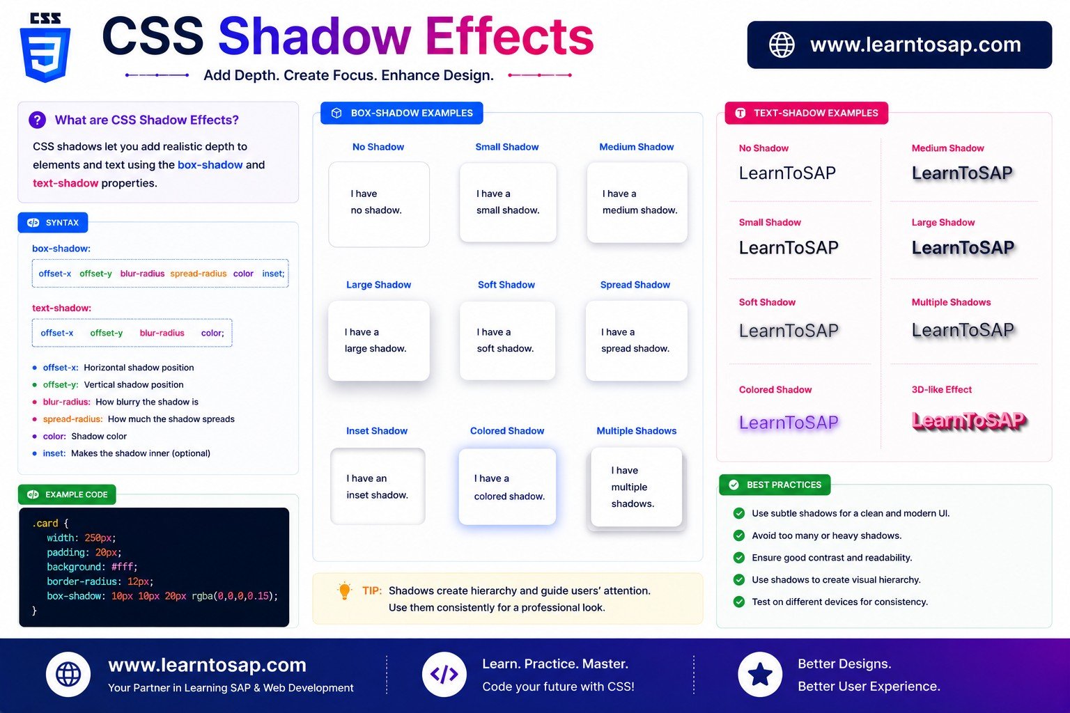
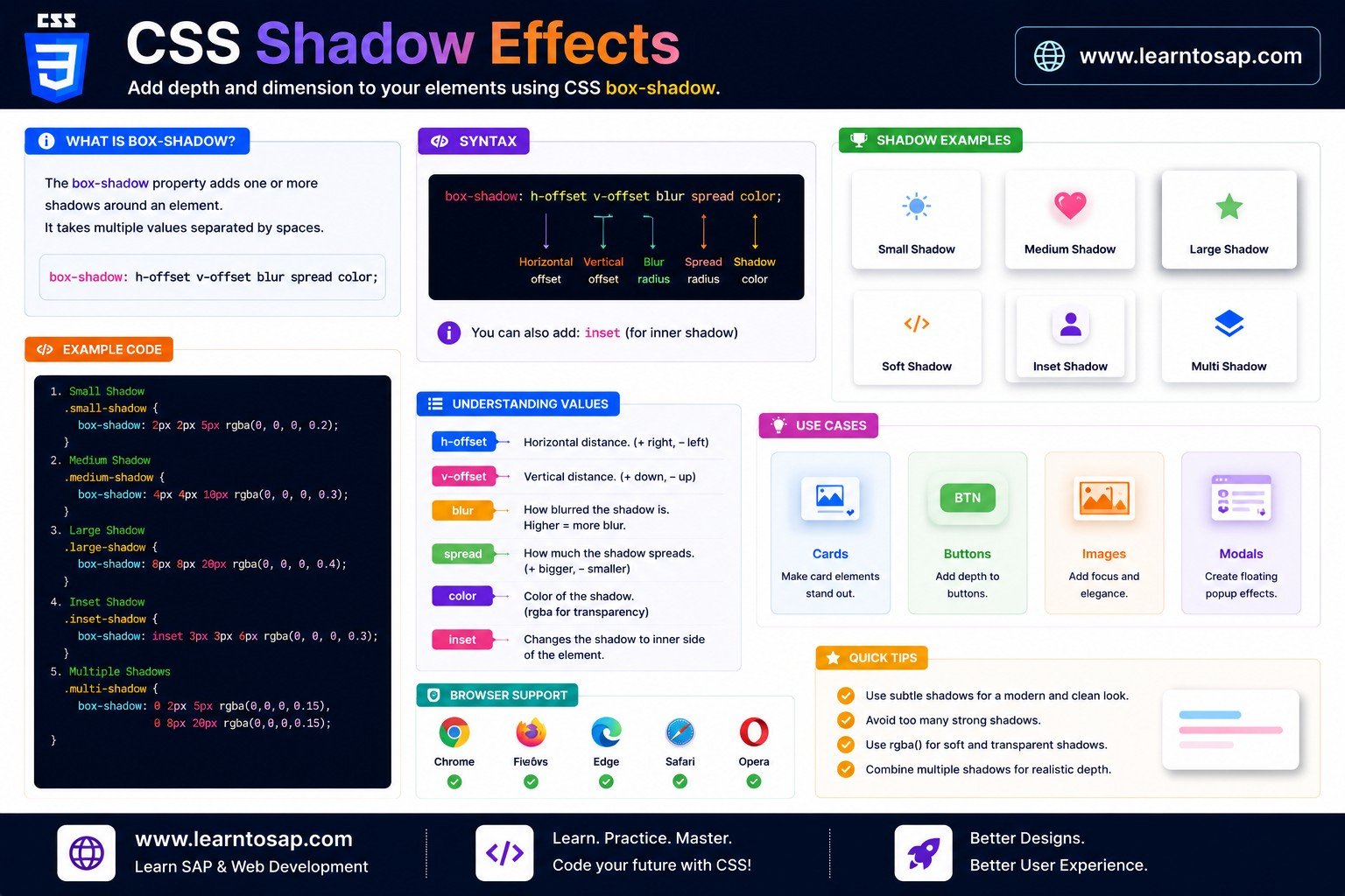
box-shadow draws a shadow shape around (or inside) an element's border box. It's defined by up to four length values, an optional color, and an optional inset keyword — and multiple shadows can be layered together using commas.
✅ offset-x & offset-y - Positioning the Shadow
The first two length values control how far the shadow shifts: offset-x moves it right (positive) or left (negative), and offset-y moves it down (positive) or up (negative). These two values are the only ones that are required.
box-shadow: 6px 6px black;
}
.box-2 {
box-shadow: -6px -6px black;
}
✅ blur-radius - Softening the Edges
An optional third value blurs the shadow's edges outward in all directions. Larger numbers create a softer, more spread-out blur; 0 (the default if omitted) produces a hard, sharp-edged shadow.
box-shadow: 4px 6px 0 rgba(0,0,0,.3);
}
.box-2 {
box-shadow: 4px 6px 18px rgba(0,0,0,.3);
}
✅ spread-radius - Growing or Shrinking the Shadow
An optional fourth value expands the shadow's shape outward (positive) or shrinks it inward (negative), uniformly on all sides, before the blur is applied. This is different from blur — spread changes the shadow's actual size, not just how soft its edges are.
box-shadow: 0 4px 10px 0 rgba(0,0,0,.3);
}
.box-2 {
box-shadow: 0 4px 10px 10px rgba(0,0,0,.3);
}
-4px) combined with a larger blur is a common technique for keeping a soft shadow from looking too large or "puffy" directly under the element's exact edges.
✅ Shadow Color & Transparency
Any valid CSS color works, but real-world shadows are rarely fully opaque — using rgba() or hsla() with reduced opacity (like rgba(0,0,0,0.25)) almost always looks more natural than solid black.
box-shadow: 0 6px 14px black;
}
.box-2 {
box-shadow: 0 6px 14px rgba(0,0,0,.22);
}
✅ The inset Keyword - Recessed Shadows
Adding the inset keyword moves the shadow inside the element's border edge instead of outside it, creating a recessed or "pressed-in" appearance — perfect for input fields and pressed-button states.
box-shadow: 0 4px 12px rgba(0,0,0,.3);
}
.inset-shadow {
box-shadow: inset 0 2px 6px rgba(0,0,0,.35);
}
✅ Layering Multiple Shadows
box-shadow accepts a comma-separated list of shadow definitions, and all of them render together, layered in the order written. This is the foundation of realistic multi-layer elevation effects.
box-shadow:
0 1px 2px rgba(0,0,0,.08),
0 4px 8px rgba(0,0,0,.08),
0 12px 24px rgba(0,0,0,.10);
}
✅ Building an Elevation Shadow System
Many design systems define a small set of "elevation levels" — low, medium, high — each with its own pre-set box-shadow value, so the more "elevated" (closer to the viewer) a component is, the larger and more dramatic its shadow becomes.
.elevation-2 { box-shadow: 0 4px 10px rgba(0,0,0,.18); }
.elevation-3 { box-shadow: 0 12px 28px rgba(0,0,0,.22); }
✅ Glow & Highlight Effects
A colorful, zero-offset shadow with a large blur (and sometimes a positive spread) produces a "glow" rather than a drop shadow — popular for buttons, focus states, and dark-themed UI.
box-shadow:
0 0 18px 4px rgba(14,165,233,.55);
}
✅ Neumorphism - Soft UI Shadows
Neumorphism pairs a light shadow offset up-left with a dark shadow offset down-right, both on a background close to the element's own color — creating the soft, "extruded from the surface" look that became popular in modern soft-UI design.
background: #e6e9ef;
box-shadow:
-8px -8px 16px #fff,
8px 8px 16px #c7cad1;
}
.neu-pressed {
box-shadow:
inset -6px -6px 12px #fff,
inset 6px 6px 12px #c7cad1;
}
✅ Combining box-shadow with border-radius
Unlike clipping child content (which needs overflow: hidden), box-shadow automatically follows the exact curve set by border-radius with zero extra code — which is why rounded cards and buttons almost always pair the two.
border-radius: 16px;
box-shadow: 0 10px 25px rgba(0,0,0,.18);
}
✅ box-shadow Syntax - Reference Table
| Value | Position | What It Does |
|---|---|---|
| offset-x | 1st (required) | Horizontal shift — positive = right, negative = left |
| offset-y | 2nd (required) | Vertical shift — positive = down, negative = up |
| blur-radius | 3rd (optional) | Softens the edges; larger = more blur. Default: 0 |
| spread-radius | 4th (optional) | Expands (+) or shrinks (−) the shadow shape. Default: 0 |
| color | any position | Shadow color — rgba()/hsla() recommended for realism |
inset | keyword, anywhere | Moves the shadow inside the border instead of outside |
| comma-separated list | — | Layers multiple independent shadows together |
✅ Best Practices
✔️ 1) Use Semi-Transparent Colors, Not Solid Black
rgba(0,0,0,0.15) to rgba(0,0,0,0.3) covers most realistic use cases far better than fully opaque black.
✔️ 2) Layer Two or Three Shadows for Real Elevation
A tight, low-blur shadow combined with a larger, softer one almost always looks more convincing than a single large shadow.
✔️ 3) Keep a Consistent Elevation Scale Across the Site
Define 2-4 standard shadow values (e.g. card, modal, dropdown) as CSS custom properties so depth feels consistent everywhere.
✔️ 4) Use inset for Pressed/Focused States, Not Regular Cards
Recessed shadows communicate "this is sunken or active" — reserve them for inputs, pressed buttons, and toggled states.
✔️ 5) Test Glow and Neumorphic Shadows on Their Intended Background
Both effects are background-dependent — a glow that pops on dark mode can disappear entirely on a white page, and vice versa.
box-shadow on :hover (rather than offset) creates a smooth "lift up" effect without any layout shift, since shadows never affect layout regardless.
✅ Common Mistakes to Avoid
Solid black with a small blur looks harsh and artificial — switch to a semi-transparent color for a believable result.
Blur only softens edges outward; spread actually grows or shrinks the shadow's shape before any blur is applied — they solve different problems.
Like border-radius, box-shadow is purely visual and never affects page layout or spacing, even with a large spread value.
The soft, low-contrast surfaces that make neumorphism look elegant can make small text or icons hard to read — always verify contrast separately.
Missing a comma between two shadow definitions causes the whole
box-shadow declaration to become invalid and silently fail to render at all.
✅ Complete Live Example
A product card combining a layered elevation shadow, rounded corners, and a hover-lift effect using only blur and offset changes:
border-radius: 14px;
box-shadow: 0 4px 10px rgba(0,0,0,.12);
transition: box-shadow .25s, transform .25s;
}
.product-card:hover {
box-shadow: 0 16px 32px rgba(0,0,0,.20);
transform: translateY(-4px);
}
✅ Try It Yourself - Interactive Editor
Edit the HTML and CSS below to experiment with box-shadow. Try layering multiple shadows, adding inset, or building a glow. The preview updates automatically.
✅ 🎨 Interactive Box-Shadow Builder
Drag the sliders to combine offset, blur, spread, color, and inset in real time, and watch the box and generated CSS update live.
✅ Practice - Yes / No Quiz
1. Are offset-x and offset-y the only two values required for a valid box-shadow?
2. Does increasing spread-radius soften the shadow's edges, the same way blur-radius does?
3. Does the inset keyword move the shadow inside the element's border instead of outside it?
4. Can box-shadow accept a comma-separated list to layer multiple shadows on one element?
5. Does box-shadow change an element's width, height, or position in the page's layout?