CSS Rounded Corners: border-radius, Pill Shapes & Elliptical Corners Explained (2026-27)
Today we are discuss topic CSS Rounded Corners. Sharp, hard-edged rectangles were the default look of the early web — but a single CSS property, border-radius, is responsible for almost every softly-rounded card, pill-shaped button, circular avatar, and friendly modern UI element you see today. In this complete guide you will master the border-radius shorthand, the clockwise per-corner value order, the four individual corner properties (
border-top-left-radius and friends), the powerful elliptical "slash" syntax, building perfect circles and pill-shaped buttons with percentage radii, and combining border-radius with overflow: hidden and box-shadow for polished real-world components. Includes live code panels, an interactive rounded-corner builder, comparison tables, common mistakes, a quiz, and FAQ — everything you need to build clean, professional rounded UI. This tutorial or document breaks down the process step by step, using simple language and real-world examples to help you master the skill.
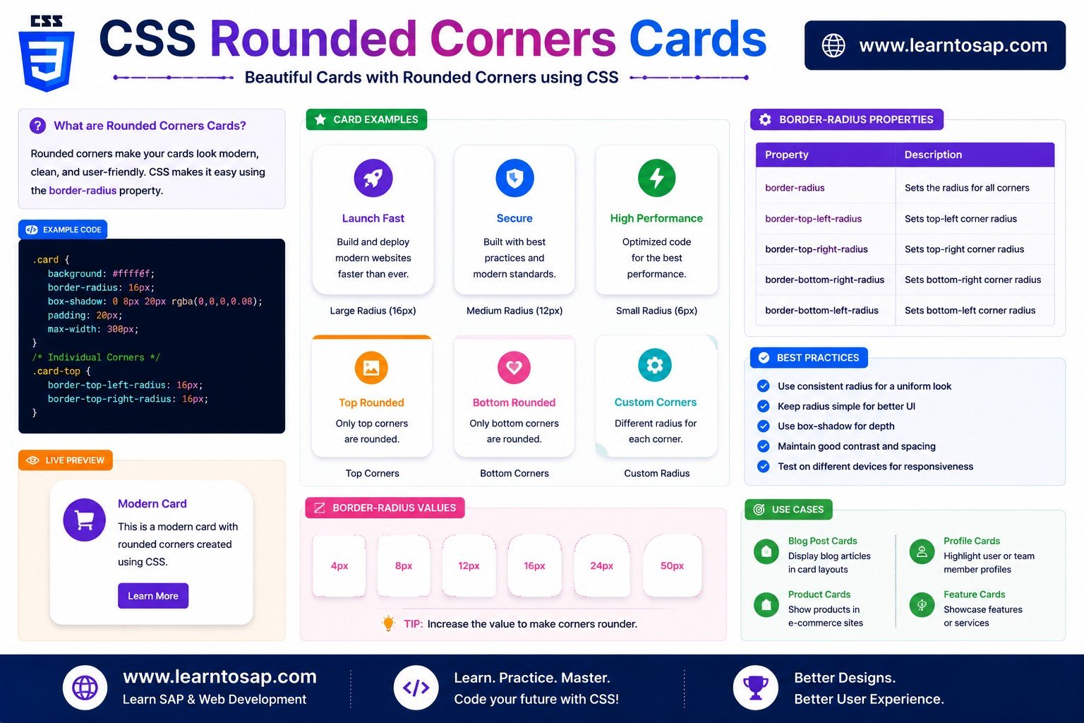
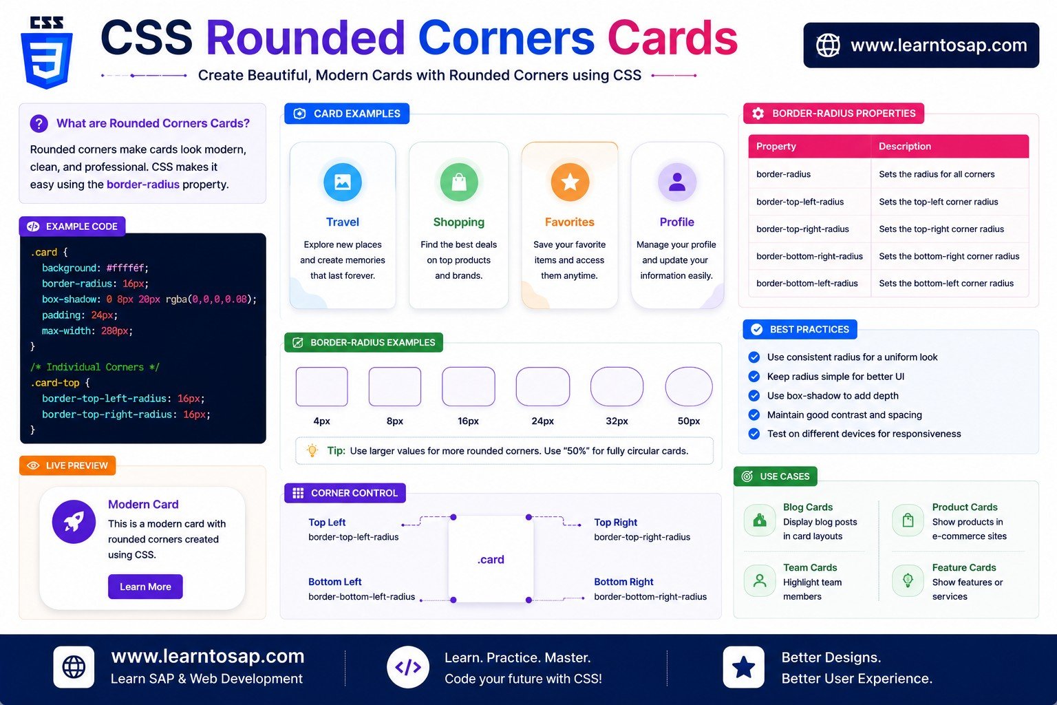
📋 Table of Contents
- What Is CSS border-radius?
- Rounding All Four Corners Equally
- Setting Different Radii Per Corner
- Individual Corner Properties
- Elliptical Corners - The Slash Syntax
- Circles & Percentage Radii
- Pill Shapes & Fully Rounded Buttons
- Organic Blob & Leaf Shapes
- Combining border-radius with overflow: hidden
- Combining border-radius with box-shadow
- border-radius Syntax - Reference Table
- Best Practices
- Common Mistakes to Avoid
- Live Code Example
- Try It Yourself - Interactive Editor
- 🎨 Interactive Rounded-Corner Builder
- Practice Quiz
- Frequently Asked Questions (FAQ)
✅ What Is CSS border-radius?
border-radius rounds off the sharp 90-degree corners of any element's box — replacing them with a smooth curve. It works on boxes, buttons, images, cards, and even entire layout containers, and is one of the most widely used CSS properties on the modern web.
✅ Rounding All Four Corners Equally
The simplest and most common usage: a single value applies the same radius to all four corners. Larger values produce a more pronounced, "softer" rounded look.
border-radius: 6px;
}
.box-2 {
border-radius: 24px;
}
border-radius accepts any CSS length unit (px, em, rem) as well as percentages, which are calculated relative to the element's own width and height.
✅ Setting Different Radii Per Corner
border-radius accepts up to four values, always read in clockwise order: top-left, top-right, bottom-right, bottom-left. This lets you mix sharp and rounded corners freely on the same element.
.box-1 {
border-radius: 20px 20px 0 0;
}
.box-2 {
border-radius: 20px 5px 20px 5px;
}
margin and padding shorthands. Three values means top-left, (top-right & bottom-left), bottom-right; two values means (top-left & bottom-right), (top-right & bottom-left).
✅ Individual Corner Properties
Four longhand properties each target exactly one corner: border-top-left-radius, border-top-right-radius, border-bottom-right-radius, and border-bottom-left-radius — handy when you only need to adjust a single corner without rewriting the whole shorthand.
border-top-left-radius: 16px;
border-top-right-radius: 16px;
border-bottom-right-radius: 16px;
border-bottom-left-radius: 0; /* sharp tail corner */
}
✅ Elliptical Corners - The Slash Syntax
border-radius supports a second, optional set of values after a forward slash — the first set controls the horizontal radius, the second controls the vertical radius, producing stretched, elliptical curves instead of perfectly circular ones.
.box-1 {
border-radius: 50px / 20px;
}
.box-2 {
border-radius: 50% / 100% 100% 0 0;
}
✅ Circles & Percentage Radii
Setting border-radius: 50%; on an element with equal width and height produces a perfect circle, because 50% of each side's length meets exactly at the center point from every corner.
width: 90px;
height: 90px; /* must equal width */
border-radius: 50%;
}
border-radius: 50%; produces an ellipse, not a circle — equal dimensions are required for a true circle.
✅ Pill Shapes & Fully Rounded Buttons
Because the rendered radius can never exceed half of an element's height, setting a value at least that large — or simply using a very large number like 9999px — fully rounds the short ends into a classic pill shape, perfect for buttons and tags.
padding: 12px 30px;
border-radius: 9999px; /* safe shortcut */
}
border-radius: 9999px; (or 50vh) is a popular safe shortcut for pill buttons — you never need to calculate the element's exact height, since the radius simply caps out at half the height automatically.
✅ Organic Blob & Leaf Shapes
Combining different per-corner values — optionally with the slash syntax — can produce surprisingly organic, hand-drawn-looking blob and leaf shapes entirely from border-radius, without any SVG or image assets.
border-radius: 50% 0 50% 50%;
}
.blob {
border-radius:
60% 40% 30% 70% / 60% 30% 70% 40%;
}
✅ Combining border-radius with overflow: hidden
border-radius only rounds an element's own background and border by default — it does not automatically clip child content like images or nested divs, which can poke out past the curve with sharp corners. Adding overflow: hidden; forces all child content to be clipped to that same rounded shape.
border-radius: 14px;
overflow: hidden; /* clips the image inside */
}
overflow: hidden, a rounded card containing a square image will show the rounded card background AND a square image poking out past the curve at the corners — a very common visual bug.
✅ Combining border-radius with box-shadow
Unlike clipping child content, box-shadow automatically follows the exact curve defined by border-radius with zero extra code — giving rounded cards and buttons a naturally rounded shadow for free.
border-radius: 18px;
box-shadow: 0 10px 25px rgba(0,0,0,0.18);
}
✅ border-radius Syntax - Reference Table
| Syntax | Example | What It Does |
|---|---|---|
| 1 value | border-radius: 12px; | All four corners equal |
| 2 values | border-radius: 12px 4px; | (top-left & bottom-right), (top-right & bottom-left) |
| 3 values | border-radius: 12px 4px 8px; | top-left, (top-right & bottom-left), bottom-right |
| 4 values | border-radius: 12px 4px 8px 2px; | top-left, top-right, bottom-right, bottom-left (clockwise) |
| Percentage | border-radius: 50%; | Circle (on a square element) or ellipse (on a rectangle) |
| Slash syntax | border-radius: 50px / 20px; | Separate horizontal / vertical radii (elliptical corners) |
| Individual property | border-top-left-radius: 16px; | Targets exactly one corner |
✅ Best Practices
✔️ 1) Use overflow: hidden Whenever a Rounded Container Has Image/Media Children
Otherwise the child content can visibly poke past the rounded corners with its own sharp edges.
✔️ 2) Use a Large Fixed Value (Like 9999px) for Pill Shapes Instead of Calculating Height
This avoids needing to know or recalculate the exact element height — the radius simply caps automatically.
✔️ 3) Keep Radius Values Consistent Across Related Components
Cards, buttons, and inputs in the same design system usually share one or two radius values (e.g. 8px and 16px) for visual consistency.
✔️ 4) Use border-radius: 50% Only on Genuinely Square Elements for Circles
Double-check that width and height are equal — otherwise you'll get an unexpected ellipse instead of a circle.
✔️ 5) Pair Rounded Corners with a Soft box-shadow for a Polished "Card" Look
Since shadows automatically follow the border-radius curve, this combination is one of the most common and effective patterns in modern UI design.
--radius-sm: 6px; --radius-lg: 16px;) so the whole site can be restyled by changing just two variables.
✅ Common Mistakes to Avoid
A square image inside a rounded card will visually break the curve at each corner unless the parent has
overflow: hidden;.
Four-value
border-radius always goes top-left → top-right → bottom-right → bottom-left — reversing this order rounds the wrong corners.
It only produces a true circle when width and height are equal; otherwise the result is an ellipse.
A button's pill shape depends on the radius being at least half its height — guessing too small a value leaves slightly rounded rectangle corners instead of a true pill.
Like all visual-only CSS properties, rounding corners never changes an element's width, height, or position in the page flow — don't expect it to create extra spacing around the shape.
✅ Complete Live Example
A profile card combining a circular avatar (border-radius: 50%), a rounded card body, overflow: hidden for the header image, and a soft box-shadow:
border-radius: 16px;
overflow: hidden;
box-shadow: 0 10px 25px rgba(0,0,0,0.15);
}
.profile-card img.avatar {
border-radius: 50%;
}
✅ Try It Yourself - Interactive Editor
Edit the HTML and CSS below to experiment with border-radius. Try combining per-corner values, percentages, and the slash syntax. The preview updates automatically.
✅ 🎨 Interactive Rounded-Corner Builder
Drag the sliders to set each corner independently, and watch the box and generated CSS update live.
✅ Practice - Yes / No Quiz
1. Does border-radius change an element's width, height, or position in the page's layout?
2. Does border-radius: 50%; always produce a perfect circle, even on a rectangular (non-square) element?
3. With four border-radius values, are they always read in clockwise order starting from the top-left corner?
4. Does border-radius automatically clip child elements, like a square image, to follow the same rounded shape?
5. Does the slash syntax in border-radius: 50px / 20px; let you set separate horizontal and vertical radii?
✅ Frequently Asked Questions (FAQ)
border-radius, such as border-radius: 10px;. This rounds all four corners equally with a 10-pixel radius. It's the most common and simplest usage of the property.border-radius: 50%;. Because the element is square, a 50% radius on every corner meets exactly in the middle, producing a perfect circle rather than a rounded square.border-radius to a value at least half of the button's height, or use a very large number like 9999px or 50vh as a safe shortcut. Since the radius can never exceed half the element's height, it simply caps out and produces a fully rounded pill shape on the short ends.border-radius accepts up to four values in clockwise order — top-left, top-right, bottom-right, bottom-left — so you can mix sharp and rounded corners freely, such as border-radius: 16px 16px 0 0; for a card with only its top corners rounded.border-radius: 50px / 20px;, sets a horizontal radius and a vertical radius separately for each corner, producing elliptical rather than circular curves. This is useful for stretched, leaf-like, or speech-bubble shapes that a single uniform radius cannot create.border-radius only rounds the element's own border and background by default — it does not automatically clip child elements such as images or nested divs, which can visually poke out past the rounded edge with sharp corners. Adding overflow: hidden; to the rounded parent forces all of its content to be clipped to the same rounded shape.