HTML Input Form Attributes Explained with Examples | Complete Beginner to Advanced Guide
HTML Tutorials · HTML Input form Attributes Tag · Introduction
HTML Input Form Attributes Explained with Examples | Complete Beginner to Advanced Guide
🔹 In HTML, the <input> tag is used to create interactive controls in web forms to accept user data. It supports a wide range of attributes that control its behavior, appearance, and functionality. Here's a categorized list of common <input> attributes:
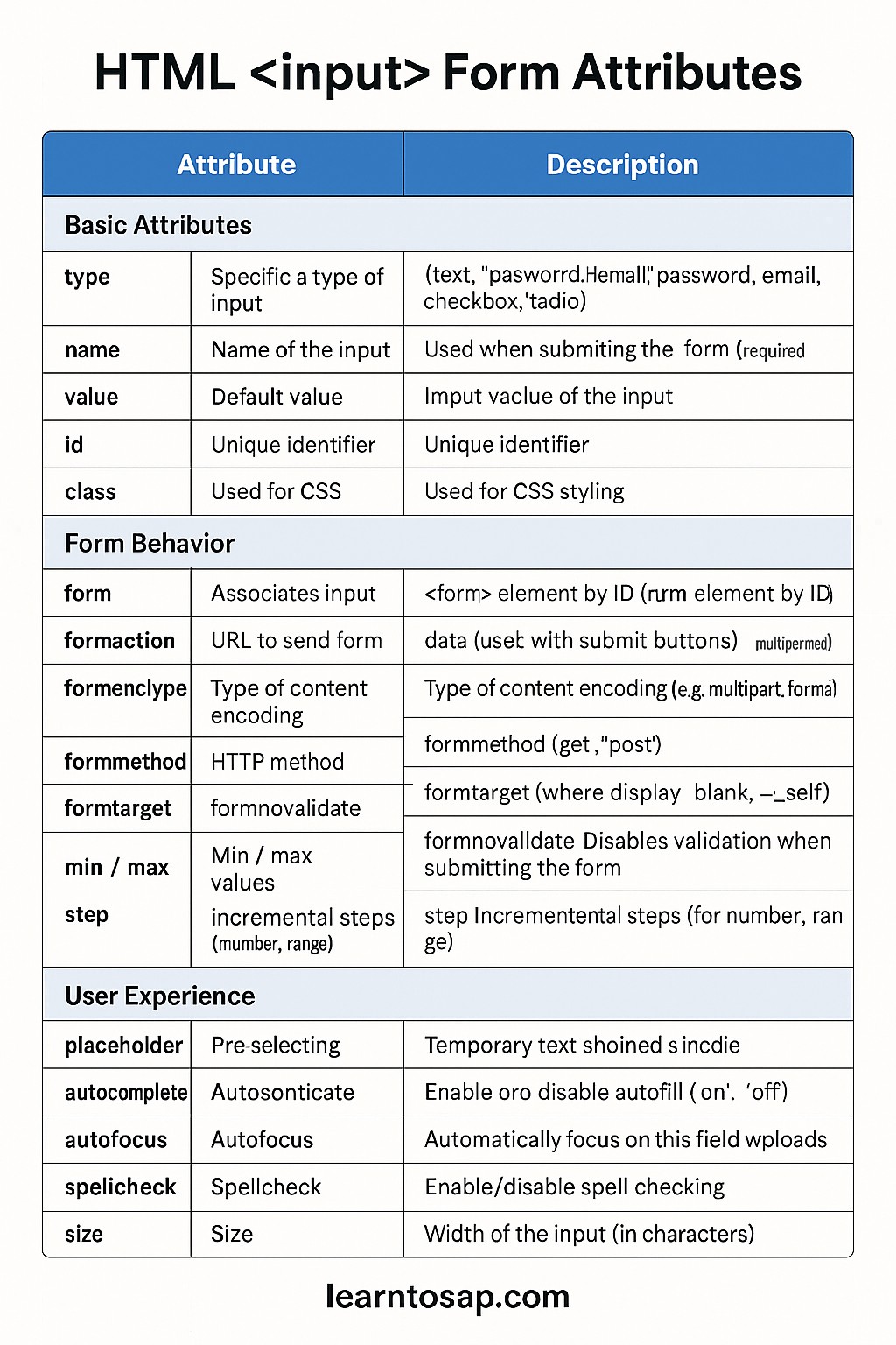
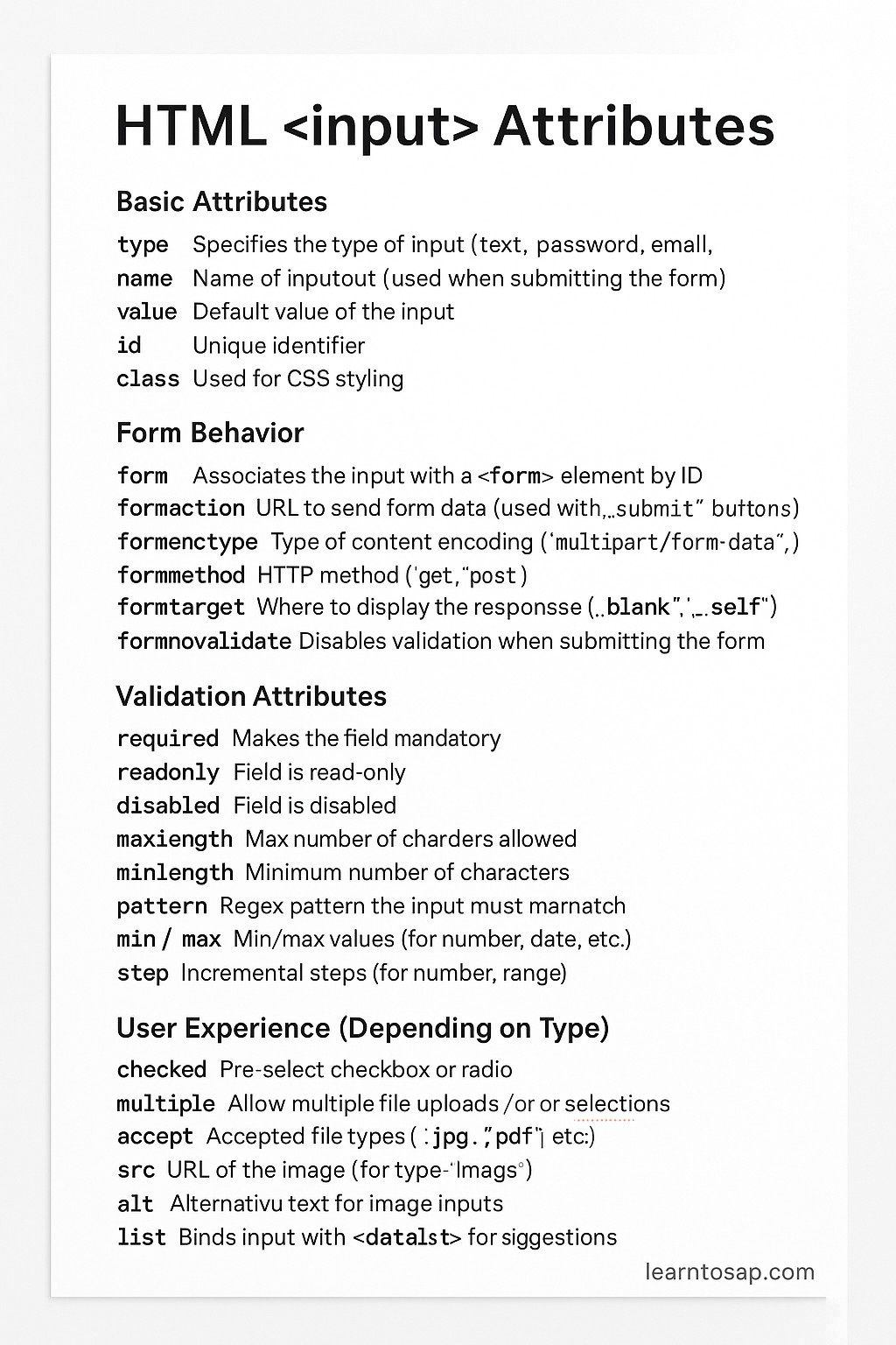
✅ 1. Basic Attributes
| Attribute | Description |
|---|---|
| type | Specifies the type of input (text, password, email, checkbox, radio, etc.) |
| name | Name of the input (used when submitting the form) |
| value | Default value of the input |
| id | Unique identifier |
| class | Used for CSS styling |
🔹 name is the key that shows up on the server when the form is submitted, while id is only meant for the page itself — linking a <label>, targeting with CSS, or selecting with JavaScript. They can hold the same value, but they serve two completely different jobs. A common beginner mistake is setting only id and forgetting name, which means the field displays and styles correctly but its value never actually reaches the server, since the server only reads fields that have a name attribute.
✅ Form Behavior
| Attribute | Description |
|---|---|
| form | Associates the input with a <form> element by ID |
| formaction | URL to send form data (used with submit buttons) |
| formenctype | Type of content encoding (multipart/form-data, etc.) |
| formmethod | HTTP method (get, post) |
| formtarget | Where to display the response (_blank, _self) |
| formnovalidate | Disables validation when submitting the form |
🔹 The form* attributes exist so that a single submit button can override the parent form's own action, method, or enctype, which is handy when one form has two submit buttons that need to behave differently — for example, "Save as Draft" versus "Publish".
✅ User Experience
| Attribute | Description |
|---|---|
| placeholder | Temporary text shown inside the input |
| autocomplete | Enables or disables autofill (on, off) |
| autofocus | Automatically focuses on this field when page loads |
| spellcheck | Enable/disable spell checking |
| size | Width of the input (in characters) |
🔹 Use autofocus sparingly and only on one field per page — if more than one element has it, only the last one in the document actually receives focus, and on mobile it can pop the keyboard open unexpectedly as soon as the page loads.
✅ Special Attributes (Depending on Type)
| Attribute | Description |
|---|---|
| checked | Pre-select checkbox or radio |
| multiple | Allow multiple file uploads or selections |
| accept | Accepted file types (.jpg, .pdf, etc.) |
| src | URL of the image (for type="image") |
| alt | Alternative text for image inputs |
| list | Binds input with <datalist> for suggestions |
🔹 list is one of the most underused attributes on this list — it turns a plain text input into a searchable, editable dropdown by pointing it at a <datalist> full of suggested values, without needing any JavaScript.
<input list="browsers" name="browser">
<datalist id="browsers">
  <option value="Chrome">
  <option value="Firefox">
  <option value="Safari">
</datalist>
✅ Validation & State Attributes
🔹 Beyond appearance and behavior, HTML gives every input a small set of attributes dedicated purely to validation and enabled/disabled state — these are what actually stop a form from being submitted with bad or missing data.
| Attribute | Description |
|---|---|
| required | Field must be filled in before the form can submit |
| readonly | Value is visible and submitted, but cannot be edited |
| disabled | Field is greyed out, cannot be edited, and is NOT submitted |
| minlength / maxlength | Minimum/maximum number of characters allowed in text-based fields |
| min / max | Minimum/maximum numeric or date value allowed |
| step | Increment allowed for number, range, and date/time fields |
| pattern | A regular expression the value must match, e.g. a postal code format |
readonly vs disabled: The Key Difference
| Aspect | readonly | disabled |
|---|---|---|
| Editable by user | No | No |
| Visually greyed out | No (looks normal) | Yes |
| Included in form submission | Yes | No |
| Typical use case | Showing a pre-filled value the user shouldn't change (e.g. an account ID) | Temporarily blocking a field until another condition is met (e.g. before terms are accepted) |
✅ Example
<form action="/submit" method="post">
  <input type="text" name="username" placeholder="Enter username" required maxlength="20">
  <input type="email" name="email" required>
  <input type="password" name="password" required minlength="6">
  <input type="submit" value="Register">
</form>
🔹 Try clicking "Register" above without filling every field — the browser blocks submission on its own and highlights the first invalid field, all from just the required and minlength attributes, with zero JavaScript written.
How Validation Attributes Work Together
🔹 It helps to think of validation attributes as a chain of checks the browser runs, in order, before it lets a form submit. First it checks required — is the field empty? Then it checks length constraints like minlength and maxlength for text, or min and max for numbers and dates. Then, if a pattern is present, it checks the value against that regular expression. Only after every attached input passes all of its own checks does the browser actually submit the form; otherwise it stops, highlights the first failing field, and shows a small built-in error bubble.
🔹 This built-in chain is why a well-attributed form can catch most obvious mistakes — an empty required field, a password that's too short, an email in the wrong format — before a single byte reaches your server. It won't catch everything (like whether a username is already taken), which is exactly the gap server-side validation is meant to fill.
A Complete Attribute Reference Table
| Category | Attributes |
|---|---|
| Identity | type, name, value, id, class |
| Form Behavior Overrides | form, formaction, formenctype, formmethod, formtarget, formnovalidate |
| User Experience | placeholder, autocomplete, autofocus, spellcheck, size |
| Type-Specific | checked, multiple, accept, src, alt, list |
| Validation & State | required, readonly, disabled, minlength, maxlength, min, max, step, pattern |
🔹 Keeping these five categories in mind — identity, form-behavior overrides, user experience, type-specific, and validation/state — makes it much easier to remember which attribute you need without memorizing over twenty individual names.
Which Attribute Should You Reach For?
- 🔹 Need to stop an empty submission? Use required.
- 🔹 Need to show a value the user can see but never change (like a generated order number)? Use readonly.
- 🔹 Need to block a field entirely until some other condition is met (like a checkbox being ticked)? Use disabled, then toggle it with a small script.
- 🔹 Need to enforce a minimum password length? Use minlength.
- 🔹 Need to enforce a specific format like a ZIP code or license plate? Use pattern with a regular expression.
- 🔹 Need to limit a numeric field to a sensible range, like an age or quantity? Use min and max together.
Common Mistakes with HTML Input Attributes
- 🔹 Confusing readonly with disabled: using disabled on a field you still need submitted silently drops that field's value from the form data.
- 🔹 Using placeholder instead of a real <label>: placeholder text disappears the moment the user starts typing, leaving no visible label for context.
- 🔹 Multiple autofocus fields on one page: only the last one wins, which can confuse where the cursor actually lands.
- 🔹 Writing an overly strict pattern: a regular expression that's too rigid can reject perfectly valid input, like international phone numbers or names with accented letters.
- 🔹 Relying only on client-side required/pattern validation: always re-validate on the server, since client-side checks can be bypassed entirely.
HTML Input Attributes Best Practices
- 🔹 Always pair inputs with a visible <label for="..."> rather than relying on placeholder alone.
- 🔹 Use readonly for values the user should see but not change, and disabled only for values that genuinely shouldn't be submitted yet.
- 🔹 Combine required, minlength/maxlength, and pattern for fast client-side feedback, but keep server-side validation as the real gatekeeper.
- 🔹 Use list and <datalist> for suggestion-style fields instead of building a custom autocomplete widget from scratch.
- 🔹 Keep autofocus to at most one field, and avoid it entirely on mobile-first forms where it can trigger the keyboard unexpectedly.
Try It Yourself (Copy This Code and Paste. See how it works). Paste the registration example into the live playground below.
Live Code Preview
Frequently Asked Questions About HTML Input Attributes
What are HTML input attributes?
HTML input attributes define the behavior of input fields such as required, placeholder, readonly, and disabled.
What is the use of required attribute?
The required attribute ensures that the user must fill the field before submitting the form.
What is the difference between readonly and disabled?
Readonly fields cannot be edited but are submitted, while disabled fields cannot be edited and are not submitted.
What is placeholder in HTML?
Placeholder provides hint text inside an input field.
What is the difference between minlength/maxlength and min/max?
minlength and maxlength limit the number of characters in text-based fields, while min and max limit the numeric or date value itself.
Can I use pattern together with required?
Yes, pattern and required work together — required ensures the field is not empty, and pattern ensures the entered value matches a specific format.
Conclusion
🔹 The <input> tag looks simple on the surface, but its attributes give you an enormous amount of control — from basic identity (type, name, value) to per-button form overrides (formaction, formmethod) to full validation (required, pattern, minlength, min/max). Learning which attribute solves which problem means you can build robust, accessible forms with far less custom JavaScript than most beginners assume is necessary. Try the live registration form above, tweak the attributes, and see how the browser's own validation responds.