CSS Animations: @keyframes, Timing Functions And Animation Properties Explained (2026-27)
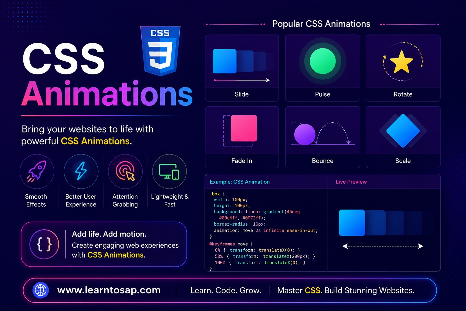
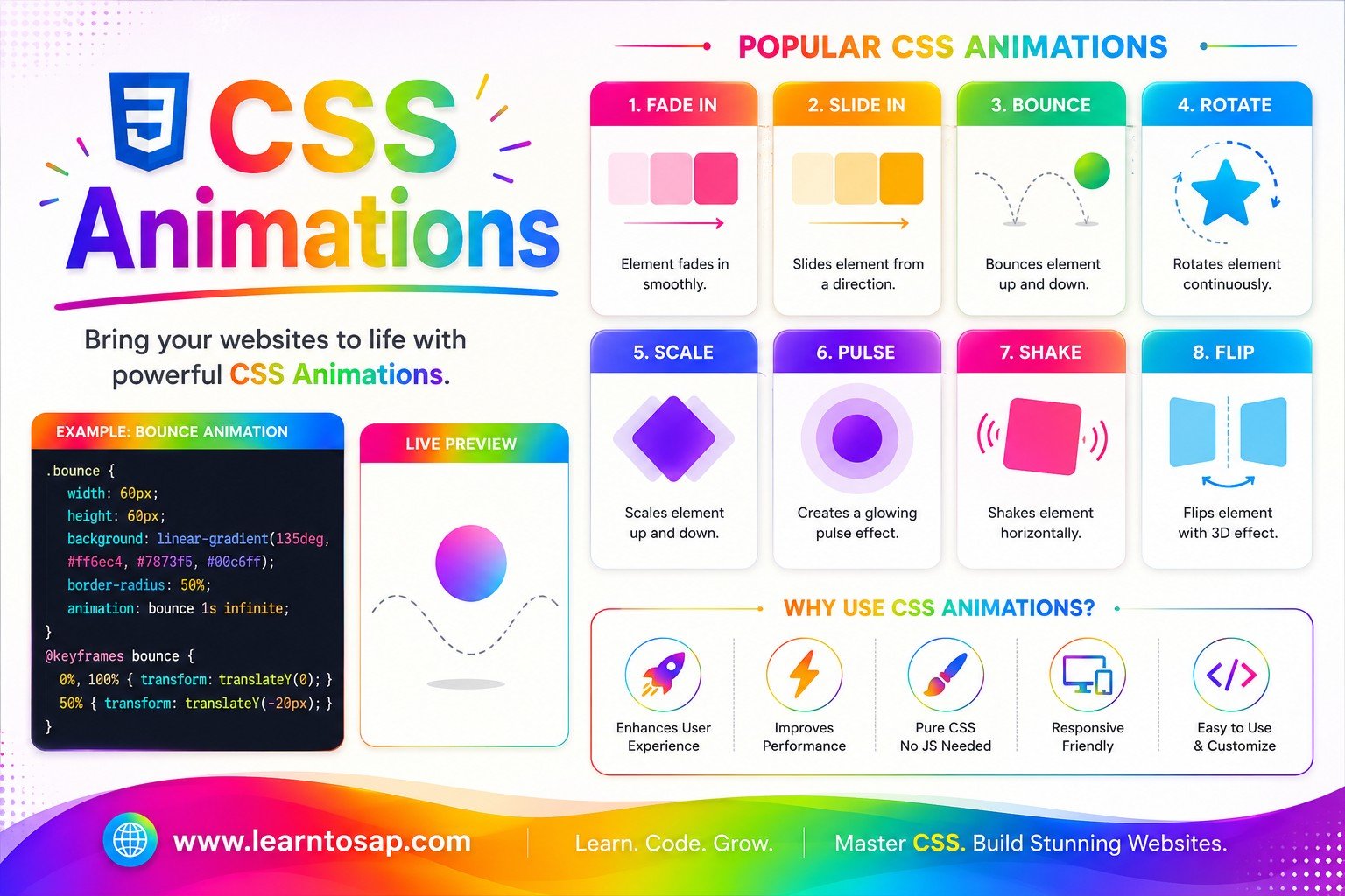
Today we are discuss topic CSS Animations. CSS transitions can smoothly change a property when it's triggered — but CSS Animations go much further, running multi-step sequences automatically, looping forever, reversing, delaying, and pausing, all without a single line of JavaScript. In this complete guide you will master the @keyframes at-rule, and every animation property: animation-name, animation-duration, animation-timing-function (ease, linear, ease-in, ease-out, ease-in-out, cubic-bezier), animation-delay, animation-iteration-count, animation-direction, animation-fill-mode, animation-play-state, and the compact animation shorthand. You'll also see real-world animation patterns — fade-in, slide, bounce, pulse, spinner, typewriter, and shake — and learn when to use each timing function. Includes live running demos, an interactive animation builder, comparison tables, common mistakes, a quiz, and FAQ. This tutorial or document breaks down the process step by step, using simple language and real-world examples to help you master the skill.
📋 Table of Contents
- What Are CSS Animations?
- @keyframes – Defining Animation Steps
- animation-name & animation-duration
- animation-timing-function – Speed Curves
- animation-delay – When the Animation Starts
- animation-iteration-count – Loops & infinite
- animation-direction – normal, reverse, alternate
- animation-fill-mode – forwards, backwards, both
- animation-play-state – Running & Paused
- The animation Shorthand
- Real-World Animation Patterns
- Animation Properties – Reference Table
- Best Practices
- Common Mistakes to Avoid
- Live Code Example
- Try It Yourself – Interactive Editor
- 🎨 Interactive Animation Builder
- Practice Quiz
- Frequently Asked Questions (FAQ)
✅ What Are CSS Animations?
CSS Animations let you animate an element through multiple style states over time, using @keyframes rules, without requiring any JavaScript. They can run automatically on page load, loop infinitely, reverse direction, and pause — making them the right tool for loading spinners, entrance effects, attention pulses, and motion that needs more than a simple A-to-B transition.
✅ @keyframes – Defining Animation Steps
@keyframes is a CSS at-rule where you define each step of an animation by name. Use from and to for a simple two-step animation, or percentage values (0%, 25%, 50%, 100%) to build multi-step sequences.
from { transform: translateX(-100%); }
to { transform: translateX(0); }
}
/* Multi-step with percentages */
@keyframes colorpop {
0% { background: #0EA5E9; }
50% { background: #a78bfa; }
100% { background: #0EA5E9; }
}
slidein, fadeup, pulse — not what properties it changes. This makes your CSS far easier to read at a glance.
✅ animation-name And animation-duration
These two properties are the minimum needed to run any animation. animation-name links the element to a @keyframes rule by its exact name; animation-duration sets how long one full cycle takes — in seconds (s) or milliseconds (ms).
animation-name: spin;
animation-duration: 1.2s;
}
@keyframes spin {
from { transform: rotate(0deg); }
to { transform: rotate(360deg); }
}
✅ animation-timing-function – Speed Curves
animation-timing-function controls how the animation accelerates and decelerates across its duration. The five keyword values cover the most common motion feels; cubic-bezier() gives you precise, custom control over any speed curve.
.ease { animation-timing-function: ease; }
.ease-in { animation-timing-function: ease-in; }
.ease-out { animation-timing-function: ease-out; }
.ease-io { animation-timing-function: ease-in-out; }
ease-out is best for entrance animations (things sliding or fading in), because fast-then-slow feels natural and responsive. ease-in is best for exit animations (things leaving the screen). ease-in-out works well for looping animations like pulses and bounces that need to feel smooth at both ends.
✅ animation-delay – When the Animation Starts
animation-delay holds the element in its pre-animation (or first-keyframe, with fill-mode: backwards) state for a set time before the animation begins. Negative values start the animation as if it's already been running for that duration.
.dot-2 { animation-delay: 0.2s; }
.dot-3 { animation-delay: 0.4s; }
/* staggered bounce for a loading indicator */
✅ animation-iteration-count – Loops & infinite
animation-iteration-count sets how many times the animation plays. A number plays it that many times and stops; infinite loops it forever — the standard value for spinners, pulses, and breathing effects.
animation-iteration-count: 3;
}
.loops-forever {
animation-iteration-count: infinite;
}
✅ animation-direction – normal, reverse, alternate
animation-direction controls which way through the @keyframes the animation runs each cycle: normal (start → end), reverse (end → start), alternate (start → end then end → start), or alternate-reverse.
.reverse { animation-direction: reverse; }
.alternate { animation-direction: alternate; }
alternate is the cleanest way to create a smooth "ping-pong" or "breathing" effect without needing to manually code the return journey in your @keyframes.
✅ animation-fill-mode – forwards, backwards, both
animation-fill-mode determines what styles the element holds outside the animation's active time — before it starts (during a delay) and after it finishes. Without this, elements snap back to their original styles the moment the animation ends.
animation-fill-mode: none; /* snaps back */
}
.with-forwards {
animation-fill-mode: forwards; /* stays at end */
}
animation-fill-mode: forwards; on a one-time entrance animation (like a fade-in or slide-in) causes the element to snap back to invisible or off-screen the moment the animation finishes — the single most jarring mistake in CSS animation.
✅ animation-play-state – Running & Paused
animation-play-state toggles an animation between running and paused — the animation freezes exactly where it is and resumes from the same point. This is commonly triggered via CSS :hover or a JavaScript class toggle.
animation: spin 1.4s linear infinite;
animation-play-state: running;
}
.spinner:hover {
animation-play-state: paused;
}
✅ The animation Shorthand
The animation shorthand combines all eight animation properties into one compact declaration. The order is: name duration timing-function delay iteration-count direction fill-mode play-state.
/* Longhand */
.box {
  animation-name: slidein;
  animation-duration: 0.6s;
  animation-timing-function: ease-out;
  animation-delay: 0.2s;
  animation-iteration-count: 1;
  animation-direction: normal;
  animation-fill-mode: forwards;
  animation-play-state: running;
}

/* Shorthand — identical result */
.box {
  animation: slidein 0.6s ease-out 0.2s 1 normal forwards running;
}

/* Most common everyday form (omitting defaults) */
.box {
  animation: slidein 0.6s ease-out forwards;
}animation: spin 1s linear infinite, pulse 2s ease-in-out infinite; — both run simultaneously and independently.
✅ Real-World Animation Patterns
Here are the six most commonly used CSS animation patterns in production UI — all running live:
✅ Animation Properties – Reference Table
| Property | Values / Example | What It Controls |
|---|---|---|
@keyframes name { } | from/to or 0%–100% | Defines the animation steps by name |
animation-name | slidein · none | Links element to a @keyframes rule |
animation-duration | 0.6s · 400ms | How long one full cycle takes |
animation-timing-function | ease · linear · ease-in · ease-out · ease-in-out · cubic-bezier() | Speed curve across the duration |
animation-delay | 0.3s · -0.5s | Wait time before the animation starts |
animation-iteration-count | 1 · 3 · infinite | Number of times the cycle repeats |
animation-direction | normal · reverse · alternate · alternate-reverse | Which direction through @keyframes each cycle runs |
animation-fill-mode | none · forwards · backwards · both | Styles applied before start / after end |
animation-play-state | running · paused | Toggle play / pause without resetting |
animation (shorthand) | name duration timing delay count dir fill state | Combines all eight properties |
✅ Best Practices
✔️ 1) Animate only transform and opacity for Maximum Performance
Browsers can run transform and opacity animations on the GPU compositor thread, giving smooth 60fps with near-zero CPU cost. Animating layout-affecting properties like width, height, top, or margin forces full layout recalculations on every frame and can cause jank.
✔️ 2) Always Add animation-fill-mode: forwards on One-Time Entrance Animations
Without it, the element snaps back to its pre-animation state the moment the animation finishes — which is almost never what you want for a fade-in or slide-in effect.
✔️ 3) Respect prefers-reduced-motion
Wrap all non-essential animations in a @media (prefers-reduced-motion: reduce) block and disable or tone them down — motion can cause discomfort for users with vestibular disorders.
@media (prefers-reduced-motion: reduce) {
  *, *::before, *::after {
    animation-duration: 0.01ms !important;
    animation-iteration-count: 1 !important;
  }
}
✔️ 4) Use animation-delay for Staggered Entrance Effects
Incrementing delay values across list items (0s, 0.1s, 0.2s…) creates a cascade that feels polished and natural with zero extra @keyframes or JavaScript.
✔️ 5) Keep animation-duration Under 600ms for UI Feedback
Animations faster than 600ms feel responsive; longer than 1–2 seconds feel sluggish for interactive UI. Save longer durations for background decorative animations where the user isn't waiting.
--anim-duration: 0.4s; --anim-easing: ease-out; — so the entire site's motion feel can be adjusted by changing just two variables.
✅ Common Mistakes to Avoid
The name in
animation-name must match the @keyframes identifier exactly, including case. A single typo silently kills the entire animation with no error message.
The most visually jarring bug in CSS animation — a fade-in or slide-in that snaps back to invisible the moment it finishes. Always set
fill-mode: forwards on one-time entrance effects.
Animating
left, top, width, or margin triggers full layout recalculation every frame — causing janky, low-FPS animation. Always use transform: translate(), scale() etc. instead.
A zero duration makes the animation play instantaneously — the @keyframes rule runs but the visual result looks like a snap, not a motion.
Spinning, bouncing, and flashing animations can cause real discomfort for users with vestibular disorders or motion sensitivity. Always provide a reduced-motion fallback.
✅ Complete Live Example
A notification toast that slides in from the right, pauses to be read, then fades out — all with CSS animations only:
from { transform: translateX(120%); opacity: 0; }
to { transform: translateX(0); opacity: 1; }
}
.toast {
animation: toast-in 0.5s ease-out forwards;
}
✅ Try It Yourself – Interactive Editor
Edit the HTML and CSS below to experiment with CSS animations. Try changing @keyframes steps, the timing function, iteration count, or fill-mode. The preview updates automatically.
✅ 🎨 Interactive Animation Builder
Pick a motion type, then dial in duration, timing function, delay, iteration count, direction, and fill-mode to generate ready-to-use CSS animation code.
✅ Practice – Yes / No Quiz
1. Are animation-name and animation-duration the only two properties required to run a CSS animation?
2. Does animation-fill-mode: forwards make an element snap back to its original style after the animation ends?
3. Does animation-direction: alternate make the animation play forward then backward on each cycle?
4. Is animating the CSS left and top properties recommended for best animation performance?
5. Can animation-play-state pause a CSS animation exactly where it is and resume from the same point?